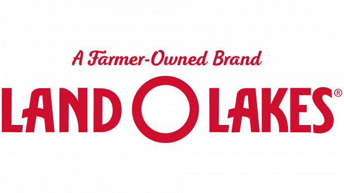
Buying farm products is an exact hit on the target. The Land O’Lakes logo testifies to the love for the business and the excellent taste and quality of dairy products. According to the symbols of the emblem, the product is prepared from natural ingredients with careful control of all stages of production.
Land O’Lakes: Brand overview
| Founded: | July 8, 1921 |
| Headquarters: | Arden Hills, Minnesota, U.S. |
| Website: | landolakesinc.com |
Meaning and History
Most consumers associate Land O’Lakes only with butter, the packaging of which used to depict a girl from an Indian tribe. After the logo was updated in 2020, the design was simplified, and the Native Americans disappeared without a trace. Now the brand name is at the heart of the identity. It appeared when the creators of the cooperative held a naming contest among the residents of Minnesota. Two people sent the winning option at once: George L. Swift and E. B. Foss. They suggested calling the brand Land O’Lakes because Americans know Minnesota as “Land of 10,000 Lakes.”
After that, the company needed a new logo that would reflect the changes on a visual level. It was designed by the artist Arthur C. Hanson. He portrayed a young girl in the national Indian costume. According to legend, her name was Mia, although many associate this image with a character from Native American folklore – the fictional woman Minnehaha. It was she who was mentioned in the stories about the leader of the Hiawatha.
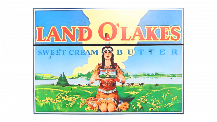
By the way, the name Minnehaha is translated as “laughing waters,” and the word Minnesota means “cloudy waters.” This is another explanation for why the brand is called Land O’Lakes. His logo also used to have a “water” theme: a girl was sitting in front of a lake. Moreover, the artist Patrick DesJarlait in the 1950s tweaked the landscape and added details to bring out the scenic Narrows Gorge that was well known to the Red Lake tribe. The same designer changed the girl’s clothes to match the traditions of Ojibwe. He decorated the hem, belt, and headband with floral designs. Patrick DesJarlait knew exactly what they were supposed to look like because he came from the Ojibwe people.
On the one hand, such artistic motifs were considered an expression of reverence for Native American culture. After all, while they were trying to forget about them, settling on reservations, the oil producer constantly reminded of the existence of the Indians with his logo. In addition, DesJarlait himself considered himself apolitical and wanted peace among all the inhabitants of America. He was confident that his work fostered historical pride. But the Land O’Lakes logo has caused a lot of scandals. It was called a caricature that does not show the real facts of the genocide. Allegations of racist stereotypes forced the dairy manufacturer to redesign globally and remove the image of the Native American girl from its butter and other products.
What is Land O’Lakes?
Land O’Lakes is a cooperative consisting of more than 1,600 American farmers. It focuses on the production of agricultural products, mainly milk, cheese, and butter. Its products also include animal feed and materials for processing planting material. Land O’Lakes’ history began in 1921 with the establishment of the Minnesota Cooperative Creameries Association.
1903 – 1925
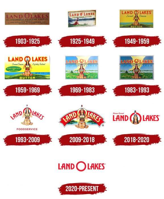
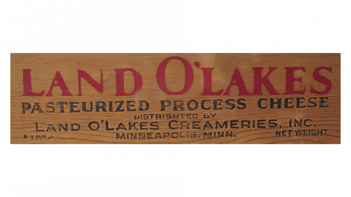
The history of Land O’Lakes dates back to 1921, when American farmers formed an association. The manufacturer produced dairy products, including pasteurized processed cheese. Its label bore the red brand name in serif typeface – obviously the logo. Below the product type was mentioned, and the inscription “Land O’Lakes Creameries, Inc.” (the organization received this name in 1926).
1925 – 1949
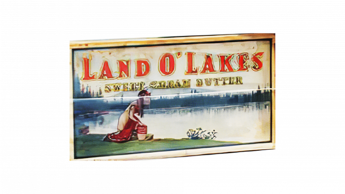
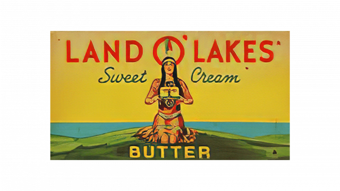
The first Native American girl emblem was designed by Arthur C. Hanson, an illustrator at Brown & Bigelow. This happened in 1928 when the cooperative decided to adapt the identity to its name. The artist depicted a landscape typical of any corner of the state of Minnesota: a green coastline, a picturesque body of water, tall pine trees on the horizon. The main selling point was a Native American woman who bent down to the water, holding a butter box in front of her.
1949 – 1959
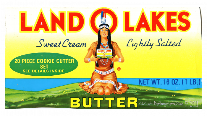
In the late 1940s, the logo has been modified. The company entrusted the redesign to Red Lake Ojibwe Indian artist Patrick DesJarlait. This is how the image of a girl turned to face the viewer appeared on the label. She was on her knees, clutching the butter to her chest. The feather on her head was in the center of the letter “O” in the red lettering “LAND O’LAKES.”
1959 – 1969
Over time, the colors became brighter. The letters were outlined in yellow, and the apostrophe disappeared for some reason. The artist has detailed the embroidery on the buckskin dress, adding ornaments that Ojibwe has for plants.
1969 – 1983
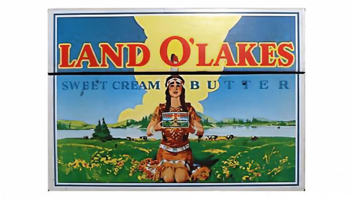
In 1969, Arthur C. Hanson refined the logo, complementing the green shore with bright yellow colors and depicting two converging tree lines on the horizon. He wanted the landscape to resemble a special area on the reservation – Narrows. This area could be recognized by any Indian from the Red Lake tribe. The apostrophe reappeared in the LAND O’LAKES caption.
1983 – 1993
The yellow dress on the label turned red and orange. In addition, the designers underlined the brand name with a long, thin line to separate it from the product name.
1993 – 2009
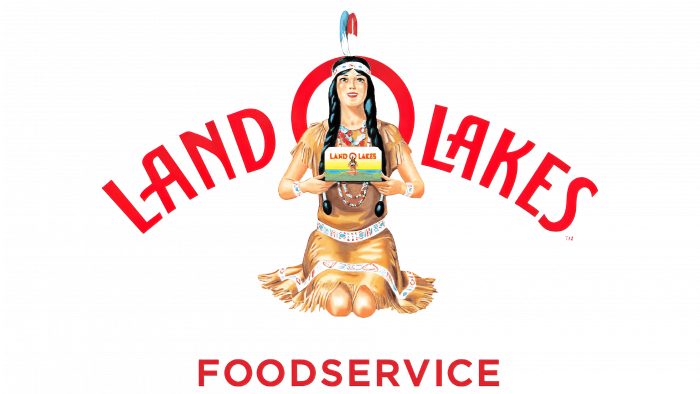
In the early 1990s. Land O’Lakes has unveiled a corporate emblem with the iconic Native American image. The upper inscription turned into a red arch, while the font was changed to a stylized sans-serif. The word “FOODSERVICE” has been added at the bottom. The lake landscape has disappeared.
2009 – 2018
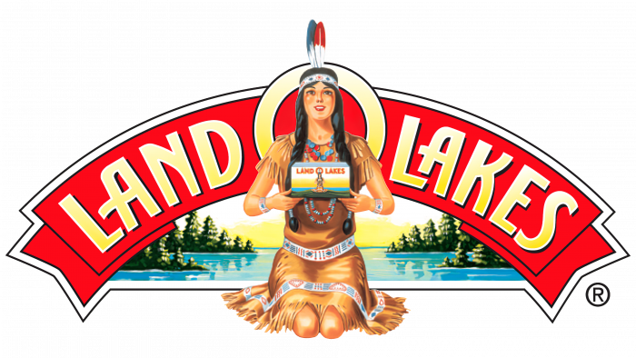
The designers repainted the brand name in golden color and placed it on a curved red ribbon. A pond with trees reappeared in the background.
2018 – 2020
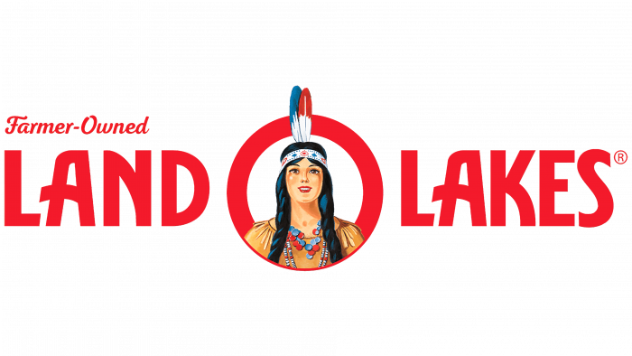
The dairy manufacturer has been accused of kneeling down as if in acknowledgment of submission. Therefore, the artists removed the torso, leaving only the head. The “portrait” was placed in the red letter “O,” the apostrophe disappeared. The word combination “LAND O LAKES” became even, and in the upper right corner, there was another inscription: “Farmer-Owned.” An Italic font was used for it.
2020 – today
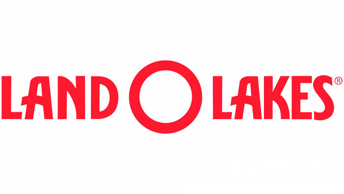
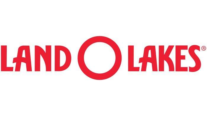
In 2020, only the name of the cooperative remained on the logo, without hints of an Indian theme. The company said it would decorate food packages with real photographs of farmers providing fresh milk. The Farmer-Owned tag also disappeared. The changes were timed to coincide with the 100th anniversary of Land O’Lakes.
Land O’Lakes: Interesting Facts
Land O’Lakes, Inc. is a well-known dairy brand that started in 1921 with a group of dairy farmers in Minnesota. It’s grown a lot since then, becoming a big deal in the agribusiness and food industries in the U.S.
- Farmer-run business: It started as a cooperative, meaning the farmers who provide the milk run the company. This helped them sell and distribute their products better, helping the company grow.
- Butter Innovations: In the 1920s, they were the first to make butter from sweet cream instead of sour cream, which was a big deal because it made butter taste better.
- Butter: While Land O’Lakes is famous for butter, It also makes cheese, milk, eggs, and even animal feed under the Purina brand (which differs from the pet food Purina).
- Beyond Local: What started locally now extends across the U.S. and other countries, showing the popularity of their products worldwide.
- Agriculture Leadership: Land O’Lakes is in the dairy products business. They’re also leaders in agriculture, helping farmers with supplies like seeds and services to make farms more productive and sustainable.
- Eco-Friendly Farming: They’re serious about farming in good ways for the planet, working with farmers to reduce environmental harm, save resources, and protect nature.
- Helping Rural Areas: Through their foundation, Land O’Lakes invests in education, food security, and development in rural communities where their members and employees live.
- Inclusive Leadership: In 2018, Beth Ford became CEO, making headlines as one of the few openly gay CEOs of a Fortune 500 company, marking progress in corporate diversity.
- Changing the Logo: In 2020, they decided to remove the Native American woman from their packaging to avoid using stereotypes and update their image for modern times.
- Tech-Savvy Farming: Land O’Lakes is also using digital technology to help farmers manage their crops better and make farming more sustainable.
From its beginnings as a cooperative to its current status in agribusiness, Land O’Lakes has been all about innovation, quality, helping the community, and shaping American agriculture.
Font and Colors
The old symbol depicting a girl named Mia has been repeatedly called racist and misogynistic because the image, in society’s opinion, was overly sexualized and did not reflect the real problems of the Indians. Therefore, the disappearance of the Native American woman caused a great stir. The owners of the cooperative hoped that the young girl from the Indian tribe would be associated with cleanliness and nature.
The name of the company is written in a stylized bold red font. The letters don’t have serifs, but they have curving decorative lines. The “O” is a perfectly flat circle and looks like a separate design element that divides the lettering in two.
Land O’Lakes color codes
| Imperial Red | Hex color: | #ec1e32 |
|---|---|---|
| RGB: | 226 30 50 | |
| CMYK: | 0 87 79 7 | |
| Pantone: | PMS Bright Red C |
