


![]() Land Rover Logo PNG
Land Rover Logo PNG
The Land Rover logo shows off the brand’s rich history. It represents elegant, elite cars of a premium class. Rich decoration and impressive dimensions are elements of the lifestyle of off-road drivers, which the emblem conveys.
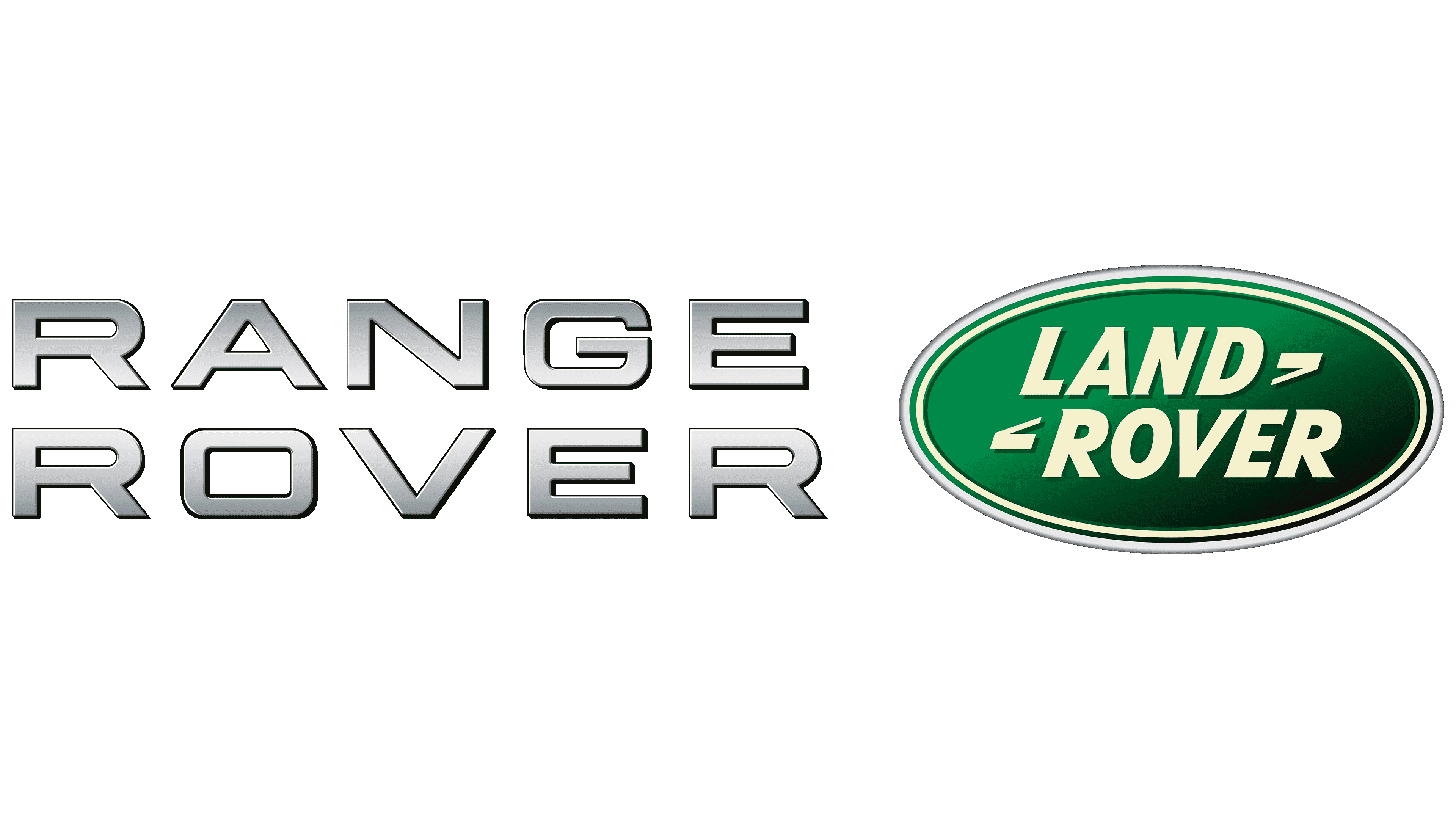
Land Rover is a British automotive brand offering elite all-wheel-drive SUVs. Previously, it belonged to Jaguar Land Rover, and since 2008, to Tata Motors, a subsidiary of the Indian conglomerate. Now, the company produces branded cars in India, Slovakia, China, and Brazil. In 1951, King George VI awarded her one of the highest British awards, the Royal Warrant. Half a century later, she received the Queen’s Award for Enterprise for the successful development of international trade. The brand appeared in 1948. Its headquarters are in Solihull in the West Midlands region (UK).
Even though luxury SUVs and Land Rover production are carried out worldwide, it is not a separate company; it is only a division or trademark with a big name and an impeccable reputation. Its current range consists primarily of four Range Rover and two Discovery models. In 2020, the line was expanded to include second-generation Defender cars. The brand has previously focused on a range of off-road vehicles, from upmarket to entry-level. That is why it gained widespread recognition: its emblem automatically signified technical excellence within a sophisticated design.
It all began with Rover’s models. The company developed its off-road vehicles and combined them into the Land Rover series. Gradually, the double name was assigned to a specific transport type and was used unchanged. In 1970, the company manufactured the Range Rover. Eight years later, it became a subsidiary of British Leyland.
In 1983/1984, variants of cars with long and short wheelbases were named. In 1990, they were hailed as Defender models, as the company had another SUV, the Discovery, a year earlier.
Meaning and History
![]()
All brand designs were adorned with the same logo, approved at the dawn of the company’s formation. It consists of the trademark name and has evolved over many decades, remaining a unique sign with wide recognition.
Land Rover’s visual identity is as business-like as the brand itself. There are no complex images, philosophical overtones, or abstract elements. Only rigor, precision, and practicality are predominant, so the line’s name can be seen in any car part. The background is an ellipse in a double frame.
What is Land Rover?
At first, the Land Rover name belonged to only one off-road vehicle, which began production in 1948. Now it is a series of off-road vehicles, the flagship brand of Jaguar Land Rover Automotive PLC from the UK. Vehicle production is carried out in several countries, including Slovakia, India, China, and Brazil.
1948 – 1960s
![]()
The debut logo uses the brand name at different levels: the top line says “Land,” and the bottom line says “Rover.” The words are linked by a zigzag stroke reminiscent of the letter “Z.” But this is not the only inscription on the emblem. It also indicates the brand’s origin: “Solihull Warwickshire, England.” They are placed on opposite sides. The inscriptions are made in a sleek, geometrically strict, and oblique type. All elements are in a gray oval.
1960s – 1968
![]()
The Land Rover logo of this period is as simple as possible. The one-line inscription is located on a diagonal rectangle with rounded sides. This is the only emblem without an oval. It is a black parallelogram-shaped plate with white uppercase letters. At the top left and bottom right are two bold dots, screw heads.
1968 – 1978
![]()
For the next ten years, the black-and-yellow logo was used. The developers removed unnecessary inscriptions, leaving only the trademark name. At the same time, they enlarged the words, filling all the inner space with them. The zigzag was split in two.
1978 – 1986
![]()
The redesign of the emblem brought minimal changes: black was replaced with emerald green, and yellow with neutral white. The authors have retained the double edging along the oval’s edge.
1986 – today
![]()
The logo proposed at the beginning of this period is still used today. He acquired only highlights and shadows, making the previous logo version three-dimensional. The developers turned the frame into a three-line contour, with one emerald stripe and two gray stripes that gracefully alternate. The brand name features a silvery gradient from white to graphite and one-sided spikes at the tops of the letters on the left side.
1996 – today
![]()
Another logo was approved during the noted period. It differed from its predecessor in that it lacked lettering glare, making it appear two-dimensional. A thin gray stripe on the edge also added a plane, replacing the wide line. At the same time, the designers deepened the emerald green, adding a gradient that transitions from dark to light.
Font and Colors
From the beginning, the Land Rover logo has had the shape we see today. It is a clear oval with a frame and the car brand’s name. The inscription is centered and complemented by a zigzag divided into two parts. Only the background always changed. It is alleged that the designer’s idea was prompted by a greasy trail left on paper by a can of sardines.
The emblem uses the Gill Sans Bold Italic typeface. It was created in 1930 by Eric Gill. The color palette is more varied than the shape and type. It originally consisted of gray. Then emerald green, white, and silver appeared in it.
![]()
FAQ
What is the slogan for the Land Rover Defender?
The slogan “Above and Beyond” captures the essence of the vehicle’s exceptional performance and capabilities. This phrase shows the Defender’s strength and ability to perform well under difficult conditions. The slogan reflects the car’s history of durability and reliability.
“Above and Beyond” resonates with consumers, positioning the Defender as a companion for adventure and exploration.
What font is Land Rover?
The company uses Gill Sans Bold Italic for its branding. This font gives a clean, modern look that matches the brand’s sophisticated, durable image. Gill Sans is classic and modern, aligning with the sleek, rugged design of their automobiles.
The bold italic version of Gill Sans makes the brand more unique and noticeable, helping it stand out in the competitive automotive market. This font choice also enhances the effectiveness of marketing materials.
What does the Land Rover logo mean?
The logo is simple but rich in stories. Designer Maurice Wilkes never explained the meaning of the logo design, so people rely on stories and interpretations. The green color of the logo may remind you of British Racing Green used in British motor racing, or it may symbolize nature, which fits the brand’s image of making cars suitable for outdoor use.
The logo has two side elements. Some believe these lines represent the brand’s slogan, “Above and Beyond,” suggesting the brand aims to go beyond what’s usual. Another interesting story about the logo is its oval shape. Maurice Wilkes is said to have used a fish can as a template when designing the logo during lunch.
Does the Range Rover logo?
It does not have a separate logo. Instead, the cars have special lettering and a radiator grille under the rear window. This brand identity helps people instantly recognize Range Rover while maintaining an elegant design consistent with the brand’s overall look and feel.
What is the Land Rover emblem?
The logo features a green elliptical shape with a gradient, symbolizing the brand’s connection to nature and adventure. This ellipse is enclosed in three concentric rings of silver and green, emphasizing its depth and sophistication. The brand name is divided into two lines inside the ellipse: “LAND” at the top and “ROVER” at the bottom. Short, dotted lines next to the words “LAND” and “ROVER” give the emblem a modern, dynamic look.
What is the symbol of Range Rover?
The brand uses a unique symbol: the model name itself. The name is displayed under the rear window and above the radiator grille at the front of the car. Instead of using a separate logo like many car brands, it takes a minimalist approach, using only its name as an identifier. This is not an official logo, but it effectively identifies the model.