


 Lane Bryant Logo PNG
The Lane Bryant logo symbolizes a stylish appearance for women of all shapes and sizes. The brand’s products are known for their unique cuts, which help create an elegant and refined look for pregnant women and those with curvy figures. The emblem reflects the company’s philosophy, which embodies the dreams of millions of women striving for beauty and comfort. The brand was founded by a talented seamstress who understood her clients’ desires and needs, making Lane Bryant a symbol of accessible and versatile style for every woman.
Lane Bryant began in 1904, when Lithuanian immigrant Lena Bryant Malsin opened a lingerie shop in New York. The business first sold handmade lace collars, then changed direction after Bryant designed a comfortable maternity dress for a customer. In 1907, she married Albert Malsin, and together they developed maternity sizing, creating a category for pregnant women.
Mail-order catalogs followed in 1909, widening sales despite newspapers refusing pregnancy-related advertising. The first Chicago store opened in 1923, and more locations appeared across the United States. During the 1930s, Lane Bryant expanded into larger-size women’s clothing beyond maternity. In the 1940s, the company helped popularize the term “plus-size” and increased magazine and radio advertising.
Stores moved into shopping centers during the 1950s, while menswear briefly joined the range. Through the 1960s and 1970s, collections adopted newer cuts and styles for a changing customer base. The Limited, Inc. acquired Lane Bryant in 1982, followed by Charming Shoppes, Inc. in 2001 and Ascena Retail Group in 2012.
A national television campaign launched in 1997, while online shopping and a mobile app grew during the 2010s. The 2015 #ImNoAngel campaign focused on body acceptance and inclusive fashion. By 2020, the range covered clothing, lingerie, and accessories in sizes 14 to 28. After Ascena entered bankruptcy, Sycamore Partners bought the brand in 2020, and it remained active in 2023.
Meaning and History
What is Lane Bryant?
This is a well-known American retailer specializing in plus-size women’s clothing. As a pioneer in this sector, the brand has influenced perceptions of beauty and diversity in fashion. It offers a wide range of clothing designed for fuller figures, including workwear, lingerie, casual wear, and accessories. With its focus on fit and style, the brand became famous for providing stylish options that were once rare in the plus-size clothing segment. By featuring diverse models in its marketing campaigns, the company has played a key role in promoting body positivity and size inclusivity in the fashion industry. Beyond retail, the brand has also contributed to broader discussions about diversity and representation in fashion.
Old
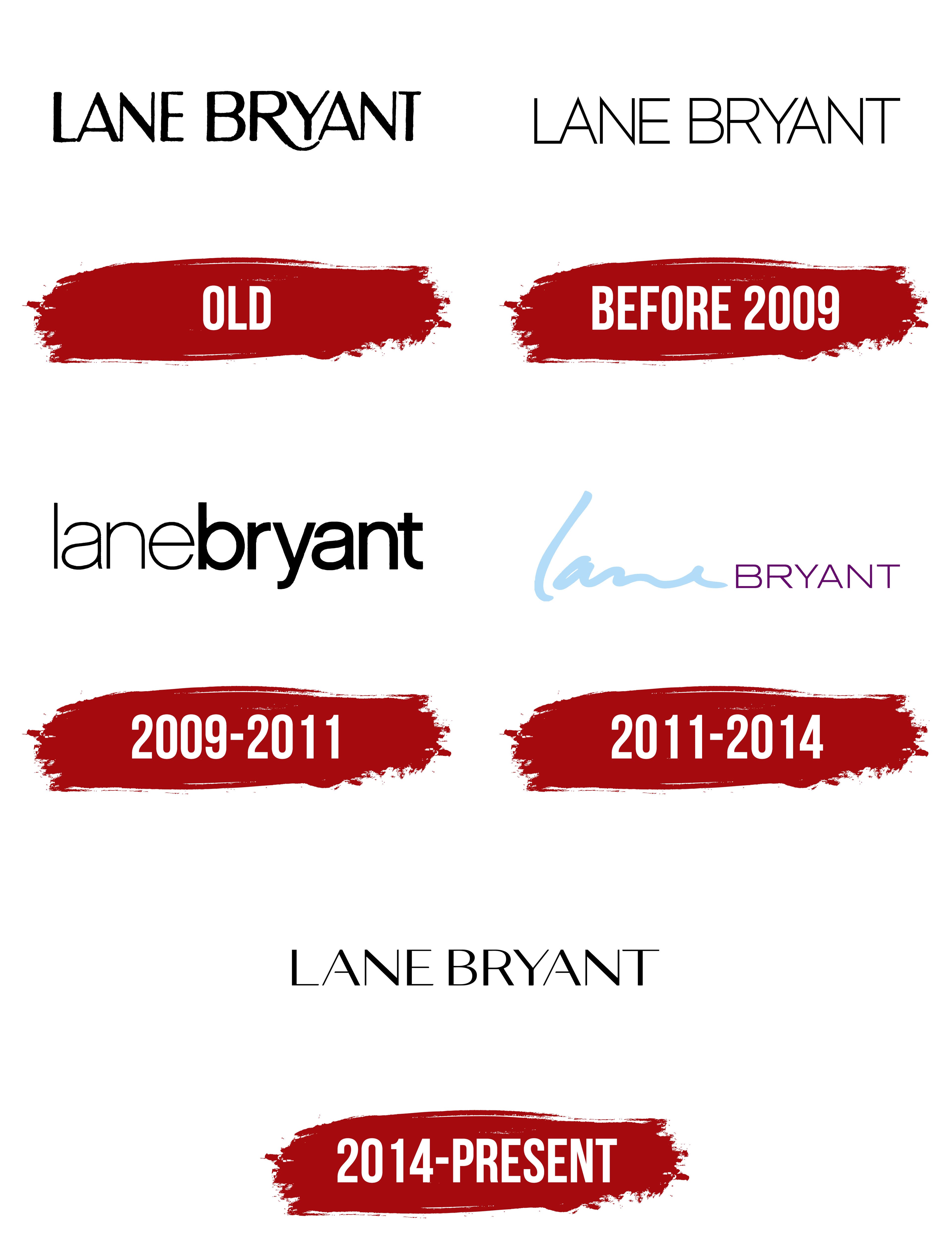
The thin, elegant letters of the logo stand out through a play on glyph thickness, highlighting the brand’s specialization in tailoring clothing in non-standard sizes. The lower leg of the letter “R” smoothly connects with the glyph “A,” as if embracing the “Y” from below, symbolizing pregnancy and care for the future baby. This design element refers to the brand’s origins in creating outfits for pregnant women, among the first on the market.
The emblem conveys the comfort and ease that Lane Bryant clothing provides. The brand’s models ensure freedom of movement, allowing women to feel comfortable and continue working. Customers appreciate this quality. The company name was derived from part of the designer Lena Himmelstein Bryant Malsin’s name, using “Lane” instead of “Lena” due to a bank error. Eventually, it became a recognizable part of the brand.
Before 2009
The brand’s emblem adopted a new visual style, with thin black letters, highlighting its modern, fashionable character. Under the leadership of the founder’s husband, the company expanded and modernized, becoming one of the first to release maternity clothing advertisements.
The new letter style symbolized accessibility, comfort, and simplicity of cut, allowing pregnant women to appear slimmer and more elegant. The outfits skillfully concealed changing shapes while maintaining the look’s sophistication.
The logo also reflected a privacy concern. The brand introduced the option of remote purchases through catalogs, allowing women who wished to keep their condition private to buy clothing conveniently and discreetly.
2009 – 2011

The logo was updated after Charming acquired the brand and received a license to sell through catalogs. The founder’s first name is now written in thin lettering as a tribute, symbolizing a connection to the past. Meanwhile, the last name is presented in bolder, more flexible letters, highlighting the family dynasty, as the Asher sons long managed the brands after Lena’s death.
The font difference also reflects the brand’s offerings for fuller-figured people who need a wardrobe refresh. The flexibility of the glyphs emphasizes the company’s core philosophy of comfort and convenience, which the designers incorporate into every item.
2011 – 2014
The logo again emphasizes the difference in the design of the name’s parts. The first name is rendered in a blue script font, resembling a signature, highlighting the company’s past, founded on the ideas and vision of its creator. This symbolizes the realization of the dream and creative concept of the female designer, Lena Bryant.
The last name, on the other hand, reflects the brand’s present. The thin letters represent accessibility and the specific niche that the company has successfully occupied. The brand conveys women’s desire to appear slimmer and more graceful through the unique cut of the clothing, which supports this idea.
2014 – today
The change in ownership to Dressbarn sparked a brand update and a logo redesign that returned to its roots while adapting to modern standards. The letters in the emblem were given wider and shorter proportions than in previous versions, reflecting the company’s expansion from maternity items to clothing for fuller-figured individuals. This visual emphasis on symbol width highlights a focus on customers with diverse body types while maintaining style and impact. Despite changes in glyph thickness, the emblem retains a confident, contemporary look, aligning with the brand’s primary goal: creating stylish, comfortable outfits.
The Lane Bryant logo exemplifies elegance and restraint. The letters are elongated vertically, lending a sense of refinement while preserving clear shapes that ensure readability. The brand name, split into two parts, “Lane” and “Bryant,” emphasizes the significance of the founder’s name, Lena Himmelstein Bryant, who began designing clothing for women with unique body types as early as the early 20th century. The brand’s history is closely linked to the evolution of fashion for all body types, and the visual symbol supports this connection, demonstrating respect for the past.
The color scheme, a classic black on a white background, emphasizes versatility, simplicity, and solidity, creating a sense of confidence and stability. In the logo, every line is meticulously considered: thin horizontal lines add lightness, while vertical lines convey stability.
The font is minimalist yet balanced. It conveys that the brand is focused on creating high-quality, comfortable clothing for women, regardless of body shape. Lane Bryant remains at the forefront of the fashion industry due to its commitment to diversity and inclusivity, as reflected in its understated, professional logo design.