


 Giordano Logo PNG
The Giordano logo evokes style and refined aesthetics. It is created with special attention to the brand’s core values, which aim to offer customers high-quality everyday clothing that meets elevated standards.
The brand identity is imbued with classic beauty and pronounced minimalism. Two contrasting colors form the foundation of the brand’s perception, reflecting its unique individuality. The emblem appears original because the text element in its graphic highlights the brand name, lending it a sense of brilliance. The elegance of the font emphasizes the visual mark on a white background, creating a timeless effect and adding distinctive depth.
The company has achieved global recognition through its personalized approach to clothing design, careful attention to customer needs, and commitment to high quality in every item. For this reason, the brand’s modern identity extends beyond mere recognition. It aims to make it easy and convenient for every customer to find products, fostering harmonious interactions between customers and the brand across markets.
Giordano was founded in Hong Kong in 1981 by entrepreneur Jimmy Lai, who had worked in textiles before opening the first store. The label began with men’s T-shirts, shirts and trousers, built around simple design, dependable quality and affordable pricing. Lai chose an Italian-sounding name to give the business broader international appeal.
Expansion began in 1985 with a store in Singapore, followed by Taiwan in 1986 and other Asian markets. The early 1990s added women’s and children’s clothing. A listing on the Hong Kong Stock Exchange in 1991 provided capital for further growth, while stores in Beijing and Shanghai established a presence in mainland China.
By the late 1990s, the company had entered the United Arab Emirates and other Gulf markets. During the 2000s, it introduced new lines, including refined womenswear and BSX for younger buyers. At the same time, franchising accelerated entry into unfamiliar regions. The 2008 financial crisis reduced sales in several countries, though demand for basic, lower-priced clothing remained comparatively stable.
Online investment increased during the 2010s through a website, mobile app, and improved delivery systems. By 2015, Giordano operated more than 2,500 stores in over 30 countries, reaching 2,700 locations in 2018. From 2020 to 2022, the company reorganized stores, supply chains, and digital sales. In 2023, its network still covered Asia, the Middle East, Australia, and parts of Europe through company-owned and franchised stores.
Meaning and History
What is Giordano?
This international retailer, based in Hong Kong, is known for its accessories and casual clothing. The company offers affordable yet quality products for men, women, and children, having impacted markets in Asia and the Middle East. The brand’s aesthetic emphasizes utility, adaptability, and simplicity, providing wardrobe essentials that appeal to many consumers. The brand stands out for its efficient inventory management and customer-focused philosophy. Its product range includes jeans, polo shirts, t-shirts, and outerwear, available in a range of colors with timeless designs. The company has successfully established itself as a leading provider of casual clothing, seamlessly blending modern and classic elements.
1981 – 1997
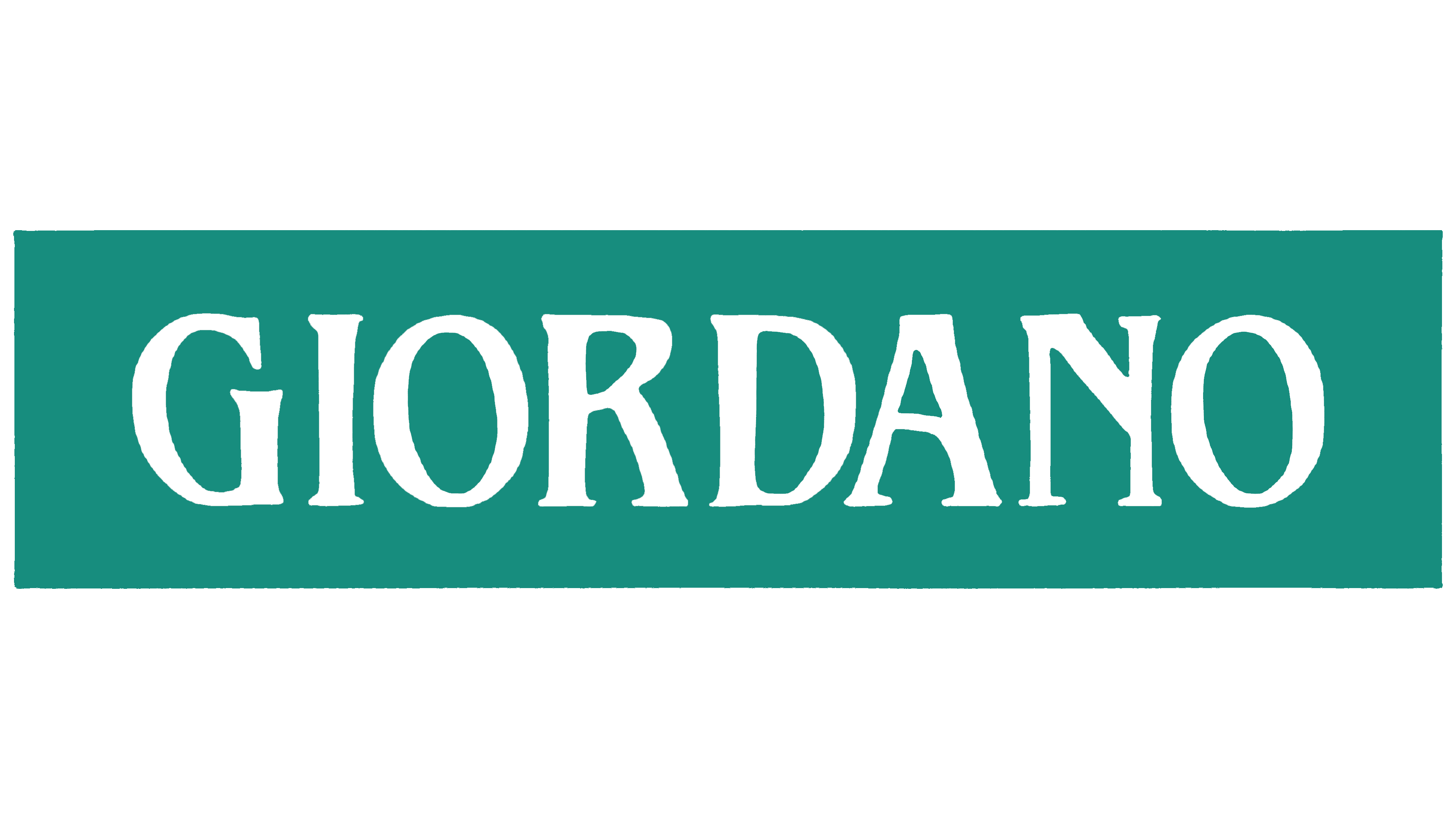
The first Giordano logo stood out for its unique color scheme and combination of colors, highlighted by an unconventional presentation. The brand emblem featured a harmonious blend of white and turquoise shades. This visual union created a sense of unity, with each color complementing and enhancing the other’s aesthetic appeal.
The logo was styled as an informational sign. The turquoise background emphasized the brand name, setting off large white letters and drawing attention to each character. One might expect the contrasting background tone to be the main focal point, yet its role was different; it served as a supporting element. The large, radiant white letters were easy to read and memorable. A significant detail was the use of a serif font, selected by the designers to highlight the brand’s uniqueness. The tall, upward-stretched letters conveyed a sense of stability and immovability, symbolizing the company’s reliability and high status.
The elegance of the text is clear, yet certain elements of freedom are evident, adding a dynamic quality to the image. In this way, the company seeks to communicate to its audience that its products are designed and stand out from the typical clothing range, emphasizing their distinctive style and uniqueness.
1997 – 2004
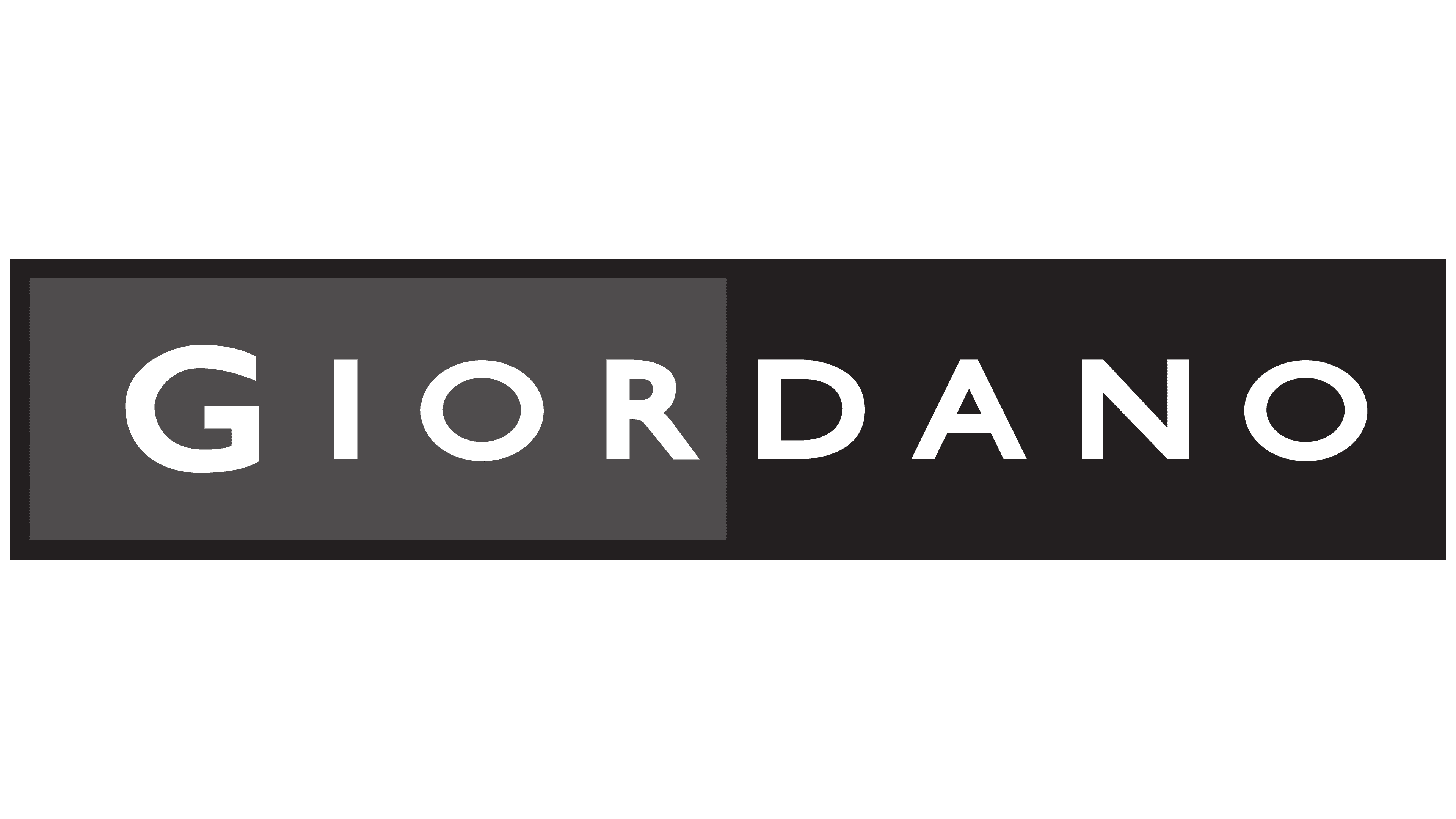
In 1997, the updated Giordano logo underwent changes that almost entirely transformed its appearance. Brightness gave way to a classic tone, and asymmetry was introduced into the identity to highlight the products’ uniqueness and distinguish them from other brands. The design used three shades, elevating the logo’s color scheme to a new, unconventional level and adding deeper meaning.
At the time, fashion houses typically used monochrome backgrounds in their brand identities, but Giordano took a different approach. The visual mark featured two backgrounds: gray and black. A black border framed both backgrounds, enhancing the overall visual effect. This frame, a rectangular outline with thick, wide edges, added a formal and polished look to the emblem.
The left part of the rectangle was filled with gray, extending to an implied vertical line through the center of the figure. The right side, by contrast, was set against a black background, nearly blending into the black border outline, creating a subtle, refined unity. The brand name was rendered in white letters, standing out in contrast on both backgrounds.
Each letter of the text appeared expressive and harmonious, emphasizing the brand’s elegance. The name looked striking on both backgrounds, underscoring the brand’s individuality and aesthetic appeal.
2004 – today
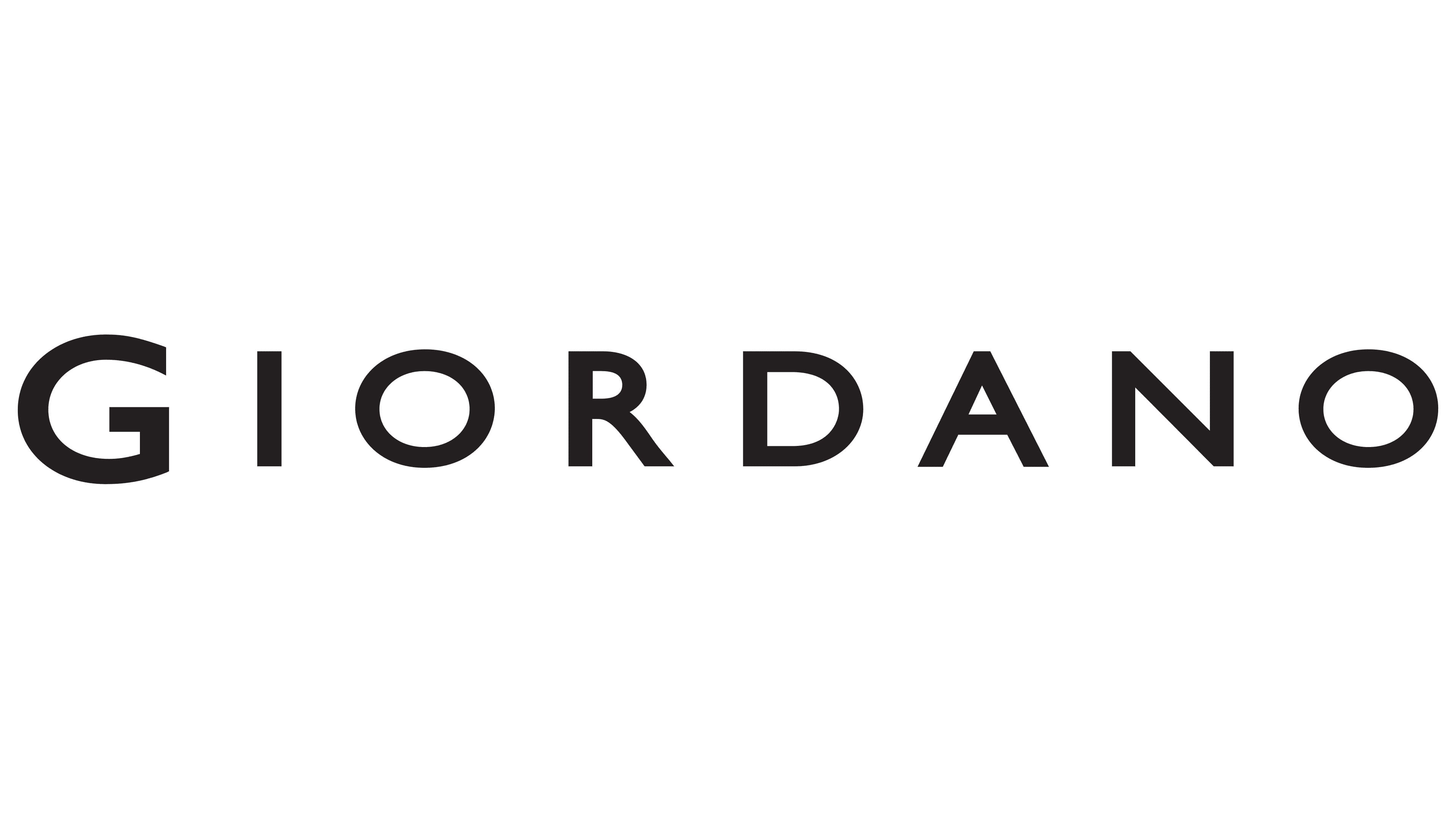
In 2004, a minimalist version of the brand identity was introduced, showcasing a simplicity not previously seen in earlier logo versions. The new design lacked bright or contrasting backgrounds, making it restrained and concise. The emblem’s base was white, creating a sense of purity and simplicity, while black served as an “attention magnet,” enhancing the overall composition. Black, associated with strength and confidence, symbolized the brand’s reliability, underscoring assurance and stability in future growth. The classic logo style highlighted the uniqueness of the products in over 40 countries worldwide.
Using bold type and straight, clear lines created a visually strong effect, appearing flawless and inspiring trust. The increased spacing between letters enhanced the readability of the name, adding a presentational effect that made the logo even more expressive and memorable.