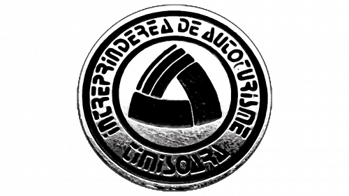
The Lastun logo combines simplicity and symbolism. The emblem reflects the key characteristics of the Romanian car from Soviet times: compactness, economy, and maneuverability. The car represents a commitment to environmental care.
Lastun: Brand overview
In the 1980s, Nicolae Ceaușescu’s government had big dreams amidst Romania’s shifting scene. This led to Lastun, a state-run automotive venture launched between 1986 and 1989 in Craiova.
The aim was to increase domestic car production to meet the nation’s needs. With its strategic location in southwestern Romania, Craiova was chosen for this ambitious project.
By 1988, manufacturing halls and office spaces had sprung up, bustling with engineers and workers, all ready to revolutionize Romanian car production.
December 1989 brought a significant change. The Romanian Revolution swept away Ceaușescu’s regime, bringing radical political and economic change to the country.
In this new democratic era, priorities shifted. The company’s grand dreams couldn’t withstand the new economic realities and political changes. The project stalled, and no cars rolled off the assembly line.
The Craiova facilities stood silent, echoing the unfulfilled aspirations of a bygone era. This story is a vivid chapter of Romania’s history, representing many ambitious projects conceived under Ceaușescu, left in the shadows of the nation’s profound post-1989 transformation.
Meaning and History
What is Lastun?
Lastun, a compact city car, was produced by the Romanian manufacturer Dacia, headquartered in Craiova, Romania. The Dacia 500 Lastun was developed by the Romanian government to meet the automotive needs of the time, focusing on affordability and fuel efficiency.
1986 – 1989
The compact company logo emphasizes the car’s economy and small size. The circular shape signifies quality. The second inner circle makes the symbol resemble a wheel, indicating the automotive industry.
The emblem features white and black edging, representing maximum fuel efficiency and minimal environmental impact.
At the center is a triangular symbol composed of three figures with curved lines, creating a soft and fluid element. These details highlight the car’s aerodynamic design and quick and easy city-driving capability.
The curved sides of the triangle resemble wings, connecting the symbol to the model’s name. “Lastun” translates to “swallow” in Romanian.
The logo’s shape suggests endless motion. The car could travel 100 km on 3.3 liters of gasoline. Three stripes dividing one side into three elements indicate a reduction in consumption by nearly three times compared to many models. For instance, the Volga consumed 10-14 liters, the Zhiguli and Moskvich about 10 liters, and the UAZ 10-12 liters.
The Romanian inscription around the logo reads Întreprinderea de Autoturisme Timișoara (Automobile Enterprise Timișoara), referring to the city where the production was based.
The logo’s color scheme is restrained, predominantly black and metallic. These shades add a touch of solidity and emphasize the car’s quality and reliability despite its small size.
Font and Colors
The circular logo features a stylized emblem in the center surrounded by text. The central emblem has three figures forming a dynamic triangular shape. These shapes are solid and bold, conveying strength and stability.
Around the emblem, the text reads: “INTREPRINDEREA DE AUTOTURISME TIMISOARA.” This text is in a bold sans-serif font with rounded edges. The letters are evenly spaced and follow the circle’s curve, creating a balanced look.
The logo uses black-and-white colors. The emblem and text are in solid black on a white background, offering a sharp contrast that improves visibility and readability. This color scheme highlights simplicity and timelessness.
The bold sans-serif font with rounded edges adds a modern touch. The spacing and curved alignment of the letters create harmony and visual appeal.


