The LAZ logo represented the best bus-manufacturing enterprise in the USSR. The emblem’s shapes reflect harmony and perfection. The manufacturer continuously expanded and adopted new technologies in its field, which is why the buses were highly ergonomic, reflected in the simplicity and brevity of the logo’s symbols.
LAZ: Brand overview
After World War II, LAZ was established in Lviv in 1945. Starting as a workshop focused on restoring war-damaged trucks and buses, these initial efforts set the stage for a significant journey in automotive manufacturing.
In 1956, LAZ launched its first mass-produced bus, the LAZ-695. This model transformed urban passenger transport across the USSR, marking a major milestone in public transport.
LAZ experienced rapid growth during the 1960s and 1970s. With models like the LAZ-697, LAZ-699, and the turbocharged LAZ-690, LAZ solidified its status as a leading bus manufacturer. These vehicles became integral to Soviet public transport and were known for their reliability and innovation.
The 1980s introduced new models, such as the LAZ-4202, LAZ-52523, and LAZ-42021, featuring advanced designs and engineering. This period focused on excellence and continual upgrades to meet market demands.
The 1990s brought challenges with the dissolution of the USSR, leading to financial difficulties. However, LAZ adapted by introducing new models like the LAZ A141 and LAZ A183, maintaining the brand’s relevance.
Entering the 2000s, LAZ introduced low-floor buses like the LAZ A292 and LAZ AX183. These buses addressed city and suburban needs, focusing on accessibility and comfort, showcasing LAZ’s commitment to innovation.
The 2010s saw technological advances with models like the LAZ A291, LAZ InterUrbanLAZ, and the eco-friendly LAZ E183. Despite financial challenges, these advancements highlighted LAZ’s dedication to progress.
Today, LAZ remains a prominent bus manufacturer in Ukraine. The company is working to modernize its production and develop new buses and commercial vehicles.
LAZ has thrived over its nearly 80-year history, impacting the automotive industry in the USSR and Ukraine. The buses from Lviv have traveled through many cities, reflecting LAZ’s lasting legacy in public transportation.
Meaning and History
What is LAZ?
LAZ, or Lviv Automobile Plant, is a Ukrainian company based in Lviv that manufactures buses and trolleybuses. The company started with the production of trucks and trailers and later shifted its focus to buses. LAZ gained recognition for its diverse range of buses, including city, intercity, and tourist models.
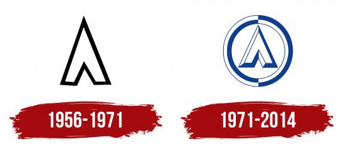
1956 – 1971
The company LAZ chose a simple and concise identity centered around the first letter “L” of the Russian and Ukrainian alphabets. This symbol, designed in white with a black outline, carries deep associations and symbolism.
In the context of the USSR, the letter “L” was associated with Lenin, adding patriotic and political significance to the logo. It was also associated with Lviv, where the company’s production facilities were located. This choice emphasized local pride and the factory’s importance to the region.
The arrow-shaped symbol indicated direction, representing progress and the company’s commitment to development and innovation in bus manufacturing. The company’s first bus, LAZ, served as a brand identifier.
Despite its brevity and simplicity, this symbol encapsulated all important concepts for the production and the company, reflecting the spirit of the times and LAZ’s ambitions in the transportation sector.
1971 – 2014
The factory received the Order of the Red Banner of Labor, one of the highest awards for an enterprise in the USSR. This recognition of the company’s achievements inspired the management to enhance the logo. The symbol gained depth, giving it a forged metal look. This effect conveyed the strength and reliability of the buses, as well as the stability and high quality of production.
A circle was added around the letter “L,” consisting of contrasting white-blue and blue-white halves. These colors echoed the design of the first buses, which used this color scheme. The two-tone and checkerboard pattern highlighted the variety of models produced by the factory.
The factory’s lineup included city, tourist, suburban, and intercity buses and truck cranes. The logo reflected this diversity, showing that the factory could meet various needs and requirements and offer various solutions for passenger transportation and construction needs.
Font and Colors
The logo features deep blue for the letter “A” and the outer circle. The outer circle has two halves: one solid blue and the other with white segments. This design gives a sense of movement and modernity. The vibrant blue symbolizes trust and reliability.
The deep blue “A” and the segmented circle show the brand’s commitment to dependability and professionalism. The segmented design adds a dynamic quality and reflects a forward-thinking approach.


