


![]()
Lazy Tan, a brand focused on achieving a natural glow without sun exposure, has introduced a fresh logo and packaging designed by Derek and Eric. The updated look reflects the brand’s relaxed approach to tanning, highlighting simplicity and confidence with a design that matches its effortless, sunless beauty vibe.
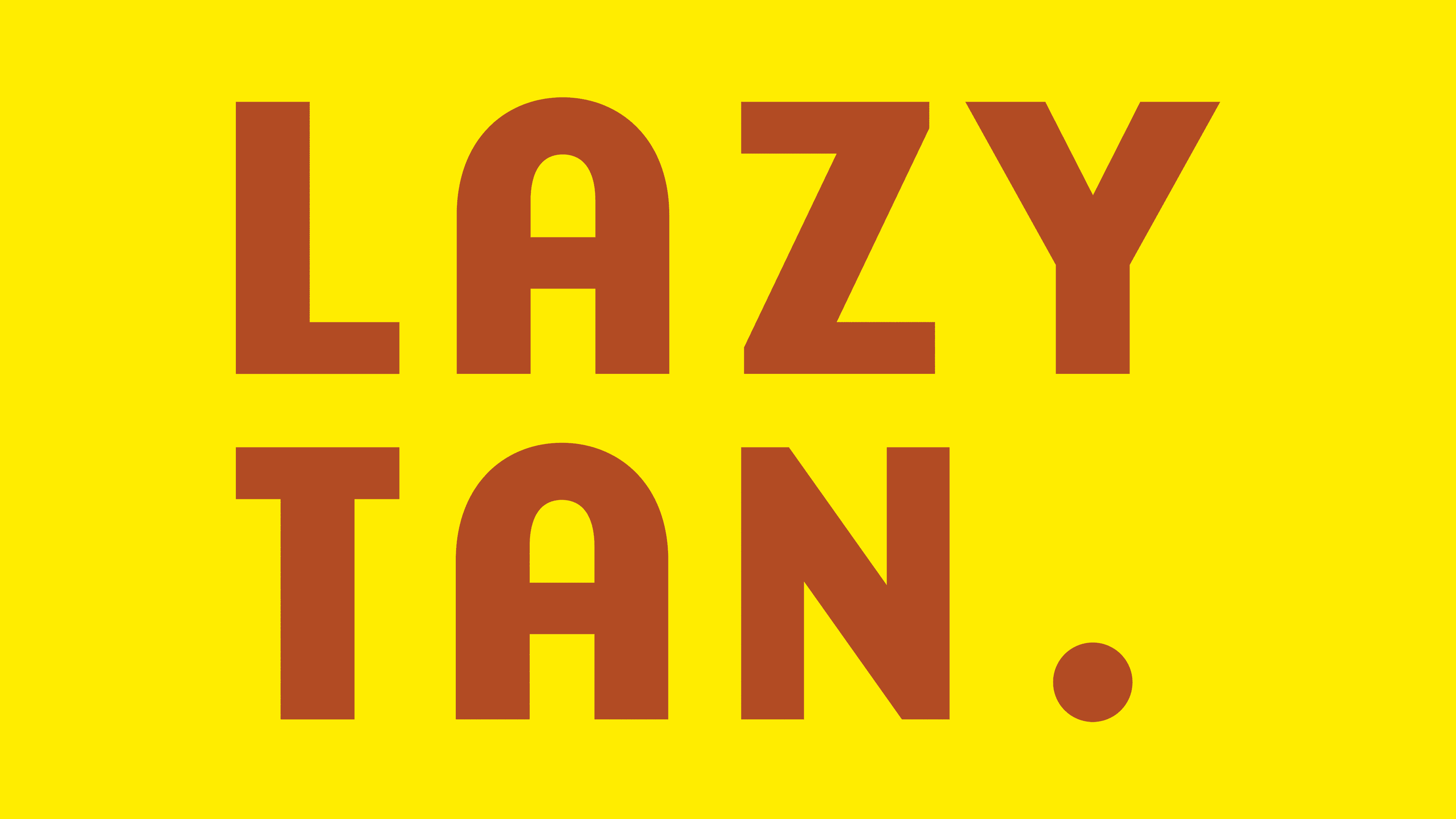
The new logo is clean and minimal, with the brand name stacked in two lines: “LAZY” on top of “TAN.” It uses Emigre’s Base 900 typeface, which gives it a bold, modern feel while still looking relaxed—perfect for the brand’s laid-back attitude. The typeface’s sharp, geometric lines create a structured look, but there’s a playful twist: the soft curve in the uppercase “A” adds a touch of personality without taking away from the sleek design. Little Curve brings a subtle retro feel while keeping things fresh and modern.
One small but impactful detail is the period after “TAN.” It’s simple but balances the logo, acting like a visual pause that complements the clean style. The text’s even spacing gives the whole logo a neat, balanced feel, reinforcing Lazy Tan’s message of simplicity and ease.

The color palette features warm, earthy tones, with terracotta as the star. The reddish-brown shade feels natural and warm, subtly hinting at that sun-kissed glow without being too bold or artificial. A soft, muted yellow adds a pop of brightness that complements the warmth of the terracotta without overpowering it. These colors reflect the brand’s natural focus and the warmth we associate with a healthy tan, even without the sun.
Lazy Tan’s “LT” monogram adds a clever design touch inspired by the brand’s tagline, “Made in the Shade.” The design features a stylized “T” that looks like it’s casting a shadow from the “L,” subtly connecting to sunless tanning. Even though it doesn’t use dark shading, the play on light and form adds depth and character to the brand’s look.
The packaging mirrors the simplicity of the logo. The self-tan spray bottle has an inverted color scheme compared to its box—the bottle shows off its natural terracotta shade, while the box features a yellow background. Contrast makes the product stand out, making the bottle a key design element. Clean layouts with plenty of white space keep the focus on the logo, giving the packaging a sleek, high-end feel.
The Base 900 font is consistent across all packaging. The bold, clean letters are used for everything from product descriptions to promotional materials, and yellow accents add a playful but polished touch.
The sharp logo, warm colors, and thoughtful packaging reflect the brand’s promise of effortless, natural-looking tans. Through its clean, confident design, Lazy Tan celebrates ease, comfort, and the confidence that comes with a sunless glow.