The commercial direction requires a simple and understandable identity for most. It is these properties that distinguish the Le Bon Coin logo. It accurately communicates to users the occupation of the Internet platform – that you can buy or sell any product here. A bright color palette attracts the attention of interested parties as much as possible.
Le Bon Coin: Brand overview
| Founded: | 28 April 2006 |
| Founder: | Schibsted |
| Headquarters: | France |
| Website: | leboncoin.fr |
Meaning and History
The site was created based on the 1996 Blocket.se platform, developed by a Swedish programmer. After seven years, the giant Schibsted bought the platform for 19 million euros and opened similar sites in other countries. The French version was called Le Bon Coin. Shibstead monetized the site in 2014 and increased the size of the platform by buying other advertising platforms (Agriaffaires, A Vendre A Louer, Videdressing, etc.). In 2019, the giant broke up, transferring control of the site to Adevinta, and in 2020, 44% of the shares were bought by eBay Classifieds Group, selling 10% in 2021 to Permira.
Since the platform’s opening, its name and logo have not changed. During operation, there were only minor font adjustments.
What is Le Bon Coin?
France’s second most popular resource specialized in placing free (for individuals) and paid (for business) ads.
The website logo is short and clear. It consists of the name written in orange lowercase rounded letters. Thanks to this choice, the emblem blends perfectly with the platform’s content. The site has a large number of a wide variety of products, both from individuals and businesses. Each of them is posted with a photo. A catchy bright-colored inscription without pictures and drawings fits perfectly into the general background.
The word Le Boncoin has several meanings: “a good corner,” “a great place,” and “a good coin” in the literary version, it can be translated as “a good deal,” “profitable sale,” “a place where you can make good money.” All options fully convey the direction of the platform’s activity – the unification of people of one territorial group to sell goods.
The benefit appears due to the similar mentality of the inhabitants of the covered area. In the same fashion, habits form the demand for used goods. People are attracted by the opportunity to get a small income from selling things that are no longer needed or at a low price when buying.
All letters of the name are written separately, except for the prefix Le. A link is drawn between “l” and “e,” as in a capital font. This separates the preposition from the rest of the word. The article Le in French indicates a proper noun, masculine. He emphasizes that the name Boncoin is known to everyone (known to everyone as Great Place). Therefore, the name of the site is also its advertisement.
Lowercase letters in the logo are a symbol of closeness to people. Using the platform is easy. Posting an ad is free. There are no rules regarding the style of presentation of information.
The absence of a capital letter indicates the insignificant role of the project administration and the concession of leadership to consumers. A site is just a place. People create the content of Le Boncoin. Visitors are responsible for setting prices, placing photos, and describing goods.
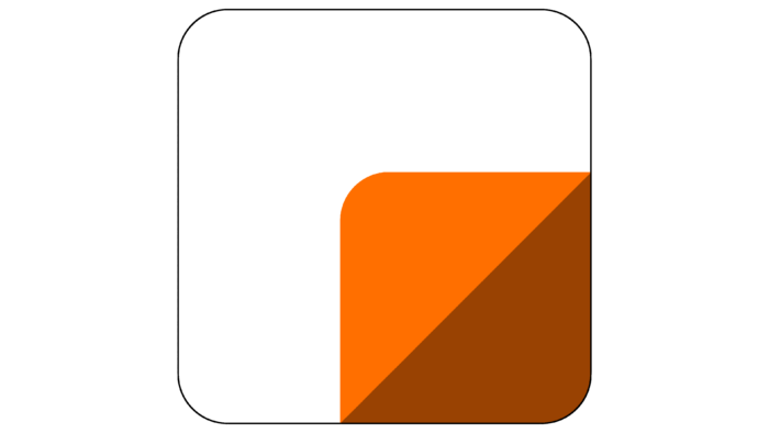
A white square is used as a favicon for the site; in the lower right corner, a brown square consists of two triangles: lighter and darker. The white figure symbolizes new things that are sold on the site. The smaller brown box shows used items that cost less than new ones. The two triangles represent the buyer and the seller. The three corners of each figure are the three sides of the transaction: the buyer, the seller, and the site.
Font and Colors
The logo is in orange. This is the best choice for platforms whose activities are based on contact with people. The color is conducive to communication, embodies friendliness, warm relations, smiles, and a good mood, and goes well with the name “Great Place.”
Even though the platform is commercial and created for sales, the choice of shade does not indicate monetary relations but emphasizes feelings. The site is popular (20 million visits per day) due to the emotions that buyers experience when they find the necessary thing at a very low price and sellers returning part of the cost of an already unnecessary thing, and at the same time helping someone.
The font is similar to Kole P Rounded Extra Bold, but with sharper b, c, and n ends.
Le Bon Coin color codes
| Orange | Hex color: | #f56b2a |
|---|---|---|
| RGB: | 245 107 42 | |
| CMYK: | 0 56 83 4 | |
| Pantone: | PMS 165 C |
