


![]() Leatherman Logo PNG
Leatherman Logo PNG
The American firm adheres to a classic design by producing folding knives and various tools. The Leatherman logo is as multi-structured as the multitools sold under this brand. But it looks abstract and opens up a wide field for imagination.
Tim Leatherman graduated from Oregon State University in 1970 with a degree in mechanical engineering. The idea for his tool came during a 1975 low-budget trip through Europe and the Middle East with his wife, Chau. Their used Fiat 600 kept breaking down, and Leatherman had only a pocketknife. He later recalled that he always needed pliers, which led him to sketch a folding tool with pliers and built-in functions.
After returning to Portland, he spent three years building prototypes and patented the design in 1980. Manufacturers rejected it for years, including knife companies, tool makers, the military, and AT&T. The first real break came in 1983, when his former classmate Steve Berliner joined him. Together, they founded Leatherman Tool Group in Portland, Oregon.
That year, Cabela’s placed its first order for 500 units and released the PST, or Pocket Survival Tool. It had 13 tools, folded to four inches, and weighed about 140 grams. Leatherman expected to sell 4,000 units in the first year, but sales reached 30,000. Through the 1980s, PST remained the key product.
The line expanded with the Mini Tool in 1986, then faced rivals such as Gerber Legendary Blades and SOG Specialty Knives in the early 1990s. In 1997, Leatherman launched Micra, and in 1998, introduced Wave at the SHOT Show. By late 2001, the company had sold more than 20 million tools, employed 450 people, and passed $100 million in annual revenue. The original PST was retired in 2004 after 21 years.
Meaning and History
![]()
Leatherman was one of the few companies that developed multitools professionally. Its early developments were already quite durable and high-quality, but the specialists did not stop there. As a result of the use of proven materials, technological experimentation, and product form, completely new multitools have emerged. They included several useful tools in different variations at once. Each of them was quite comfortable and functional.
Initially, Leatherman products had a neat, strict logo. It focused on the company’s name and its products. This confirmed the presence of a corresponding inscription in the center of the emblem and an icon resembling a tool. Later, minor changes were made to the emblem, which mostly affected the decorative badge. It has become simpler and more modern, which, in general, has significantly improved the corporate logo’s appearance.
What is Leatherman?
Leatherman is a well-known company that manufactures functional tools and multitools (products consisting of several components). The main office is located in Oregon (USA). The main production facilities are also located here. Products are high-quality, reliable, and convenient. Thanks to these features, it has become popular far beyond the country’s borders.
1983 – 2019
![]()
Leatherman was founded in 1983 by the University of Mechanical Engineering graduate Timothy S. Leatherman and his partner Steve Berliner. The main direction was the creation of high-quality tools and knives. The brand still produces these products, but with significant changes. At the time of its creation, the company received its first strict thematic logo. The name “Leatherman” was centered, and the original badge was on the side.
The decorative symbol was shaped like a multitool with pliers. The image was not chosen by chance since the product is a direct product of the company. Such a drawing not only dilutes the strict inscription but also performs an explanatory function. The main element is the name “Leatherman”. The inscription is made in the original style.
Fairly smooth, straight lines distinguish the sans serif font, with clear spacing. The selected rendition looks attractive and is also highly readable. In general, the presented elements demonstrate confidence, professionalism, and trust. This line is complemented by achromatic coloring, emphasizing prestige and honesty.
2019 – today
![]()
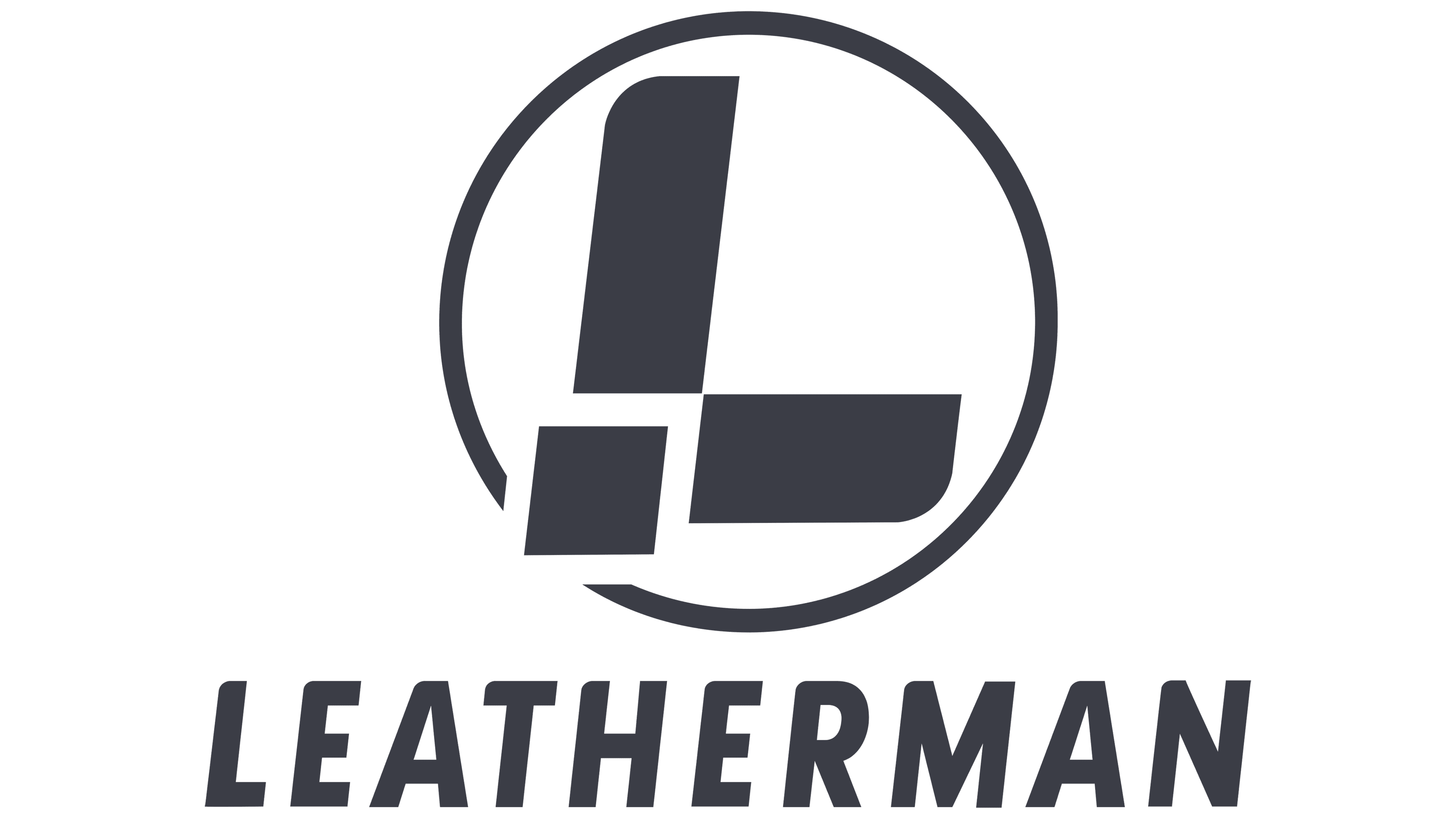
In 2019, the company had already achieved incredible success and supplied products to the international market. Leatherman decided to update the existing logo to highlight its accomplishments. In the new version, only the decorative icon has changed. Such changes signaled the company’s unchanging course while also emphasizing the introduction of innovation. The updated L-shaped symbol was enclosed in a round frame and resembled a folding knife, one of the products of a well-known manufacturer.
So the brand additionally emphasized that the direction of activity remained the same, and innovations were reflected in the use of new technologies and materials. The font of the inscription remained the same. Despite this, the format harmonized perfectly with the new element. The classic black-and-white colors favorably complemented the elegant filling. These colors perfectly conveyed the meaning of Leatherman. They symbolize reliability, high quality, professionalism, and integrity, which are the key principles of activity so far.
Font and Colors
The Leatherman badge is a carefully crafted picture, the main element of which is a word mark. It is he who conveys the company’s main message. It clearly shows straight lines of medium thickness without serifs. There are spaces between letters. This format belongs to the category of modern fonts, symbolizing innovation, improvement, and development.
In addition, the chosen style reflects simplicity, reliability, and authority. Additional brand values are also manifested through the right choice of colors. In this case, classic black-and-white colors are used. The first demonstrates strength, prestige, authority, and reliability. White color is a symbol of honesty and openness.
In addition, he emphasizes another important characteristic of the company, integrity. Leatherman has used the colors chosen since their inception. The fidelity to the chosen gamut also confirms the work’s stability. The brand has adopted a successful strategy and has put all its efforts into creating a high-quality, reliable product that has only been improved. As a result, the company has become one of the best in its field and has won over customers from all over the world.