


Lebara introduced a new logo and updated the brand’s presentation. In a category where the main argument is often low price, the company shifts the conversation from the plan to the connections among people, loved ones, countries, and everyday situations. The British operator appeared in 2001 and operates in the United Kingdom, France, Denmark, the Netherlands, and Germany. The brand has more than five million customers. Lebara sells SIM plans, pay-as-you-go plans, and mobile data packages. The name is made from the names of the three founders, Leon, Baskaran, and Ratheesan. The new image was developed by the Amsterdam studio Verve.
The relaunch was needed due to the gap between Lebara’s actual performance and its brand image. The company has a reliable network, European scale, and a price advantage. But the old identity created the feeling of a cheap operator. The previous logo, with rounded uppercase letters, looked uneven. The “E,” “B,” and “R” lost balance, and the word broke apart into separate pieces. Flat collages, stock photos, and a weak color combination reinforced the feeling of randomness.
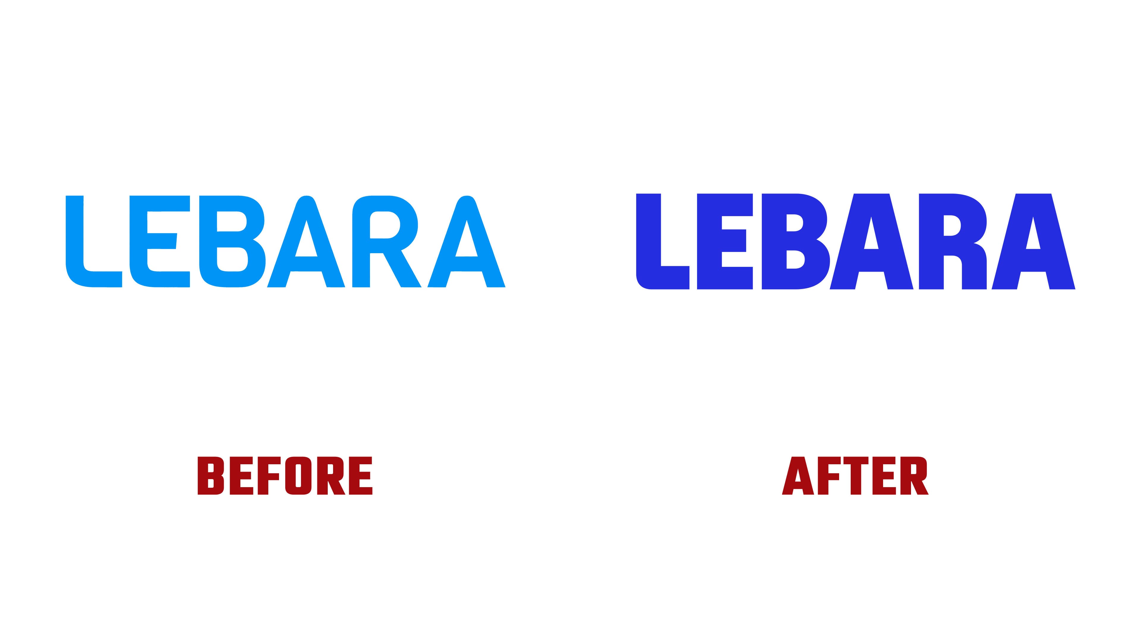
Verve moved the brand toward the theme of making a smart choice in mobile service. Lebara speaks to people who need a fair plan, control over spending, and service without overpaying for status. The new logo supports this idea through a compact and more substantial form. The proportions remained close to the old mark, but the letters became larger, sharper, and more cohesive.
The logo is based on a custom sans-serif. The mark has a thick stroke, angular geometry, and tight setting. A slight rounding in the “L” preserves a connection with the brand’s previous style. The letters sit close together, and the “AR” and “RA” pairs are built without gaps.
The Lebara Sans typeface was developed from the logo. It was created under the direction of Barbara Bigosińska and Blask Foundry. The typeface extends the mark’s form into a full character set, giving the brand its own digital tone. The letters stretch, bend, and gain volume, but the text does not fall apart. Through this device, Lebara moves away from a static telecom image and gains a more lively system.
Verve’s system works in three modes. The first suits calm messages and interface use. The second adds bending and stretching. The third uses strong deformation in advertising and emphasis formats. The logo remains the anchor of the whole system. In animation, the “L” letters work like brackets, bend, and bring the mark into the needed form.
The color system became simpler and tougher. Smart Blue holds Lebara’s base image. Think Pink provides a bright accent where the brand needs energy. The same logic is carried into the digital product. Buying an eSIM, topping up a balance, and other user scenarios look consistent with the brand’s communication.
The new identity removes the feeling of being a random budget operator. The logo makes Lebara more unified, more mature, and closer to people who choose mobile service rationally.