


![]() Led Zeppelin Logo PNG
Led Zeppelin Logo PNG
The Led Zeppelin logo showcases music that transcends the ordinary. The band’s ideas and motifs are timeless and popular across eras. The emblem displays a play of notes and transitions between high and low tones in the rock legends’ compositions.
The history of Led Zeppelin began in 1968 after the collapse of The Yardbirds. Jimmy Page sought to continue a heavier blues direction and assembled a new lineup to fulfill Scandinavian tour commitments.
On August 12, 1968, Page, John Paul Jones, Robert Plant, and John Bonham first played together in London. The group toured as New Yardbirds, then adopted the name Led Zeppelin, derived from a remark by The Who drummer Keith Moon.
In November 1968, Atlantic Records signed the band to a $200,000 deal and granted the band full creative control. The debut album was recorded in about 30 hours and released in early 1969. Led Zeppelin II followed the same year, recorded across US studios during tours.
Led Zeppelin III (1970) shifted toward acoustic and folk material. In 1971, the untitled fourth album introduced “Stairway to Heaven”. Later releases, including Houses of the Holy (1973) and Physical Graffiti (1975), expanded stylistic range. The 1973 tour surpassed The Beatles’ revenue record.
In 1974, the band launched Swan Song Records, releasing artists such as Bad Company and the Pretty Things. Activity slowed after Plant’s 1975 accident and the death of his son in 1977.
On September 25, 1980, John Bonham died at age 32. The band disbanded, stating they could not continue without him. In 1995, Led Zeppelin was inducted into the Rock and Roll Hall of Fame. A one-off reunion took place in 2007 at London’s O2 Arena with Jason Bonham on drums.
Meaning and History
![]()
The classical emblem of the musical group appeared five years after its founding, in 1973. The delay was due to the group’s renaming from New Yardbirds to Led Zeppelin. Then, the black-and-white label with stylized font began to appear on many albums and quickly gained fame. Now, the band members and their logo are represented in the Rock and Roll Hall of Fame.
What is Led Zeppelin?
Led Zeppelin is a British rock band founded in 1968 under the name New Yardbirds. Its founders were Robert Plant (vocalist), John Bonham (drummer), John Paul Jones (keyboardist), and Jimmy Page (guitarist). They laid the foundations of heavy metal and hard rock, significantly influencing the music industry.
Font and Colors
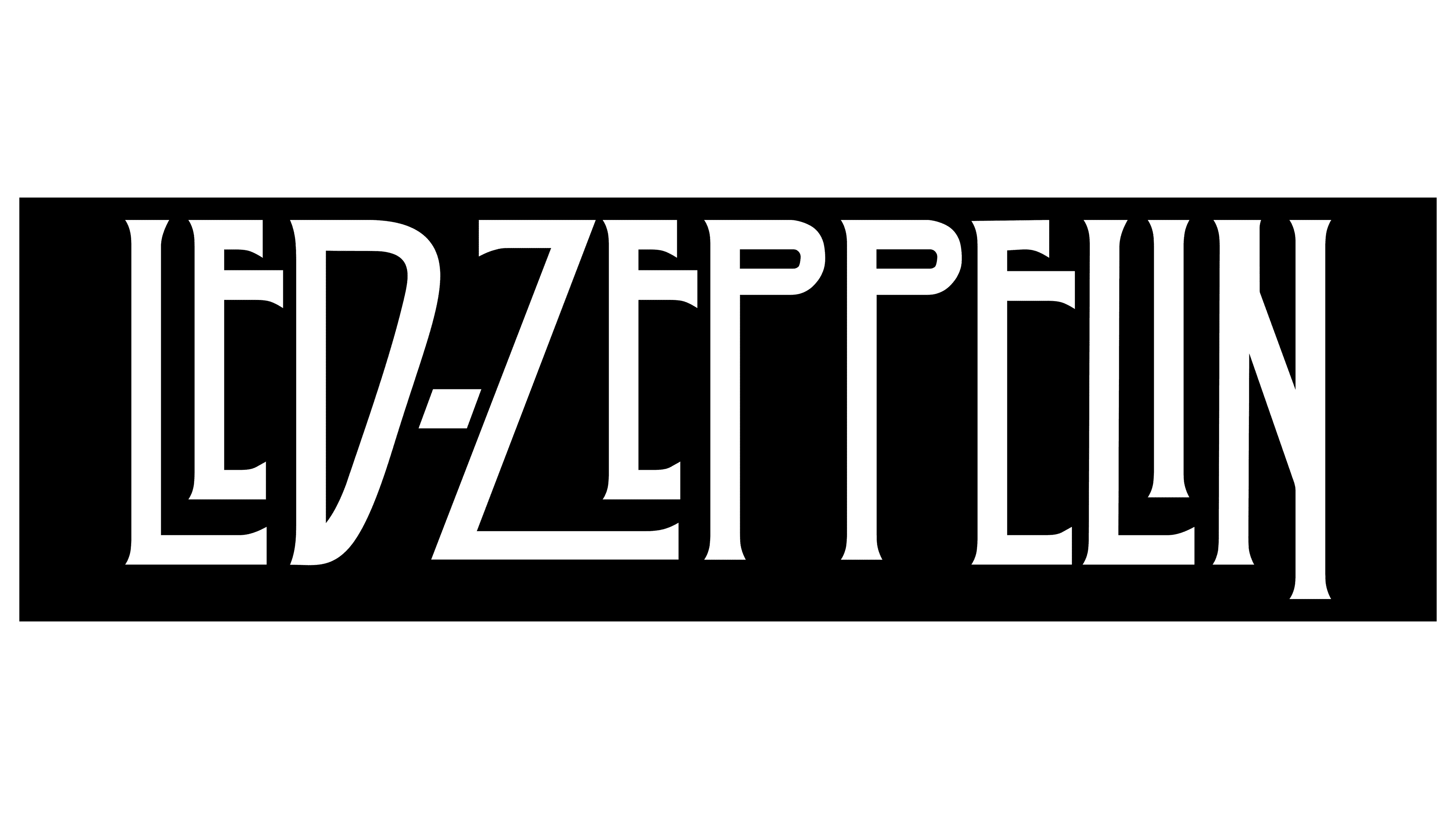
The primary visual identifier of the British rockers is the group’s artistically designed name. Thin black letters of irregular shape are placed on a white background. In style, they are close to mystical signs carved into stone and runes. Symbols of different sizes are compactly combined, and a hyphen is placed between the words “Led” and “Zeppelin” to prevent them from merging.
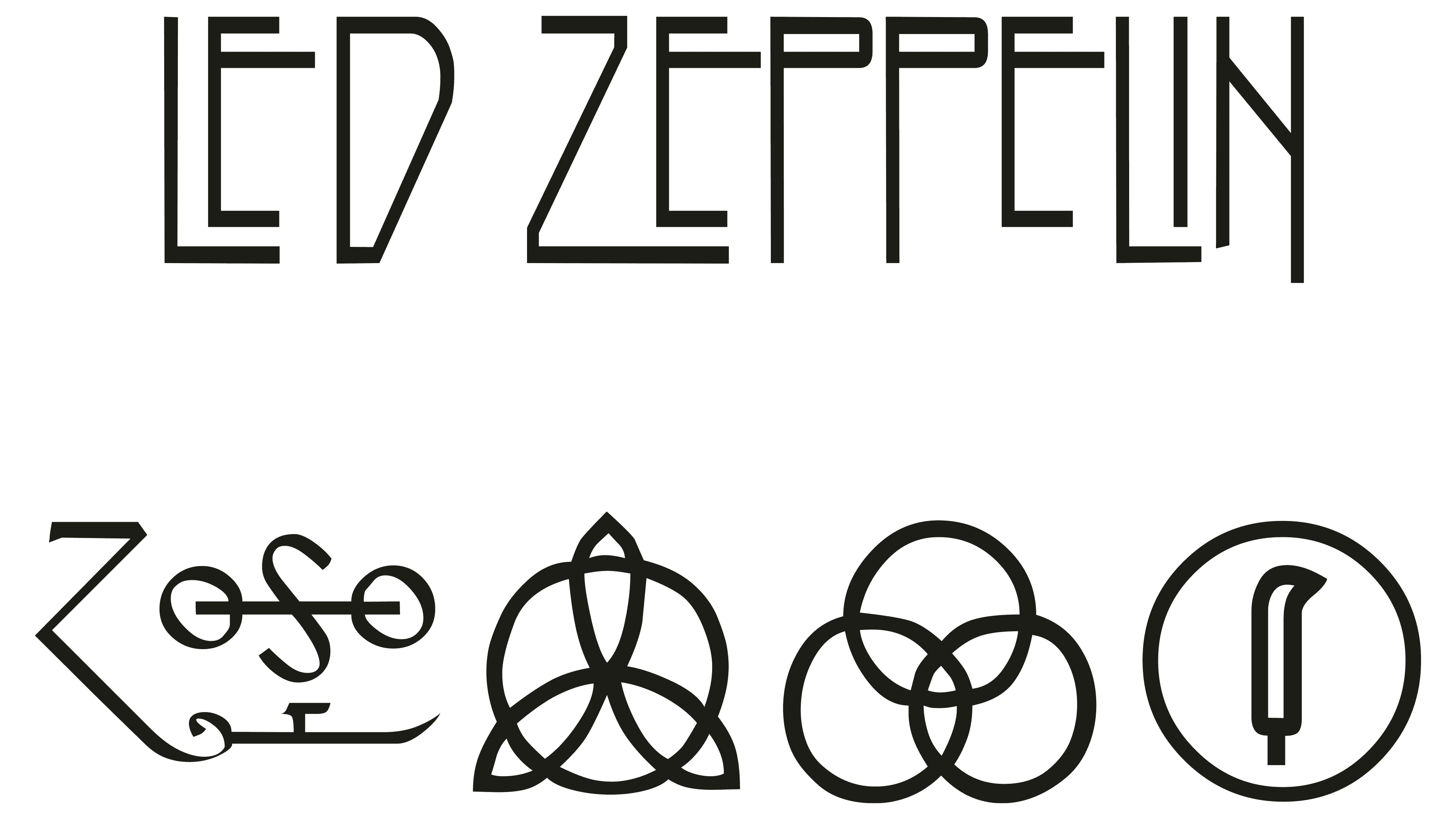
There are also individual logos for each group member. These are small signs in the form of a combination of various geometric shapes and other elements in a free interpretation. John Paul Jones and John Bonham took theirs from Rudolf Koch’s “Book of Signs.” Robert Plant developed his emblem himself, drawing inspiration from the supposed Mu civilization. Page never explained his personal sign, although he created it himself. All four versions adorned the cover of the fourth studio album.
Throughout its long existence, Led Zeppelin had many elements of visual identity. One of them is Icarus. It appeared in 1974 on the Swan Song Record Label. The design was based on William Rimmer’s work. This symbol is considered the most iconic.
The British musicians’ logo has been individual from the beginning. All letters have different shapes and sizes. The only thing that unites them is style. They are executed in a strict geometric design, complemented by light serifs and elongated lines. For example, the letters “E,” “Z,” and “P” are elongated, and the right part of the letter “N” is slanted downwards and extends beyond the general boundary. In addition, the musicians sought to ensure that no two identical symbols appeared in their emblem.
As for color, it’s much simpler: for the logo, the rock band chose a classic black-and-white contrast. At the same time, their album covers feature a rich palette.