


![]() Lee Kennedy Logo PNG
Lee Kennedy Logo PNG
The Lee Kennedy logo represents design and construction. It shows a precise, unmistakable connection between structures, allowing you to create harmonious structures that please the eye.
Lee Kennedy Company grew out of Lee Kennedy Sr.’s years in the U.S. Marine Corps and on construction sites. After his honorable discharge, he worked as a union laborer, crane operator, and steel erector. That field experience shaped his business idea: a contractor that relied on its own skilled staff instead of passing most work to temporary subcontracted crews.
In February 1978, Kennedy founded Lee Kennedy Company in Boston, Massachusetts. From the start, the firm focused on direct client communication and close project control, from feasibility review and technical audits to construction management and final delivery. It also built a niche in historic renovation and adaptive reuse. At the same time, larger rivals such as Gilbane Building Company and Turner Construction focused more on new builds and major public contracts.
Gene Kennedy joined the company in 1987, starting as a laborer before moving through estimating and project management. That path reinforced a family culture based on practical construction knowledge. Over time, the company expanded into education, healthcare, biotech, commercial real estate, hospitality, and retail, with work for Berklee College of Music, Wheelock College, NBCUniversal, Analog Devices, and SharkNinja.
Leadership later passed to Lee Michael Kennedy, the founder’s son, who became president and CEO. The company moved its headquarters from Boston to Quincy while continuing to serve Greater Boston and the Route 128 corridor. Recent work included the Patrick F. Cadigan Family Foundation wellness center at Boston College High School. Lee Kennedy Company also adopted BIM, laser scanning, and drone imaging for planning and jobsite control.
Meaning and History

The prestige of ordering construction work from Lee Kennedy is not just a trend among customers. It guarantees impeccable quality, high responsibility, and meticulous adherence to the allocated budget. Some of the world’s largest and best-known organizations cooperate with the company. These include NBC Sports Boston, Analog Devices, NBCUniversal, New England Cable News, and Shark Ninja. The key to it is 100 percent customer-focused.
The Door Award is proof of that. It relates to employee super-responsibility. One example was when a carpenter diligently repaired a door. Representatives of Boston Properties (the client’s firm) were surprised and asked why he was so diligent about his responsibilities. He replied that this particular door was the most important job for their company right now.
The same could be said of every one of its representatives. The fact is that the current owner and manager started at the bottom. He worked as a laborer at his father’s firm from high school onward and continued to do so during college. Lee then graduated with a degree in construction management. When he became head, he kept the original logo, so they had only one sign.
The original logo traditionally has two parts: graphic and text. It depicts several geometric shapes that symbolize many construction elements. First, the rectangle on the left resembles an iron T-beam, the foundation of any building. It is positioned vertically, suspended from a crane for transport to the desired area. The designers painted the element in Marsala to make it stand out.
Second, the part on the right resembles an arrow-shaped pointer pointing to a hidden speaker. Therefore, despite the two-dimensional image’s static nature, the illusion is created as if the picture were moving. At the same time, it is almost an exact copy of a fragment of a high-rise crane moving building materials. This fragment is completely yellow. Both parts are far apart, suggesting the work is constantly being done, developing, and always in motion.
The lettering is in uppercase, sans-serif type. The grotesque is perfectly integrated into the logo’s left side, so the text does not stand out from the overall concept. On the contrary, it looks like an extension of the logo, as the left side resembles the letter “K,” the first character in the founder’s name.
Font and Colors
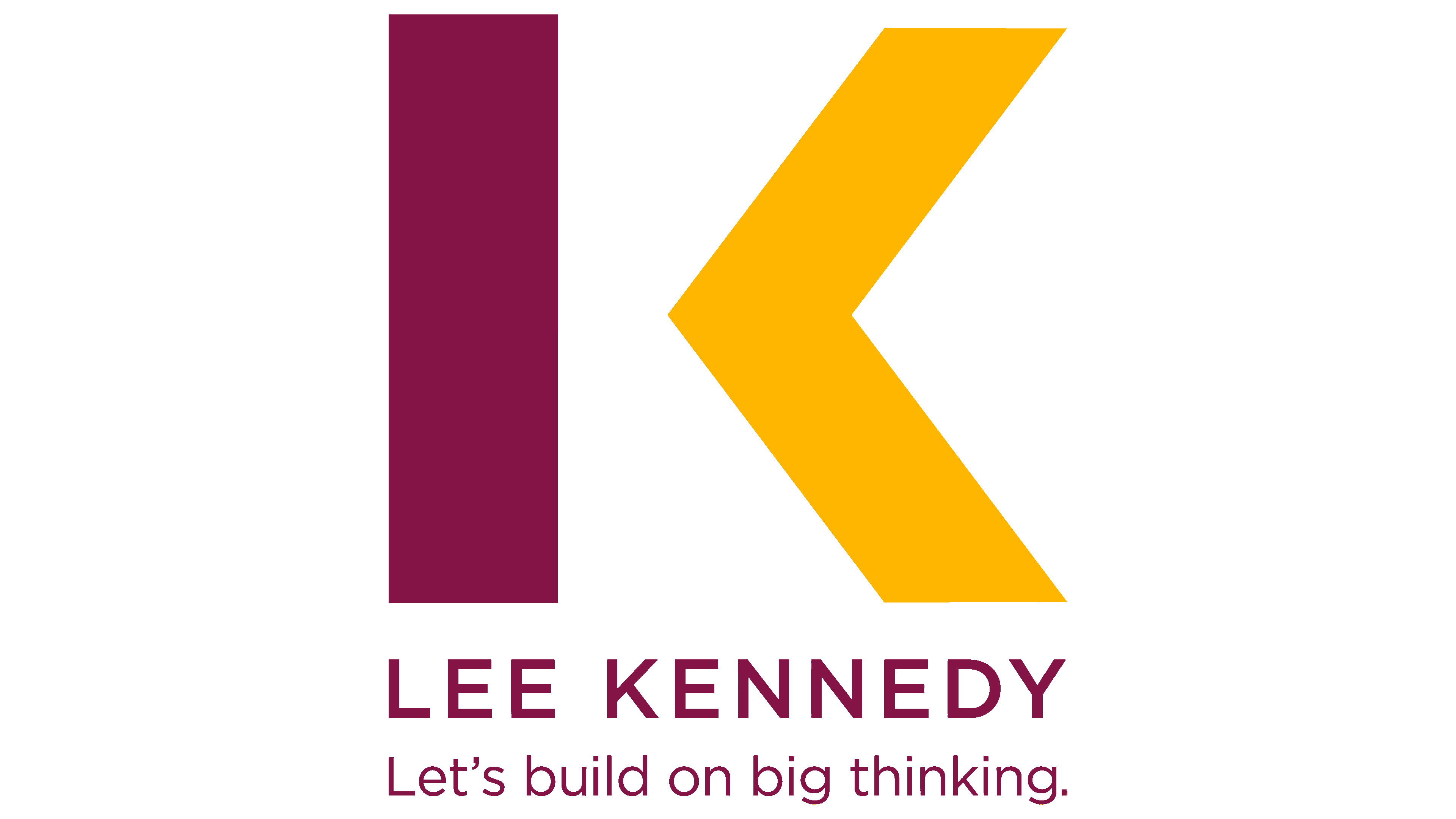
The logo’s font is geometric, strict, smooth, and flat. It has no embellishments, as it represents a construction company. The chopped symbols stand freely, not touching each other. The corporate palette includes marsala (used for the letters and the left figure) and yellow (used for the arrow).