


![]() Lenor Logo PNG
Lenor Logo PNG
Freshness and pleasant aroma come from the emblem of air conditioners. The Lenor logo says: things washed with the brand’s products become special and worthy of aristocrats. Anyone who cares about the quality of life should use the supplement.
Lenor and Downy originated from a flaw in synthetic detergents. By the late 1950s, products like Tide removed dirt effectively but left fabrics stiff, especially after tumble drying. Research teams at Procter & Gamble identified compounds that bond to fibers during rinsing, forming a thin layer that reduces friction and static. A commercial formula was ready by 1960.
Downy entered US test markets in August 1960 and expanded nationwide by December 1961. It was a concentrated liquid softener with limited competition, effectively defining the category. The application posed a practical issue. Users had to manually add the liquid during the rinse cycle. P&G worked with appliance manufacturers to integrate automatic dispensers into washing machines.
In 1963, the product entered Europe under the Lenor brand, distributed alongside Ariel and other P&G detergents. The name was localized for linguistic neutrality. A key competitor in Europe was Unilever with its Comfort brand. Both companies competed for shelf space and advertising share in the softener segment.
In 1987, P&G introduced dryer sheets under the Downy name. These released softening agents in tumble dryers and addressed users without a rinse cycle. In 2002, P&G attempted to replace Lenor with Downy in the UK. The change was reversed after consumer resistance to the Lenor name.
In 2011, Downy Unstopables scent beads launched, followed by Downy Infusions in 2012. These formats focused on fragrance enhancement while maintaining the liquid softener as the core product.
Meaning and History
![]()
Formed in 1960, the fabric softener brand is known as Downy. Lenor is a variant of the name for the markets of three regions: European, Russian, and Japanese. It is adapted to the language standards of those countries so that the word sounds soft, aligns with the concept, and does not evoke negative associations. That is, the manufacturer will prioritize identity.
Attempts to replace Lenor with Downy in the UK in 2002 were canceled immediately due to inefficiency. But in China, since 2017, aromatic laundry products have been sold only under their original names. To promote the line evenly, the owners unified the logos of both local series to ensure a common text design. Subsequently, the graphics became unified – the image of a symbolic flower formed from several arcuate strokes. There are four variants of the emblem in total.
What is Lenor?
Lenor is the alternative name for the Downy brand used in Japan, Europe, Hong Kong, Taiwan, and Russia. It is owned by the American company Procter & Gamble and was launched in 1960. The product line mainly consists of fabric softeners and dryer sheets.
1969 – 2003
![]()
The debut version has an inscription in the form of the line’s name. It is executed in wide blue letters diagonally from bottom to top. Although the text is not italicized, it is handwritten with vertically spaced characters. The inscription is coherent; each letter transitions to the next.
2003 – 2016
![]()
In 2003, a feather appeared on the emblem. It is located under the brand name and completely covers it. The new graphic also resembles a flowing stream of water, which means the conditioner makes the laundry light and soft. The inscription itself has become thinner and is made in italics.
2012 – 2016
![]()
The designers replaced the curved line, resembling a feather or water jet, with the same wavy stripe but with a different texture and color. Now it resembles a fabric cut, becoming smooth, flat, wide, and beige-brown. But this is not the only change. The inscription, which has lost its volume, has also changed. It became a two-dimensional composition of blue glyphs with an emerald border on the right. The highlights and gradient are gone.
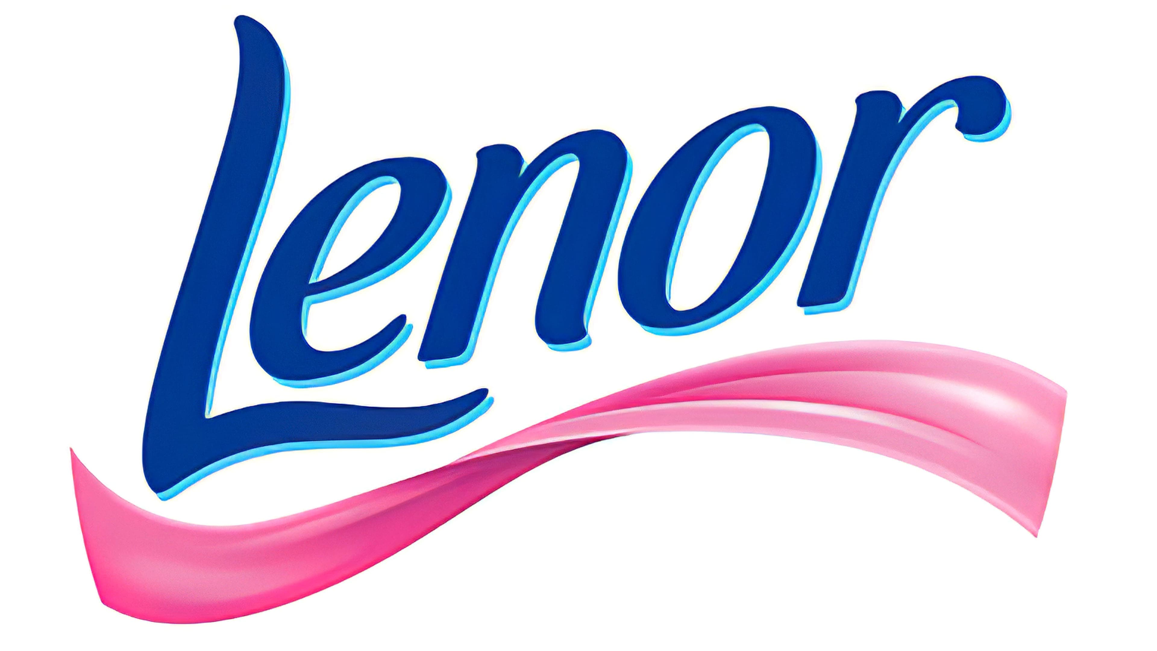
2016 – present
![]()
The modern version of the logo consists of printed symbols. The horizontal stroke of the capital “L” is lengthened and reaches “n.” The designers removed the pen and instead used a flower outline, placing it above the word “Lenor” in the center.
Font and Colors
Each version of the logo includes the same basic detail: the line name. Only the style of its writing and the presence or absence of additional elements differ. The original color is preserved everywhere, as the product is associated with water, which is key to visual brand identity.
In the first version of the logo, the typeface resembles handwriting. In the second and third, it is printed and consists of a combination of uppercase and lowercase letters. The color palette is stable: it includes only three shades of blue on a white background.