For an electronics manufacturer, the most important thing is that his logo evokes confidence and is associated with reliability. The Lenovo logo fully meets these criteria. It looks presentable despite its simple structure and minimalistic style.
Lenovo: Brand overview
| Founded: | 1 November 1984 |
| Founder: | Liu Chuanzhi, Danny Lui |
| Headquarters: | Hong Kong, China |
| Website: | lenovo.com |
Lenovo is a digital product brand owned by the Chinese company Lenovo Group Limited. It represents a huge segment of personal computers – 20% of the world market. This manufacturer also specializes in manufacturing laptops, docking stations, drives, server equipment, smartphones, smart TVs, tablets, and much more. It was founded by a team of engineers from the Chinese Academy of Sciences who founded the firm in 1984. Now she works in more than 60 countries of the world. Its international headquarters is located in the PRC’s capital, Beijing. The main office is located in Hong Kong, and the operations center is located in Morrisville, North Carolina (USA).
The key figure in the creation of Lenovo is Liu Chuanzhi. He formed a group of 10 highly skilled engineers who founded the flagship of the Chinese computer industry. The application for the institution was approved instantly – immediately on the day of submission. All eleven Computing Technology engineers from CAS became employees of the newly formed structure. Although the opening time is considered to be 1984 (then the submitted documents were signed), the organizing committee of the company arose later – in early 1985. It included engineering, clerical, technological, and administrative departments.
After a series of failures associated with the production of televisions and watches, the company switched to mastering the methods of manufacturing computers. To do this, a competition was held to recruit staff through the newspaper. As a result, in 1990, the company launched the production of PCs under its brand. Then she got lines for the production of servers, electronic boards, and smartphones.
Meaning and History
At first, a hieroglyphic inscription was used as a label to demonstrate the product’s authenticity. But after increasing demand for goods and entering the international market, the company’s management switched to the English logo.
What is Lenovo?
Lenovo is a Chinese brand of desktop PCs, laptops, and other computer equipment. It is owned by Lenovo Group Limited and was founded by Liu Chuanzhi, who led a Chinese Academy of Sciences group of engineers. The year of its appearance is 1984. The location of the head office in Hong Kong, the headquarters in Beijing, and the operational center in Morrisville (North Carolina, USA). Today, the products of this company occupy 20% of the international market.
1984 – 2003
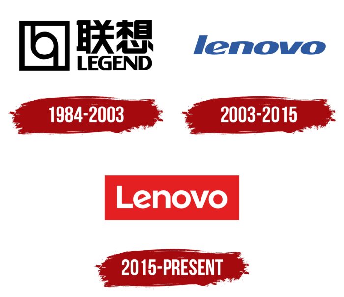
For the first 20 years, this Chinese organization was called Legend, which is reflected in its logo. The name was typed not only in English letters but also in Chinese characters. The text was split into two lines: the top was much larger than the bottom. They were aligned on both sides – both right and left. In front of them was a square, divided in two by a circular figure in the form of a “highway ring” with elongated lines that went in opposite directions. The glyphs were capitalized, with a tight connection between “E” and “N.” The main color was black.
2003 – 2015
After consolidating production and expanding the range, the company decided to enter the international market. However, she had an unforeseen obstacle – the name. In the foreign market, there were a huge number of such names in all areas of activity, and the Chinese manufacturer needed something individual and recognizable. Then, after a large-scale rebranding, the word “Lenovo” appeared in the logo. It was lowercase, italic, and single. That is, no other details were used in the emblem. Of particular interest was the letter “e,” which had a pointed connecting end. The black color was canceled – blue appeared instead.
2003 – today
In 2003, the company approved a new corporate identity, which is characterized by versatility. The text logo is simple and clear, written in sans-serif letters, and located in lower case (except “L”). The author of this emblem is the Saatchi & Saatchi studio. It has a red rectangle with a white inscription. The font of the text has been changed to Montserrat Alternates Bold: it is now straight vertical letters with a slightly rotated “e.”
Font and Colors
The evolution of Lenovo’s visual identity is as simple as the logo itself. It consists mainly of text – no graphics, except for the unique “e.” In one version, this letter has a sharp crossbar; in the other, it has a diagonal one. In addition, the company name’s color and style were actively changing. For the supply of goods to the international market, the management excluded the hieroglyphic inscription from the emblem, retaining only the English version. The company also changed its old name during the rebranding to start exporting goods. She took part of the former name as a basis: Le + novo.
The debut logo’s inscription is made in a grotesque, reminiscent of Steagal Rough Bold with a modified “N.” The modern emblem uses a typeface that is close to two types of fonts: Yorkten Demi (developer of Insigne Design) and Gilroy Bold (author of Radomir Tinkov). The difference between them and the branded version is the letter “e,” which is turned diagonally. The palette is varied and consists of black, blue, and red colors on a white background.
Lenovo color codes
| Lust | Hex color: | #e42022 |
|---|---|---|
| RGB: | 228 32 34 | |
| CMYK: | 0 86 85 11 | |
| Pantone: | PMS Bright Red C |
