


 Lifebuoy Logo PNG
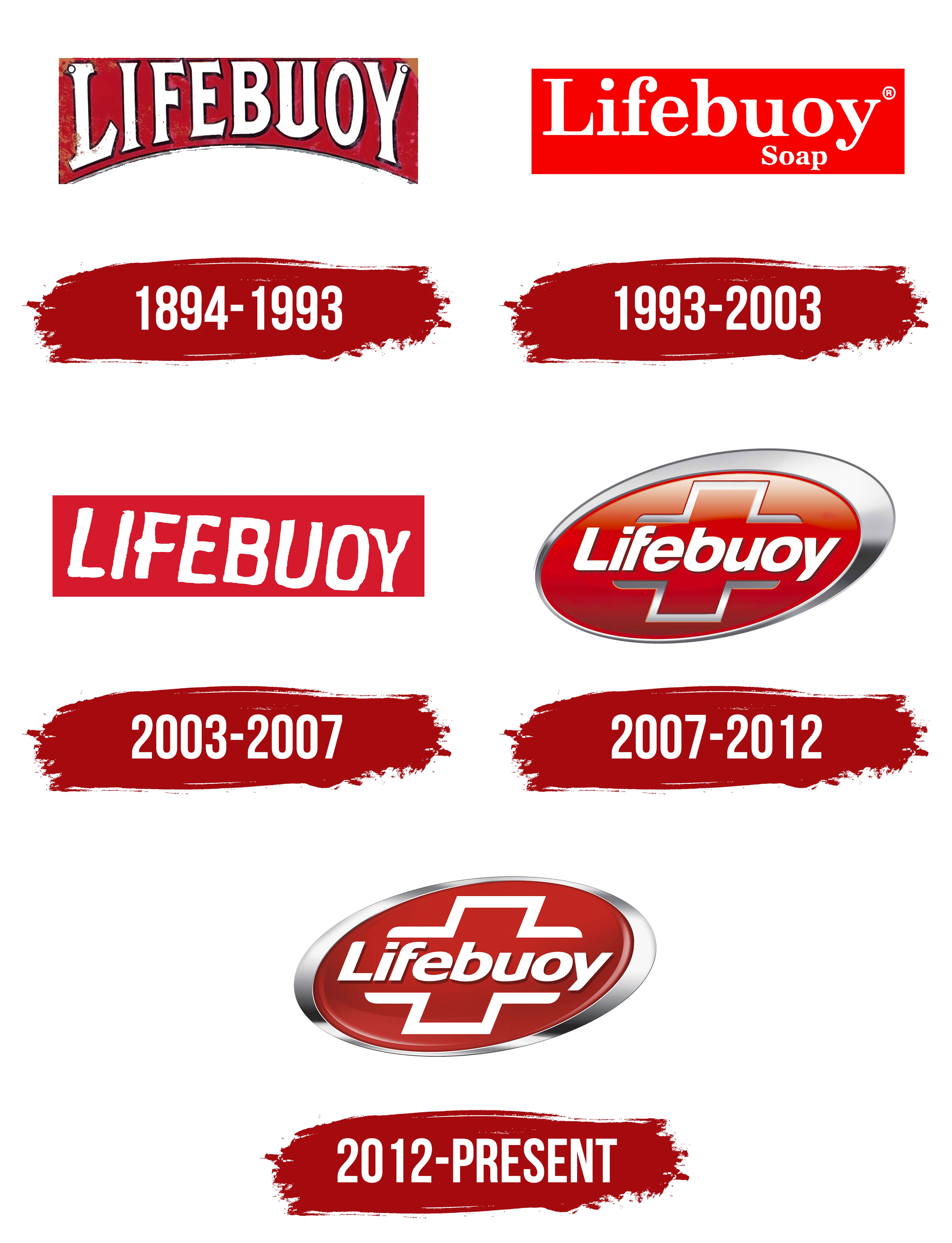
The Lifebuoy logo combines simple shapes and rich colors to evoke protection and cleanliness. Its appearance echoes traditional life-saving devices, evoking reliability and care. All elements are designed to reinforce trust in the brand.
Established in 1894 in England by the Lever Brothers (now Unilever), Lifebuoy soap pioneered the use of carbolic acid. This gave the soap strong cleaning power, a distinctive phenol aroma, and a reputation as a soap synonymous with hygiene.
As the 20th century began, Lifebuoy gained widespread popularity in multiple countries because it was affordable and promoted health and hygiene. Its marketing strategies emphasized its antibacterial properties and its ability to ward off germs.
As consumer needs and preferences evolved towards the end of the 20th century, so did Lifebuoy. It transitioned from a carbolic soap to a gentler, more skin-friendly formula. The soap’s 2002 reinvention, particularly in India, positioned it as a cost-effective, germ-fighting soap, supported by health campaigns advocating hand hygiene. This strategy resonated with rural markets and significantly boosted its popularity.
Lifebuoy operates in over 60 countries and offers a range of products, including bar soaps, liquid hand washes, body washes, and hand sanitizers. Lifebuoy is one of Unilever’s most enduring brands, still synonymous with hygiene and health, though with modern ingredients.
Despite no longer containing carbolic acid, Lifebuoy has retained its iconic red color, symbolizing its continued commitment to protection and promoting good health.
Meaning and History
What is Lifebuoy?
Since its introduction in 1894, Lifebuoy has symbolized purity, protection, and improved life through proper hygiene. Developed by the multinational corporation Unilever, Lifebuoy’s formula included carbolic soap imbued with phenol, a coal tar derivative, and was initially manufactured in the UK. Over the years, Lifebuoy has helped curb the spread of contagious illnesses and promote better personal hygiene.
1894 – 1993
1993 – 2003

2003 – 2007

2007 – 2012

2012 – today
