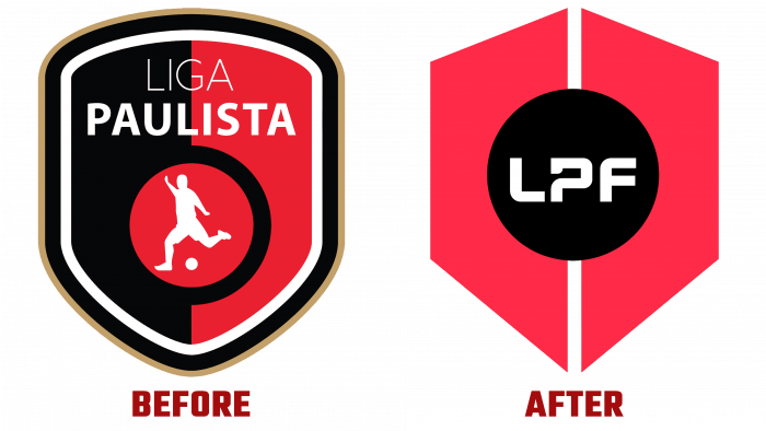
Liga Paulista de Futsal is another destination in the São Paulo (Brazil) State Football Championship. As the most important state championship, the Liga Paulista created a separate non-profit business in 2012 for the women’s and men’s futsal teams. Despite the lack of commercial interest, this direction increasingly attracted not only fans but also participants. Gradually increasing in the number of participating teams, the championship became more interesting and exciting. It was decided to meet the tenth championship in a new “guise” – by rebranding its symbols in the light of the changes that have occurred over the past period. The agency Nacione ™ Branding successfully coped with this, providing the opportunity to debut LPF in a new image already on August 4, 2021.
The new concept, Respect Futsal, required creating an emblem that would represent the pride and desire to win, characteristic of competition in all its categories. Over the years of the championship’s existence, solid leaders have been formed, many new teams have appeared, which began to confirm the existence of the viability of this sport. It became necessary to promote the championship, its participants at a professional marketing level in all districts of São Paulo with the possibility of reaching the national level. This is especially true of the female team members, whose number has increased by 400%. The development of the new logo also considered the promotion methods and their requirements for the quality of the material presented to the viewer. The use of TV streaming and digital transmission and the obligatory Internet with its social networks, Instagram, and YouTube required the conversion of the brand mark to the appropriate form.
The very idea of the new logo was inspired by the organization and leadership of similar organizations in America. A decision was made to take the model from the franchise, and a consultation was held with the members of the playing clubs. The result is a completely new Liga badge, which retains only the previous emblem’s black and red color scheme. Two vertically located non-isosceles trapezoids, forming an arrow sign to the bottom, symbolize men’s and women’s teams, their difference (separated by a small gap) and unity, as participants in sports competitions. In the center, there is a white circle with the abbreviation for the name Liga, uniting both trapezoids. The full name of the league with the indication of the year of the season is placed directly under the sign—white font on a black background. The words are located one below the other, centered.


