


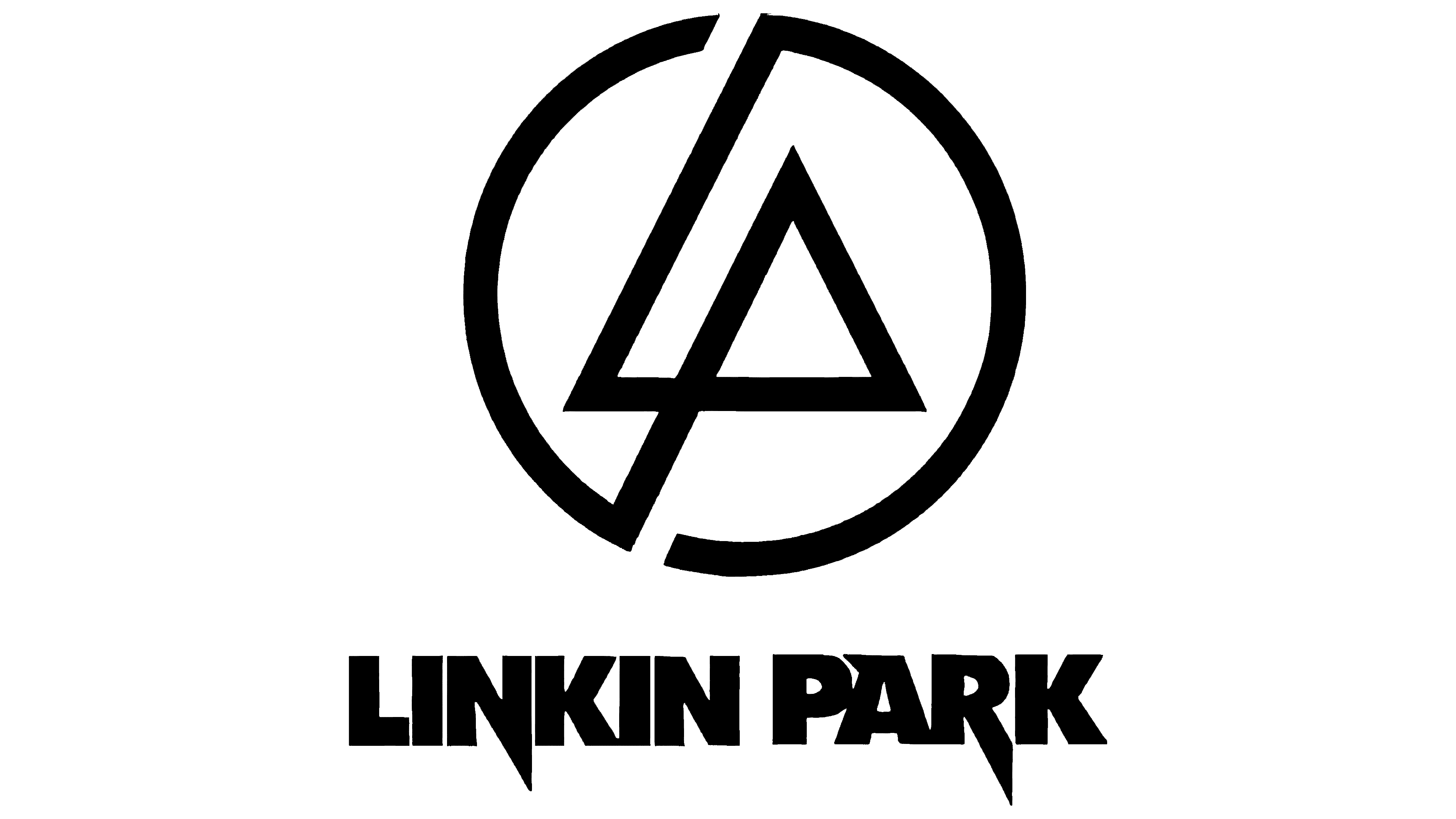
![]() Linkin Park Logo PNG
Linkin Park Logo PNG
The color scheme, sign, and text of the American rock band’s emblem symbolize its connection to the underground. Japanese motifs and graphics on the Linkin Park logo visually reflect the brand’s style and spirit, as well as its performance features.
Linkin Park formed in 1996 in Agoura Hills, California, when Mike Shinoda and Brad Delson started a band with Rob Bourdon, Joe Hahn, Dave Farrell, and Mark Wakefield. Early recordings were made in Shinoda’s bedroom under the name Xero.
In 1997, Xero released a demo and played at Whisky a Go Go alongside System of a Down. Labels rejected the project, and Wakefield left in 1998. The group searched for a new vocalist.
In March 1999, Chester Bennington joined after sending a demo. The band became Hybrid Theory and released an independent EP online. A naming conflict with Hybrid led to the final name Linkin Park. In 1999, they signed with Warner Bros. Records.
The debut album Hybrid Theory (2000), produced by Don Gilmore, emerged during the rise of nu metal with acts like Korn and Limp Bizkit. It sold 523,000 copies in its first week and later reached diamond status. “Crawling” won a Grammy in 2002.
Meteora (2003) topped the Billboard 200. In 2007, Minutes to Midnight, produced by Rick Rubin, shifted the sound toward alternative rock. Later releases included A Thousand Suns (2010), Living Things (2012), The Hunting Party (2014), and One More Light (2017).
On July 20, 2017, Bennington died at the age of 41. The band paused activity for several years. In 2024, Linkin Park returned with Emily Armstrong and Colin Brittain. The album From Zero was released on November 15, 2024.
Meaning and History
![]()
Until 2000, the rockers were known under a different name. The name Linkin Park came later and brought them more success than their first album. It all started with a four-track tape, recorded by three school friends.
What is Linkin Park?
Linkin Park is a rock band from the USA, which was formed in 1996 in Agoura Hills, California. It was founded by Mike Shinoda (vocalist, guitarist-keyboardist), Rob Bourdon (drummer), Joe Hahn (DJ), Dave Farrell (bassist), and Brad Delson (guitarist). The musicians play in genres such as heavy metal, hip-hop, pop, electronic, and several types of rock.
1997 – 1999
![]()
The first emblem is associated with the name Xero. It represents an inscription in the ancient Greek style: with curved letters that more closely resemble symbols. The “X” and “R” are half-cut off, the “O” is shown as a degree sign, and the “E” looks like an inverted number three.
1999 – 2000
2000 – 2002; 2020 – 2023
![]()
In 2000, the rock band released a landmark album, on which an early version of the modern logo first appeared. It was attended by “L” and “P” in bold sans serif. They were intricately connected to form the original symbol. The Linkin Park lettering consisted of uppercase letters and was enclosed in square brackets on both sides, from which only the corner details were visible.
2002 – 2003
![]()
The remix album Reanimation received almost the same artwork as the previous one. The differences were reinforced side brackets, a more visible title, and thinner horizontal lines and letters.
2003 – 2007; 2023 – 2024
![]()
In 2003, the American rockers released another album, Meteora, which repeated the themes of their previous album.
2007 – 2010
![]()
This period is the most important in the emblem’s history because it was then that the prototype of modern symbolism first appeared. The cover shows the band’s badge: “L” and “P” forming a circle. There is also the name Linkin Park, executed in large capital letters with pointed ends at “N,” “A,” and “R.” This design is used in the third album, Minutes to Midnight.
2010 – 2017
![]()
In 2010, a different corporate identity appeared on the cover of Thousand Suns, an elongated, strict inscription with a marked name. She is also featured on the 2014 album The Hunting Party. Until 2019, it was also used on the group’s official website.
2017 – 2020
![]()
One More Light embellishes the logo of a new format: the band’s full name, set in a free arrangement of thin sans-serif letters. This version is light, airy, and transparent, as befits the album’s name.
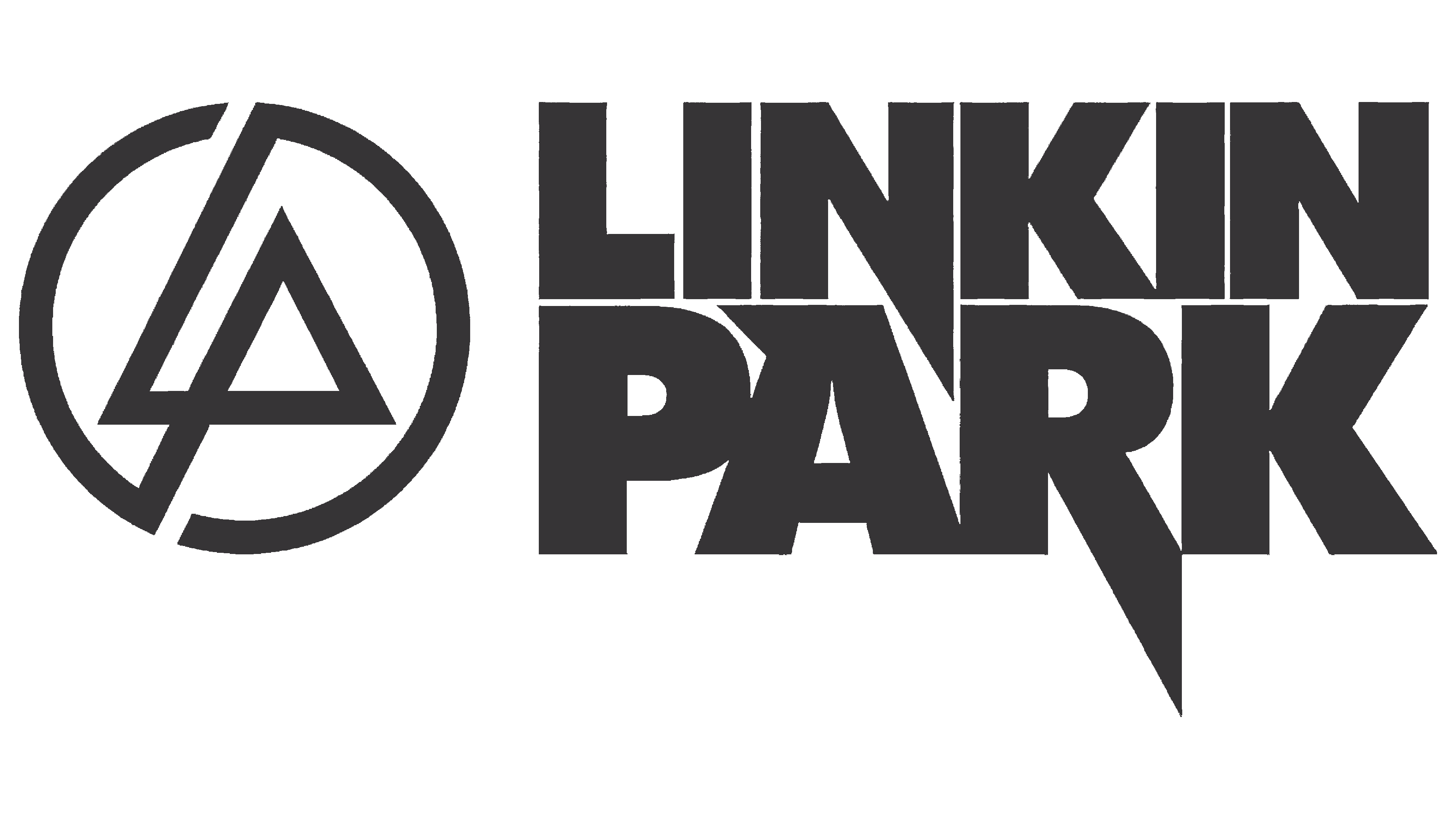
2019 – today (Website only)
![]()
2024 – today
Font and Colors
Unlike the text portion, the logo’s graphic component almost always looked the same. The rockers settled on a monogram made up of Linkin Park caps. “L” and “P” are connected in the form of triangles and zigzags with sharp corners, and their elongated legs form an open ring.
The fonts used for music album titles often resonate with the content, so the letters are sometimes hard and rigid, sometimes translucent and airy. Simple, smooth, sans-serif symbols are preferred.
The palette of emblems is monochrome, with a predominance of black and white. According to the musicians themselves, it is between these two colors that a bright spectrum is concentrated. Also, black reflects its connection to the underground.