Linksys: Brand overview
Originating in 1988 in the garage of Taiwanese immigrants Victor and Janie Tsao, Linksys has carved a niche for itself in the technology world. At first, the Tsao’s invested all of their life savings into the venture, focusing on developing solutions that allowed multiple computers to share printers. They soon found their footing, offering budget routers and other networking equipment for everyday consumers and small companies.
In the 1990s, Linksys played a crucial role in making WiFi and home networking more accessible to ordinary people. Its consumer-oriented approach propelled the company to a leading position in the home networking sector by the early 2000s, ahead of competitors such as Intel and 3Com. The company grew rapidly, employing more than 300 people and achieving annual sales of half a billion dollars.
This success did not go unnoticed, leading to its acquisition by Cisco Systems in 2003 for the equivalent of $500 million. The acquisition was mutually beneficial: Linksys was able to adopt Cisco’s advanced technologies and scale globally while maintaining its operational independence. Under Cisco’s leadership, the Linksys brand remained a significant player in consumer networking, and products such as the WRT54G router gained immense popularity.
In 2013, Cisco made the unexpected decision to sell Linksys to Belkin, but the brand retained its position as a leading provider of consumer networking solutions. As for the company’s founders, Victor and Janie Cao have moved on to become technology investors and prominent figures in philanthropy.
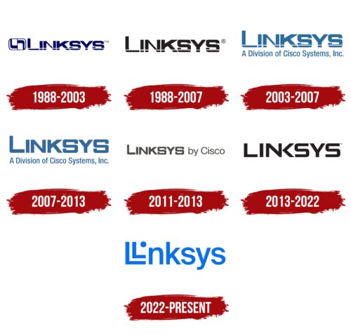
Meaning and History
1988 – 2003
1988 – 2007
2003 – 2007
2007 – 2013
2011 – 2013
2013 – 2022
2022 – today
The American brand of network equipment, Linksys, has chosen originality in its logo. It shows a double letter “L,” arranged in such a way that it resembles an arrow and a network coming from a certain source. Interestingly, the second letter in the name is absent; instead of it, there is a bold dot, as in the case of the lowercase letter “i.” This dot is the source of the improvised signal. The rest of the letters are standard lowercase, sans-serif, and classic. The emblem is colored in light blue.
The logo is like a small puzzle that makes you look twice to catch the details. The double “L” and the dot are not just random; they tell the story of the spread of network signals. The light blue color is soothing as if to let you know that the network is reliable and secure. It’s simple, but there are little twists that make it unique.
Linksys color codes
| Blue | Hex color: | #0a70ea |
|---|---|---|
| RGB: | 10 112 234 | |
| CMYK: | 96 52 0 8 | |
| Pantone: | PMS 2727 C |


