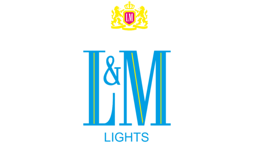
Simplicity and elegance fill the L&M logo with deep meaning. It is a symbol of the fact that the cigarette manufacturer adheres to strict quality standards. In addition, the logo shows the high status of the brand and its special position in the tobacco market.
L&M: Brand overview
| Founded: | 1885 |
| Founder: | Altria, Philip Morris International |
| Headquarters: | United States |
| Website: | lm.com |
L&M is one of the world’s most popular cigarette brands. The company is located in America, and deliveries are made to the American, Asian and European markets. The reason for large-scale deliveries is the availability of opportunities to enter the international level and the high quality of the products presented. Careful control is provided by the two largest corporations, Philip Morris International and Altria, which are the owners of the well-known brand.
Incredibly popular products have always had a laconic stylish design. On packages, at different times, one could notice a strict badge in the form of a name, designed in basic colors. The current version favorably emphasizes the best aspects of the tobacco manufacturer L&M. Strict sharp font demonstrates a competent strategy and strict adherence to established standards, and neutral, stylish colors symbolize professionalism, reliability, and authority.
Meaning and History
L&M is one of the oldest tobacco companies with an interesting long history. Initially, she produced cigarettes for local markets, and over time she was able to arrange supplies abroad. The geography was constantly expanding, which ensured the establishment of strong business relationships with clients from different parts of the world. Today, L&M is a real giant in its segment, and its products compare favorably with those of other tobacco manufacturers.
For all time, the brand has used not so many logos, which also emphasizes the stability of its activities. The older version was restrained but, at the same time, including a small bright detail. The company wanted to make a statement and make the badge memorable. After some time, L&M expanded the structure and achieved incredible success, which contributed to the change in corporate identity. It became more basic and stylish, which showed professionalism.
What is L&M?
L&M is a large American tobacco company. This is one of the first brands that released cigarettes with a non-sided filter. Currently, the company produces products with different levels of strength, which have a convenient shape and a high-quality filter. Cigarettes are supplied not only to the local market but also to Asian and European cities. The brand is owned by two corporations, Philip Morris International and Altria.
Old
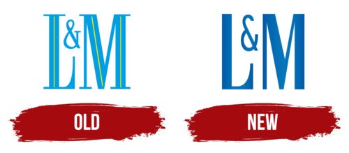
An early version of the emblem appeared around the 50s. At that time, the manufacturer Liggett & Myers (its the old name) released the first cigarettes. Up to this point, the company has been manufacturing chewing tobacco (since 1885). During this period, L&M produced goods under an attractive classic logo, diluted with a bright detail. Its basis was directly the name of the company. The letters were made in the original format.
L and M were shown in large sizes, and the frame was created with thick and thin serif lines. This design fully complied with the canons of brand design of that time. The symbol & stood out clearly from the overall picture. The sign differed in size (it was reduced) and was located in a small space between the main letters.
In this format, the main values of the tobacco brand were traced: high quality, strict standards, and attention to detail. An additional characteristic of the visual concept is coloring. The stylish emblem was painted in bright blue, and thin lines of yellow were also placed inside the two main letters. Blue showed confidence and reliability, while yellow reflected energy, perspective, and positivity.
New
After some time, the management decided to update the logo since the old version no longer reflected the whole essence of the company. As a result of the rebranding, a more perfect emblem appeared, which fully conveyed the desired message. The key element was still the brand name, but its design has changed significantly. The designers have chosen a new font and colors, but the location of the signs remains.
L and M were small neat symbol ampersands between the large expressive letters. Using the same location as the predecessor indicates respect for the manufacturer’s past. Otherwise, the logo demonstrates the desire for improvement and a progressive approach to business. This confirms the use of a softer flowing font, which belongs to the modern group, and a more stylish coloring.
Font and Colors
The visual identity of L&M is based on a clear, expressive wordmark that conveys the essence of the well-known brand’s message. The central element is a large, confident inscription consisting of originally designed letters. Two of them (L and M) are presented in the same size. They are quite large and immediately attract attention. Between them, there is a small space where & is located.
The chosen design solution is intended to emphasize the importance of the founders of Liggett & Myers, as well as their significant contribution to the further development of the manufacturer. At the same time, the font reflects the desire for innovation. This is reflected in more modern shapes, smooth curves, and the absence of the classic serifs that were typical of the early version of the logo. Another feature is the different thicknesses of the lines of the letters.
This format makes the logo more original and memorable, which is especially important for a company operating in a field with many competitors. The final touch of the visual concept is an incredibly stylish symbolic coloring. For the design of the L&M logo, two main colors were used: deep blue and basic white. The first reflects reliability, quality, and trust, and the second reflects openness and readiness to implement new solutions. In these features, all aspects of the L&M philosophy are perfectly revealed.
L&M color codes
| French Blue | Hex color: | #0175bb |
|---|---|---|
| RGB: | 1 117 187 | |
| CMYK: | 99 37 0 27 | |
| Pantone: | PMS 660 C |
| Lapis Lazuli | Hex color: | #005da9 |
|---|---|---|
| RGB: | 0 93 169 | |
| CMYK: | 100 45 0 34 | |
| Pantone: | PMS 7685 C |
