


![]() L’Occitane Logo PNG
L’Occitane Logo PNG
The emblem emphasizes the brand’s Provençal roots. Indicates a limited geographic area from which the ingredients for the company’s cosmetic products are sourced. The L’Occitane logo has style and a catchy, uniquely French charm.
In 1976, Olivier Baussan began distilling rosemary oil in Provence and selling it from a truck at local markets. The work relied on regional plants such as lavender, thyme, and verbena, with no formal funding behind the project. In 1977, together with chemist Yves Millou, he acquired an abandoned soap factory in Manosque and restarted production of traditional olive soap. The first store opened in 1977, and in 1981, a larger retail space opened in Volx, where the range expanded to include its own creams, gels, and lotions.
By the mid-1980s, the company operated several stores in France and remained a regional business. Its plain packaging and plant-based formulas stood apart from mass-market producers like L’Oréal and growing competitors such as The Body Shop.
In the early 1990s, Baussan sold a controlling stake to investors to finance expansion. In 1994, Reinold Geiger acquired a 33% stake in the company, and by 1996, he secured control. He restructured operations, brought Baussan back as creative director, and formalized the name L’Occitane en Provence, linking the brand to the historical region of Occitania.
During the 1990s, Baussan traveled to Burkina Faso and began sourcing shea butter from local cooperatives. This led to the launch of Shea Butter Hand Cream, which became the brand’s key product and supported long-term supplier partnerships.
In 1997, L’Occitane introduced Braille labeling across its packaging. In 2001, Clarins acquired a stake in the business. In 2007, Geiger increased his share, reducing Clarins’ position. In 2010, the company listed on the Hong Kong Stock Exchange, raising $708 million. In 2024, Geiger completed a buyout, returning the company to private ownership.
Meaning and History
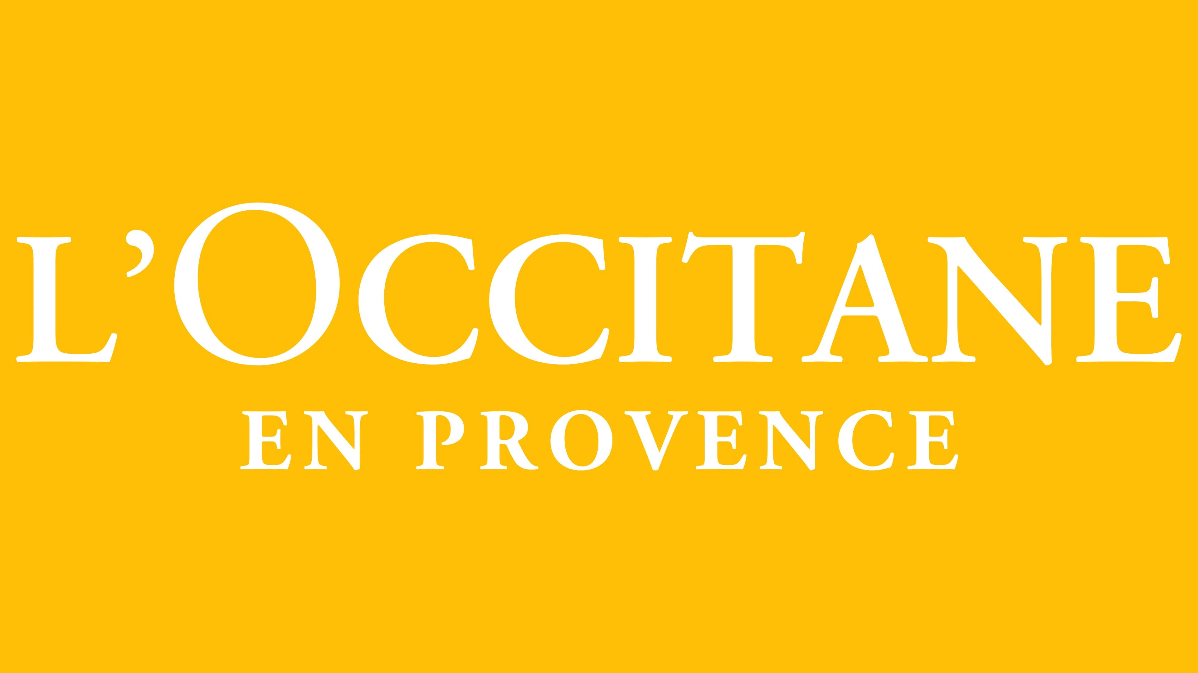
This brand’s logo is simple enough not to overload the bottle labels, yet it conveys a lot of information. It has the most important thing: a name that immediately catches the eye. Moreover, the company’s personal mark includes the full name “L’Occitane en Provence.”
The inscription is located in two lines. In the top row is the word “L’Occitane.” It is very large and takes up a lot of space. Below is the second part of the brand name – “en Provence.” It is rendered in smaller characters and centered in the logo.
What is L’Occitane?
L’Occitane is a French company that produces luxury cosmetics for face, hair, and body care. It also offers perfumes and various home products. The brand has existed since 1976, when it was founded by Olivier Baussan to preserve the diverse traditions of his native Provence. The headquarters is located in Manosque.
Font and Colors
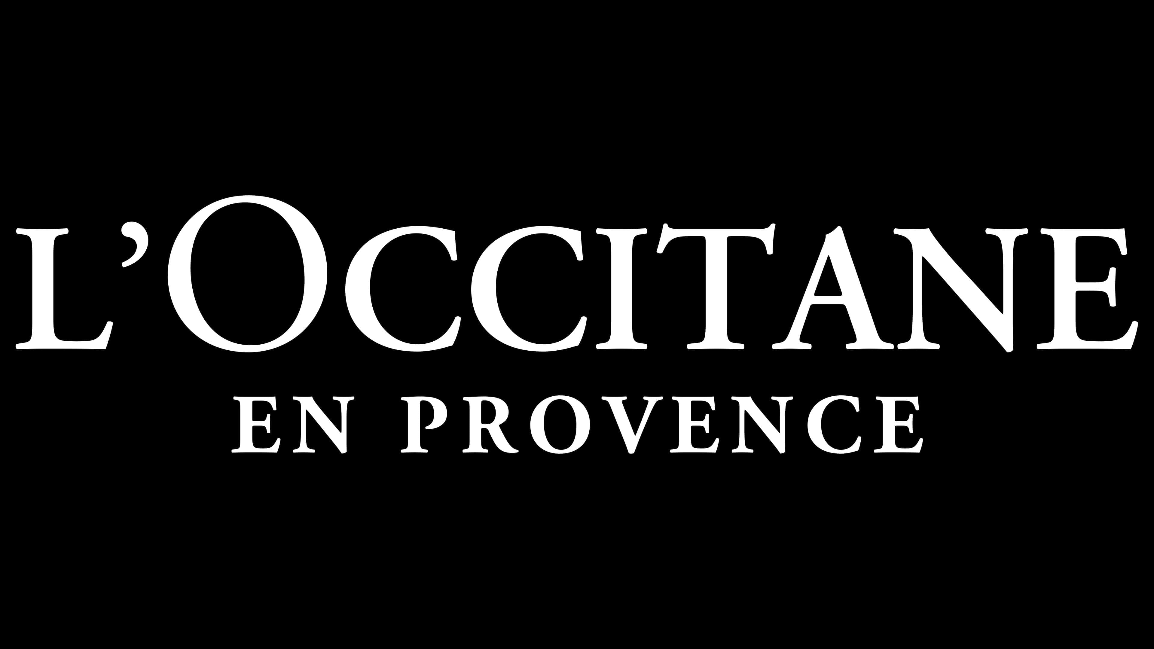
Both pieces of text are in the French Oldstyle serif typeface. It’s called Adobe Garamond SemiBold and was developed by designers Robert Slimbach and Claude Garamond. Words are in uppercase. The emblem palette is classic: white (background) and black (lettering).