


![]() Lockheed Martin Logo PNG
Lockheed Martin Logo PNG
The pursuit of the stars for the good and protection of their country is reflected in the Lockheed Martin logo. Paving the way to heaven is not easy. The emblem conveys a sense of new beginnings and innovation, helping the company maintain its leading position in this market.
Lockheed Martin was formed in 1995 through the merger of Lockheed Corporation and Martin Marietta. The new company, which brings together defense, aerospace, advanced technology, and information security operations, is headquartered in North Bethesda, Maryland.
Its roots go back to 1912. Allan and Malcolm Loughead founded an aircraft company focused on seaplanes. At the same time, Glenn L. Martin started his own aviation business the same year. During World War II, Lockheed produced aircraft such as the P-38 Lightning and Constellation. At the same time, Martin’s company became known for the B-26 Marauder bomber.
After the war, both businesses moved deeper into missiles, satellites, and space systems. In 1961, Glenn Martin’s company merged with American-Marietta, creating a major producer of rockets, satellites, and defense systems. Defense cuts in the 1990s pushed the industry toward consolidation, and talks between the two companies began in 1994. The $10 billion merger was approved in 1995, and Lockheed Martin bought Loral in 1996.
The combined company built a portfolio covering missiles, satellites, reconnaissance aircraft, patrol aircraft, and orbital systems. In 2008, it received $36 billion in government contracts. Later programs included the F-35 Lightning II, NASA’s Orion spacecraft, Mars missions, satellite launches, autonomous systems, hypersonic weapons, and cybersecurity. By 2020, revenue had passed $65 billion, and the company employed roughly 114,000 people worldwide.
Meaning and History
![]()
As of 2020, Lockheed Martin is owned by various institutional investors, including Capital Group Companies, BlackRock, Vanguard Group, State Street Corporation, and several others. These entities are the shareholders, and Lockheed Martin serves nearly twenty governmental agencies. Despite the array of stakeholders, the corporation has maintained a cohesive visual identity across its branding. This consistency in design ensures that Lockheed Martin’s emblem remains a distinctive and recognized symbol, encapsulating the company’s ethos and the breadth of its operations in the defense and aerospace sectors. The emblem serves as a visual representation of Lockheed Martin’s integral role as a production entity and its standing in the industry.
1995 – 2022
![]()
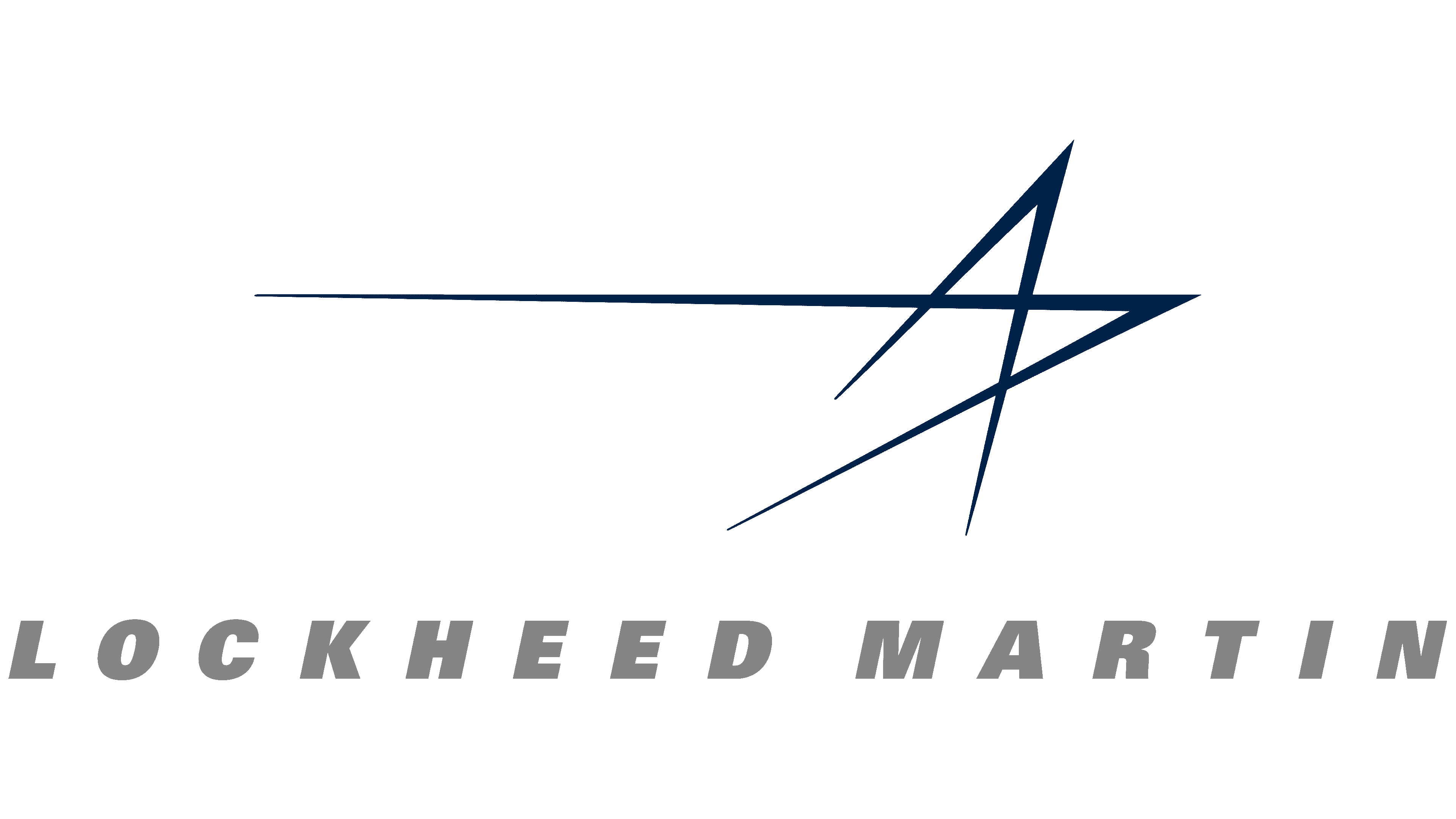
The newly formed company’s visual identity was well thought out and adopted in the same year the two strategically important firms were merged. The identity reflects the line of business and connects all four basic areas: defense, Aerospace, Innovation, and Information Security.
Each listed industry is conveyed in one of four lines, forming an unfinished star. The strokes are connected in pairs, forming sharp angles pointing upward (symbolizing space) and to the right (hinting at ground-based aircraft). The open triangles resemble a rocket launching and part of its construction, a rushing airplane, and its nose or wing.
The organization’s full name is on the left side, “Lockheed Martin.” It is written in upper-case bold type with a barely noticeable rightward slant, as if a powerful jet-star current were pulling the words. The letters are chopped, smooth, and flat. They are loosely spaced, so they stand far apart. The characters lack rounding because they mostly have angular shapes. The exceptions are the “D” and the “R,” with sloping, rounded strokes. The last word in the name is outlined with even stripes that form the star’s ribs. One line is drawn at the top; the other is drawn diagonally on the side.
2022 – today
![]()
The 2022 Lockheed Martin logo is a modern reinterpretation of the classic image while retaining the previous design’s recognizable features. It is a verbal designation of the company’s name, executed in a denser, more compact form than its predecessor. The changes in the font improve perception and readability: the letters have been brought closer together, and their size increased, making the name more expressive and significant.
The deep blue color of the logo was chosen deliberately: it is traditionally associated with professionalism, stability, and reliability qualities consistently valued in the aerospace industry and in Lockheed Martin’s operations. This is the color of the ocean depths and the boundless cosmos, symbolizing infinite possibilities and the company’s commitment to exploration.
The star-streak following the word “Martin” embodies dynamism and innovation. This element emphasizes the company’s forward-looking approach, development of cutting-edge technologies, and exploration of space. The star that extends into infinity hints at the company’s aspiration to reach the stars and its role in the defense and aerospace sectors.
With its long and rich history, Lockheed Martin demonstrates its commitment to preserving tradition with this logo while highlighting its readiness for continual development and innovation. The logo reflects the brand’s evolution in an ever-changing world and its ability to adapt while remaining at the forefront of technological progress and engineering achievements.
Font and Colors

In the latest logo design, the typeface choice remains anchored to the powerful, trust-evoking Univers ExtraBold Oblique. This font, developed by Adrian Frutiger in 1954, carries on the legacy of the 1898 Akzidenz-Grotesk, mirroring its gravitas and functional clarity. While the font’s enduring presence in the new logo design signifies continuity, subtle alterations have been made. These changes involve scaling the font size and tightening the spacing between characters, lending the logo a refreshed, modern, compact feel while preserving its authoritative essence.
In the updated design of the company’s emblem, a bolder, more robust blue hue has been adopted, leaning towards a deep navy. This choice intensifies the logo’s visual impact, reinforcing its association with the vastness of the sky and space the company is deeply involved in. The original emblem featured a lighter shade of blue, often coupled with a stark white background to evoke the ethereal qualities of the aerospace industry. The occasional use of gray for the company name provided a subdued alternative. The new darker blue amplifies the emblem’s authority and presence, reflecting Lockheed Martin’s enduring legacy and pioneering spirit in the technological forefront.
FAQ
Is Lockheed Martin a brand?
Lockheed Martin is a well-known aerospace and defense brand. It’s known for innovation, high-tech solutions, and contributing to national security. This company is behind major projects such as the Space Shuttle and the F-35 fighter jet. Its strong reputation stems from a history of reliable, advanced work.
The brand matters a lot to Lockheed Martin. It builds trust with key customers, such as government agencies, and helps the company stand out. This trust comes from consistently delivering on tough projects and pushing the technological envelope.
Lockheed Martin’s brand helps it attract skilled workers and make smart business moves. It’s not just about making things; it’s a brand known for pushing forward technology and quality in areas vital to security and progress.
Is Lockheed Martin well known?
Lockheed Martin is a global leader in defense, aerospace, and technology. It is known for its groundbreaking work in these areas and for leading numerous important, complex projects.
The company has worked closely with the U.S. Department of Energy and NASA, putting it at the heart of many key space missions and projects. For example, it has helped build spacecraft and satellites essential for exploring space and studying Earth.
Lockheed Martin was formed in 1995 when Lockheed Corporation and Martin Marietta Corporation merged. Both were already big names in defense, and their union made Lockheed Martin a major player in aeronautics, space, information security, and cutting-edge technologies.
Lockheed Martin is often in the news and is linked to discussions on defense, technology, and international security. This attention helps make it well-known.
The company’s work goes beyond military stuff. It’s also about advancing science and technology, such as developing stealth technology and exploring Mars. These efforts affect national defense and our understanding of the universe.
What types of products does Lockheed Martin make?
Lockheed Martin is a big name in defense, aerospace, and technology. It started in 1995 when Lockheed Corporation and Martin Marietta Corporation, two big defense contractors, merged. This company is known for its work with government agencies such as the U.S. Department of Energy and NASA, making it well-known not just within its industry but also to the general public.
Lockheed Martin makes many land, sea, air, and space products. Here’s a quick look at some of their main products:
- Sikorsky BLACK HAWK® Helicopters: The military uses these helicopters for various missions, and the civilian sector uses them for firefighting and search-and-rescue operations.
- C-130J Super Hercules: An updated version of the C-130 Hercules, mainly used for military transport. It’s known for being able to take off and land in rough conditions.
- F-16 Fighting Falcon: A highly versatile and widely used fighter jet known for its speed and agility.
- F-35 Lightning II: A state-of-the-art stealth fighter designed for multiple combat roles, including air superiority and strike missions.
- HIMARS: A mobile rocket launcher system mounted on an Army truck frame.
- JASSM: A long-range missile designed to hit high-value targets from far away, avoiding enemy air defenses.
- Javelin Weapon System: A portable anti-tank missile that can be fired and forgotten, effective against various targets.
Lockheed Martin is at the forefront of military and aerospace technology, making equipment essential for modern military forces worldwide. Their products, known for their sophistication and innovation, help maintain their status as a leading company in the defense industry.
Is Lockheed Martin still around?
Lockheed Martin is still a key player in the aerospace, defense, and security industries. The company has a broad impact, with more than 345 locations and a supply chain that reaches every U.S. state and 52 countries. Based in Bethesda, Maryland, Lockheed Martin leads with a range of products and services.
The company keeps growing and adapting, showing its products and technologies are still very much needed. Lockheed Martin makes some of the most sophisticated technologies used by the military and civilians, which is important for keeping countries safe, exploring space, and connecting the world.
Lockheed Martin’s impact extends beyond its global operations. It’s known for driving innovation, often setting the standard in aerospace and defense. The company’s work is crucial for many, including the U.S. government and international clients, making it a foundational part of its sector.
Lockheed Martin’s success is also due to its ability to navigate the challenges of shifting politics, new technologies, and the global economy. Its focus on research, skilled team, and strong partnerships ensures that Lockheed Martin stays ahead in its field for the foreseeable future.