The Loctite logo represents a progressive manufacturer of adhesives and surface treatments. The emblem projects durability, reliability, and confidence, reflecting its dynamic nature. It also embodies the brand’s commitment to developing and continuously improving its products.
Loctite: Brand overview
Loctite is an American company specializing in producing and selling adhesives. It was founded in 1956. The first product was officially presented and sold on July 26 of the same year. Every year, the popularity of the presented brand increases due to the scale of production and the quality of the final product. Today, the presented brand belongs to the German corporation Henkel. The largest company in Germany acquired the American brand in 1997; since then, it has been considered one of the main brands. Loctite products are available to customers from more than 100 countries worldwide. Adhesives and sealants are ideal for industrial applications and are also used extensively by hobby customers. They are headquartered in Düsseldorf. Over the past few years, Loctite has emphasized sustainable and environmentally friendly technologies.
Back in 1953, in a Connecticut college lab, Dr. Vernon Krieble invented the world’s first anaerobic adhesive. This groundbreaking glue changed the game by working without air, making it perfect for sealing and fastening metals tightly together.
Seeing the potential in Dr. Krieble’s creation, entrepreneur Paul Ballok bought the rights in 1956 and started the American Sealants Company. This business would later become Loctite Corporation in 1963, beginning its legacy of strong and reliable adhesives.
During the ’60s and ’70s, Loctite didn’t just stick with what it knew. It introduced new products like thread lockers and bearing fixatives, quickly becoming favorites in the automotive, aerospace, and industrial worlds. This time of big growth and innovation set it up to go global.
The 1980s marked Loctite’s leap onto the international stage, opening branches in Europe, Asia, and Latin America. They also broadened their product range to include instant glues, epoxies, and silicone sealants, meeting a wider array of needs.
In 1997, a major change occurred when Henkel, a German giant in chemicals and consumer goods, bought Loctite for $1.2 billion. This move expanded Loctite’s reach and capabilities, allowing it to break into new markets like electronics, medical devices, and green energy with custom solutions.
In the 2010s, Loctite pushed boundaries with hybrid adhesives, light-cure adhesives, and solvent-free products. Diving into digital tech like 3D printing and the Internet of Things kept leading the adhesives industry into new territories.
Today, Loctite is a top name in adhesives and sealants, with over $3 billion in sales. Their products are essential in countless fields, from cars and planes to electronics and renewable energy.
Loctite’s lasting success comes from never-stopping innovation, ensuring top quality, and excellent customer service. Always looking for new ways to improve and expand, they’ve stayed at the forefront of the adhesives market.
Joining forces with Henkel broadened Loctite’s horizons and injected more resources and global insight into their work. This partnership has propelled them to keep innovating and growing.
With rising demand for cutting-edge adhesive solutions, Loctite is set to lead the industry. With over 60 years of innovations and a reputation for quality, Loctite is ready to face future challenges and find new growth opportunities.
Meaning and History
Loctite’s visual identity sets it apart. For over 65 years, it has maintained a consistent and recognizable logo. This logo is known for its light, bright, and memorable design, making it stand out in the crowded adhesive market, where competitors often opt for more muted colors. The logo’s striking and confident appearance grabs the attention of potential customers, drawing them towards Loctite products even before they make a purchase. This distinctive branding differentiates Loctite from its rivals and plays a crucial role in attracting and retaining its target audience.
What is Loctite?
It is one of the biggest brands in the world when it comes to adhesives, superglues, epoxy, construction adhesives, and thread lockers. More than 100 million people purchase Loctite products every year. Therefore, this brand does not need additional advertising because almost everyone has heard of it.
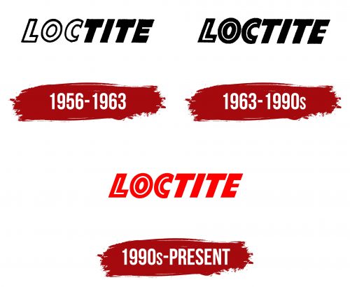
1956 – 1963
In 1956, the American Sealants Company launched its first brand with a clear and simple logo. They chose the brand name Loctite, combining the words “lock” and “tight” to reflect the product’s purpose of bonding elements securely. The name is split into “Loc” and “tite” to emphasize this function visually.
The logo features the word parts as two halves, suggesting they are meant to join together, which reflects what Loctite products do. The design uses a black outline around the white “Loc” that merges into an all-black “tite,” representing how the sealant fills cracks and gaps. This visual is intended to show the product’s ability to fill and seal effectively, underscoring the reliability and quality that the company stands by.
The size of the letters in the logo shows the company’s ambition to lead the market in sealants and adhesives, reflecting their confidence in their products and their role in the industry from the start.
1963 – 1990s
In 1963, seven years after its successful debut, the company officially adopted the Loctite brand name, already known for its reliability and innovation in sealant technology. This marked a key point in the brand’s history and ushered in a new era.
While the importance of this shift was clear, the logo saw only minor updates. The word “Loc” in the logo was given a bolder outline to visually highlight the company’s progress over the past seven years. This bolder outline represented the company’s stronger market position and ongoing industry leadership despite changing times.
The logo featured fewer white elements, a change meant to convey the company’s confidence in its products. This adjustment in the design suggested that Loctite products effectively fill and seal, addressing the common issues of cracks and gaps. The fewer white spaces in the logo reinforced the idea of thorough filling and sealing, which is core to Loctite’s purpose.
1990s – today
The logo consists solely of red wordmarks. The brand name used a classic bold sans-serif font. All letters are slightly slanted to the right, indicating the use of italics. The lines in the symbols are clear and straight, which makes the logo more neat and harmonious. The elongated capital letters look powerful and only confirm the brand’s credibility in the adhesive market. There is enough space between the characters, which makes the verbal inscription more ambitious and confident.
The logo is generally based on the principles of conciseness and minimalism. The company name is the only logo element other than the white lines in the first three letters. Due to these lines, the company tried to create a more pronounced color contrast. Moreover, they could be associated with the glue that this company produces. The combination of red and white is associated with love and passion. At the same time, white alone makes the logo look lighter and cleaner.
Font and Colors
The Loctite logo features a large, bold, and compressed sans-serif font that conveys stability and strength, ideal for a company known for the reliability and durability of its products. The font resembles styles like Point Panther Bold Oblique or Diamanti Diagonal EF Heavy but with unique customizations that make it distinctive. These adjustments enhance the logo’s visual impact, emphasizing the brand’s commitment to quality and dependability.
Although the letters are not italicized, they are slightly slanted to the right, creating a dynamic appearance while maintaining easy readability from any distance. The letter spacing is tight, yet the name remains clear.
The bright red logo symbolizes energy, passion, and action, making it highly visible and attention-grabbing. This color effectively attracts the target audience, invoking feelings of passion and a drive for innovation.
A unique feature of the logo is the first three letters, with a white interior that creates the illusion of a cut-out middle, giving the letters a subtly three-dimensional look. This design element does not compromise the logo’s overall firmness and structure.
The font and layout of the Loctite logo reinforce the company’s reputation for producing high-quality industrial adhesives and sealants. The consistent text placement throughout the brand’s history underscores its stability and conservative approach.
FAQ
What is the tagline of Loctite?
Loctite’s slogan, “Fixes Everything,” isn’t just about how well it sticks things together. It’s a fun and catchy way to show off how useful and versatile Loctite adhesives are. The slogan jokingly claims that Loctite can fix anything, even suggesting it could mend relationships within the House of Windsor, though we all know that’s stretching the truth for humor. It cleverly mixes a joke with the truth: Loctite is great for repairing broken things or gluing stuff, but it can’t solve complex issues like family problems. This slogan is memorable for consumers, highlighting Loctite’s confidence in what its products can do, all while humorously admitting there are limits.
In what country is Loctite manufactured?
Loctite is a well-known brand that makes adhesives and sealants. It’s part of Henkel KGaA, a German company that makes various products, including chemicals, detergents, and cosmetics. Henkel bought Loctite in 1997 for $1.2 billion, which helped grow their adhesives business. Thanks to Henkel’s German engineering and high-quality standards, Loctite has a strong foundation in manufacturing and innovation. This acquisition has also allowed Loctite to be used in many different areas, from electronics to beauty products, showing how versatile and globally recognized the brand is.
What is Loctite made of?
Loctite is a famous German brand known for various adhesives, sealants, and industrial chemicals. It offers many types of chemical formulas for different uses across industries. Here’s a simpler look at what they offer:
- Acrylics are strong glues that are suitable for many uses. They’re tough and can withstand high heat and chemicals.
- Anaerobic: These glues are set without air, perfect for metal parts, keeping them tight and leak-free.
- Cyanoacrylate: Also known as “super glue,” these set quickly and stick to many materials, like plastic and rubber.
- Epoxy: Made of resin and hardener, epoxy creates a strong bond and resists chemicals. It works on many surfaces.
- Hot Melt: These melt with heat and set quickly as they cool. They’re used in packaging, textiles, and putting things together.
- Silicone: Flexible and able to withstand high temperatures, silicone is good for cars, electronics, and building things.
- Urethane: These glues are strong, flexible, and can take a hit. They’re used in woodwork, cars, and manufacturing.
- UV/Light Curing: Set with UV or visible light, allowing for precise gluing. They’re used in electronics, medical devices, and glass bonding.
Loctite’s range of products allows it to stick just about anything together, from offering instant stickiness to creating waterproof seals and withstanding high heat. This makes Loctite a go-to for reliable and innovative solutions in many fields.
How do you dispose of Loctite?
When throwing away Loctite products or any chemical glues and sealants, it’s important to do it right to protect the environment and follow the law. These products might have chemicals, like bisphenol-A (epichlorohydrin) epoxy resin, that can harm the environment, so picking the right way to dispose of them is key.
Here’s what you need to know:
- Check the Rules: Look at local and national laws about eliminating hazardous materials. There are rules to ensure that chemicals don’t harm nature or people.
- Burning: Sometimes, you can burn chemicals at special places designed to handle dangerous waste safely. They have equipment to clean the smoke so it doesn’t pollute the air. But, be careful because not all Loctite products can be burned without causing other problems, like toxic smoke.
- Landfills: Another way is to bury them at a landfill that accepts hazardous waste. This needs to be done in a way that doesn’t mess up the soil or water. This is usually the option when burning isn’t right.
- Extra Info on the Label: Loctite labels might say, “Environmentally hazardous substance, liquid, n.o.s., (Bisphenol-A-(epichlorohydrin) epoxy resin) Class 9, Pkg grp III.” This means it’s a general warning for hazardous stuff. It also tells you how to deal with spills or emergencies.
- Why Molecular Weight Matters: Talking about “Bisphenol A-epichlorohydrin resin with average molecular weight < 700” helps figure out how to safely get rid of it because it’s about the chemical makeup and how it affects the environment.
The bottom line is that removing Loctite products must be done carefully. If unsure how to proceed, ask your local waste management or environmental agency. They’ll tell you what to do and might even take care of it or point you to someone who can.
