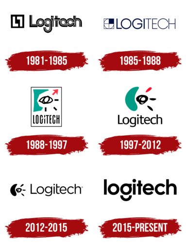
The Logitech logo is futuristic and unusual. The emblem seems to be watching the user through the peephole of the webcam. The sign promises the latest technology and friendly interface of the brand’s products. It remains to reach out and take a gadget from the future.
Logitech: Brand overview
| Founded: | 2 October 1981 |
| Founder: | Daniel Borel, Pierluigi Zappacosta, Giacomo Marini |
| Headquarters: | Lausanne, Switzerland |
| Website: | logitech.com |
Meaning and History
The company logo bears the word “Logitech.” This name was coined by Pierluigi Zappacosta and Daniel Borel, slightly modifying the French word “logiciel.”
What is Logitech?
Logitech is a Swiss-American manufacturer of software and peripheral equipment. It is a leader in supplying the international market with input devices and interfaces for various digital gadgets, from PCs to tablets. The brand was founded in 1981 by Giacomo Marini, Pierluigi Zappacosta, and Daniel Borel. It has two headquarters: in Lausanne, Switzerland, and in Newark, USA (California).
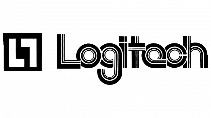
1981 – 1985
The debut logo was not as creative as the subsequent versions. But he accurately conveyed the nature of the company’s activities and was thematically related to it. Its main feature was the geometry and accuracy of the figures. For example, the inscription was made in the form of a computer cable – a wide and flat connecting cable with thin stripes. Each wire is packed in a separate track, which is why a striped logo pattern appeared. In front of the brand name was a miniature icon with two “L” letters, one of which was turned upside down.
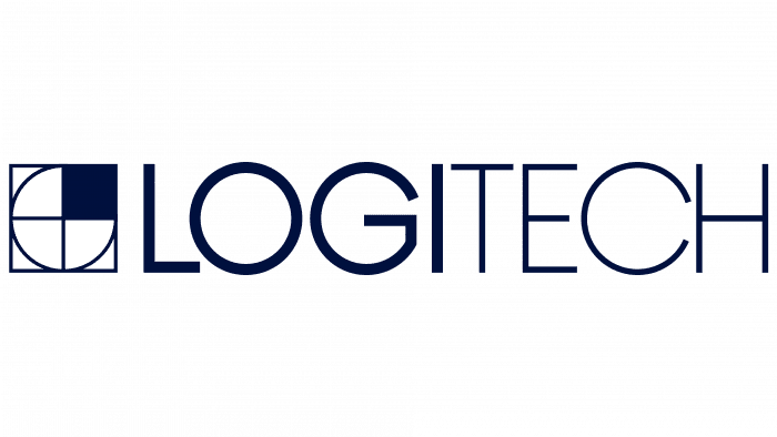
1985 – 1988
Then the designers simplified the logo. They reduced the characters’ thickness, leaving thin lines, converted the letters to upper case, and separated the name with color. The left half (LOGI) is wider and darker than the right half (TECH). In front of them, the developers placed a complex geometric figure: a square with a circle inside, divided into four equal parts. The upper right side was completely black. In general, the authors chose a classic monochrome for this logo.
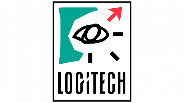
1988 – 1997
The new emblem appeared in the late 1980s. It was developed by British designer Timothy Wilkinson, who was on a frog design branding agency in Silicon Valley. The artist drew a graphic sign on a simple drawing board.
A red cursor was depicted in the corner. Timothy admitted that it was previously occupied by a “+” because he did not know what the mouse pointer looks like. On the left was a surreal face with open eyes. Below is the handwritten name of Logitech. The font was inspired by Emigré magazine.
1997 – 2012
In 1997 Wilkinson redesigned the logo. The human face has turned into a computer mouse, and the eye has become a point where two worlds are connected: the virtual and the real. The logo looks like a print of a human hand lying on a computer mouse.
2012 – 2015
This version of the logo is not new; it was used along with the emblem of 1997 but on documents. The only difference between this logo and the old one is the change of the lettering font. The font has become thinner and more refined. This inscription was located to the right of the brand symbol.
2015 – today
The company decided to change the trademark back in 2013. It entrusted the redesign to the specialists of the London-based DesignStudio. The developers have severed all ties with the old identity, making the composition clearer and more logical while removing the brand symbol. The font has become modern and a bit futuristic. Along with the full name of the brand, a shorter form of mentioning “logi” appeared.
Logitech: Interesting Facts
Logitech, established in 1981 in Apples, Switzerland, by Daniel Borel, Pierluigi Zappacosta, and Giacomo Marini, has become a leading company for computer peripherals and other digital devices.
- Swiss Roots, Worldwide Reach: Originally a Swiss company, Logitech now operates globally, with its first factory in Le Lieu, Switzerland, and branches across continents.
- First Invention: Logitech’s initial product was a digital pencil for computer drawings. However, its focus shifted to making computer mice, which became its signature product.
- Mouse Innovations: The company led in mouse technology, creating the first wireless and laser mice and, later, high-DPI sensors for better precision.
- Wide Product Range: Besides mice, Logitech makes keyboards, webcams, headsets, speakers, and gaming gear. Its products support gaming, video conferencing, music, and smart homes.
- Gaming and Esports: The Logitech G line targets gamers with top-notch peripherals. The brand supports esports and backs teams and competitions.
- Growing Through Acquisitions: Logitech has broadened its offerings by acquiring brands like Ultimate Ears (portable speakers), Jaybird (sports earbuds), and Blue Microphones.
- Award-Winning Design: The company has won many design awards, emphasizing combining functionality with appealing aesthetics to improve user experience.
- Enhancing Video Communication: Logitech has significantly contributed to video communication with its high-quality webcams, which became even more popular during the COVID-19 pandemic as remote work rose.
From a small Swiss startup to a global powerhouse, Logitech’s story is one of constant innovation and adaptation to digital trends. Its dedication to quality, sustainability, and design keeps it ahead in the fast-paced tech industry.
Font and Colors
The new logo reflects the brand’s 30-year heritage, but this time without the mouse and surreal eye. Most of the space is occupied by the word “Logitech.” The font used for the inscription is Brown Pro. It was created by the typographer Aurèle Sack. If you look closely, you can see elements of the modernist Futura typeface that Paul Renner worked on.
All characters in the word are lowercase, sans serif. The letter “g” looks unusual – like a circle (top) with an inverted semicircular line (bottom). Another abstract sign, composed of two geometric shapes, is to the right of Logitech.
Logitech color codes
| Black | Hex color: | #000000 |
|---|---|---|
| RGB: | 0 0 0 | |
| CMYK: | 0 0 0 100 | |
| Pantone: | PMS Process Black C |

