
London Sinfonietta has updated its identity with NB Studio and brand strategist Cecilia Martin. The ensemble has worked with new music since 1968, commissioning works, performing them, and helping contemporary classical music reach a wider audience.
The previous logo was built around concentric circles. The shape suggested sound waves, resonance, and a vinyl record. The connection to music came through familiar imagery, while the overall tone felt calm for an ensemble built around experimentation.

The new identity has a livelier rhythm. The name London Sinfonietta is formed from many dots. They recall musical notes, stage lights, pixels on a screen, and an audience before a concert. The word London keeps the link to the city and the ensemble’s history. Sinfonietta feels lighter and freer through dots of different sizes and densities. The logo responds to sound, changes, pulses, and forms different shapes. The mark functions as part of a concert, in which composers, musicians, and the audience are involved in a shared process.
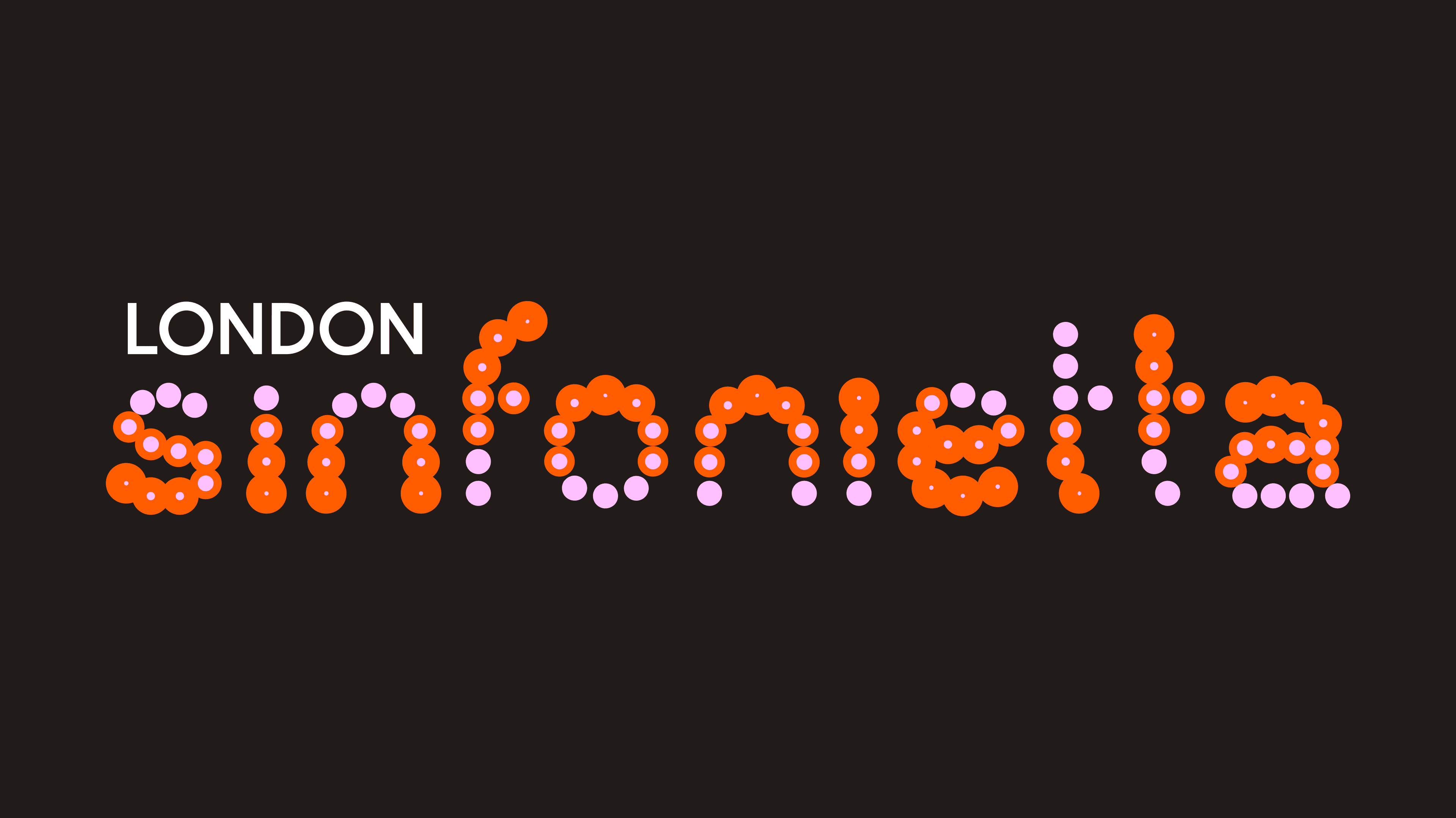
The color range strengthens the stage-like feeling. The previous black-and-white restraint has been replaced by orange, pink, and even purple dot accents. The identity has moved closer to performance, light installation, and urban culture. London Sinfonietta now looks like a living platform for new musical experiments and an open environment for the contemporary classical scene.
The system uses Digital Sans by Blaze Type. Its calm geometry supports the logo’s dotted form and gives the mark the main role. The updated image helps the ensemble communicate its mission through the stage, light, sound, and audience participation.