 Lonely Planet Logo PNG
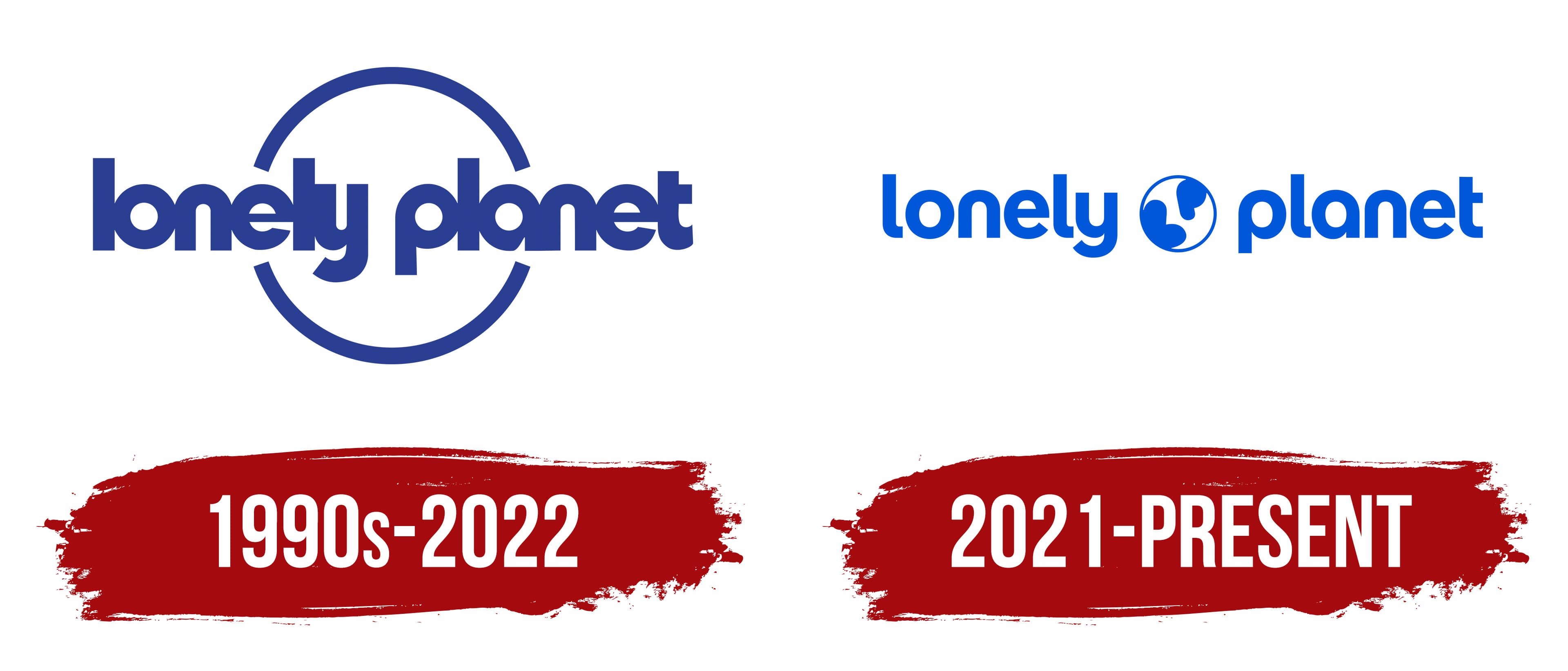
The Lonely Planet logo, refreshed in 2022, introduced a brighter shade of blue alongside white, revitalizing the emblem’s color scheme. The design composition underwent slight modification, positioning a graphical depiction of the Earth, showcasing blue landmasses set against a white sphere neatly nestled between the two segments of the wordmark. Furthermore, the typeface used for the inscription underwent a subtle transformation, characterized by a sleeker, lighter rendering of the letters and increased white space between them.
Symbolically, the emblem’s graphical element, a globe, conveys the company’s mission to serve as a comprehensive guide to the world’s most intriguing destinations. The choice of blue represents vastness and depth, symbolizing the limitless possibilities of travel. In contrast, white symbolizes purity and clarity, aligning with the brand’s commitment to providing clear, concise, and accurate travel information.
The change in typography, with a thinner design and more space between letters, is a move toward a more modern, contemporary look. This design choice signifies the brand’s adaptability, reflecting its ability to evolve with the ever-changing world of travel.
Thus, the meaning behind the emblem of Lonely Planet’s iconic travel guide company can be seen as an embodiment of its purpose: to inspire and guide travelers by providing reliable, up-to-date information about every corner of our diverse planet.
Lonely Planet began with Tony and Maureen Wheeler’s 1972 overland trip from London to Australia. They traveled through Europe, the Middle East, and Asia along the “hippie trail,” passing through Turkey, Iran, Afghanistan, Pakistan, India, and Southeast Asia. By Christmas 1972, when they reached Sydney, they had only 27 Australian cents left.
Other travelers kept asking how they had made the journey, where they had stayed, and how much it had cost. That led the Wheelers to create Across Asia on the Cheap. Maureen typed the manuscript, Tony drew maps and illustrations, and the first 1,500 copies were assembled by hand. The 94-page guide sold for 1.80 Australian dollars and sold out in ten days after a review in the Sydney Sun-Herald.
The company name came from Tony’s misheard version of “Space Captain” by Joe Cocker and Leon Russell. In 1975, Lonely Planet published South-East Asia on a Shoestring, a guide that helped define budget travel for backpackers. During the late 1970s, the Wheelers added books on Nepal, Africa, New Zealand, and Papua New Guinea, though the business still operated on tight finances.
A breakthrough came in 1981 with the India guide, one of the company’s best-selling books. In 1987, the Lonely Planet Foundation was created to direct 5% of profits to communities featured in the guides. Thorn Tree, its online travel forum, launched in 1996. By the mid-2000s, Lonely Planet published about 500 titles and competed with Fodor’s Travel and Rough Guides. BBC Worldwide bought most of the company in 2007, took full control in 2011, sold it to NC2 Media in 2013, and Red Ventures acquired it in 2020.
Meaning and History
Lonely Planet’s brand identity is defined by its commitment to authentic travel experiences. Its guidebooks aren’t merely collections of popular tourist spots; they provide a deep dive into the culture, traditions, and offbeat paths of each destination. This authenticity, complemented by first-hand experiences and thorough research, is the cornerstone of the brand’s identity.
Another critical component of the brand’s identity is its inclusivity, which manifests in its broad range of guides. Whether it’s catering to the luxury traveler, the budget backpacker, the adventurous explorer, or the culinary tourist, it strives to cover every travel style. This approach of offering something for everyone amplifies its appeal to a diverse global readership.
At its core, the brand communicates a sense of adventure and discovery, inspiring readers to venture beyond their comfort zones. The imagery used in its promotional activities, from book covers to social media campaigns, encapsulates this spirit. By encapsulating the magic and allure of travel, Lonely Planet’s branding compels readers to embark on their own journeys, solidifying its status as a trusted companion for globetrotters.
What is Lonely Planet?
Lonely Planet, founded in 1973 by Tony and Maureen Wheeler, is one of the world’s most successful travel publishing companies. It is headquartered in Fort Mill, South Carolina, United States. Lonely Planet provides comprehensive travel guides that cover a multitude of destinations across the globe. These guides include information about sights, accommodations, restaurants, and travel tips, and they have become essential resources for travelers seeking independent, reliable travel advice. The company also produces phrase books, children’s titles, and a range of digital content, including apps, ebooks, and an active online community for travelers.
1990s – 2022

2021 – today