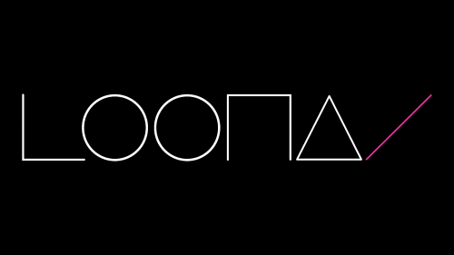
The LOONA logo is a visual symbol of the group and is used on official releases, events, print materials, and fan merchandise. Designers made the emblem simple and memorable so the girl band’s fans would recognize it.
LOONA: Brand overview
| Founded: | 2016 – present |
| Founder: | Blockberry Creative |
| Headquarters: | Seoul, South Korea |
| Website: | loonatheworld.com |
Meaning and History
The group’s main logo features the stylized word “LOOΠΔ.” It’s linked to the initial name of the music project, which was formerly known as “이달의 소녀” (or “Idarui Sonyeo” in the Latinized version). This phrase, meaning “Girl of the Month,” was chosen because one of the group members introduced her mini-album or single every month.
The group’s creators then took the consonant letters that start the syllables in the Korean inscription “이달의 소녀,” resulting in “ㅇㄷㅇㅅㄴ.” A rearrangement of the glyphs resulted in the word “ㄴㅇㅇㄷㅅ” visually corresponding to the English “LOONA.” This letter similarity is played out in the main emblem. But for album covers, Hangul inscriptions are used, showing a connection with the history.
What is LOONA?
LOONA is a South Korean group created under the guidance of the Blockberry Creative agency and released its debut album in 2018. The group consists only of girls, each presenting a solo song from 2016 to 2018 to demonstrate her individuality and talent. The group has since released several joint albums in Pop, EDM, and K-pop genres.
2018 – today
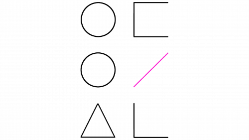
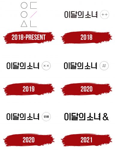
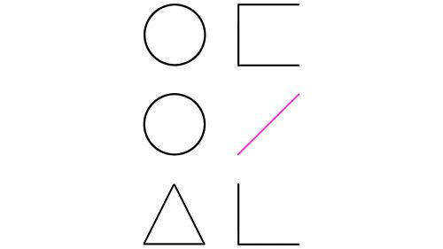
The vertical version of the logo represents the abbreviation “ㅇㄷㅇㅅㄴ,” formed from the phrase “이달의 소녀.” Between the third and fourth glyphs is a slash (“/”), denoting the separation of two words. The symbols are written in pairs and arranged in a column – three rows in total. The Korean letters are stylized as geometric shapes: circles, a triangle, right angles, and incomplete squares. The slash is colored pink, unlike all other black glyphs.
The horizontal version contains the stylized inscription “LOOΠΔ/.” In this case, the “/” symbol reflects the idea that every member of the “LOONA” group is unique and has their own identity.
2018
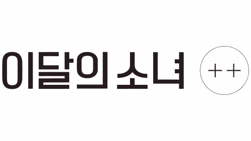
In 2018, an innovative music collective emerged, releasing their debut album “[+ +].” The album cover was distinctly embellished with the project’s unique logo, which was intriguingly set in the Hangul alphabet, the writing system used in Korea. The artistic design added complexity to the album’s image, capturing the group’s cultural and artistic inspirations.
Two plus symbols enclosed within a circular outline were positioned to the right of the logo. These elements could easily be mistaken at a casual glance for a quirky smiley face with its eyes playfully crossed out. This whimsical touch lent an air of lightheartedness to the overall design, inviting viewers into the collective’s unique world of music.
The debut album was more than just a collection of tracks. Everything was a testament to their creative exploration, from the originality of the group’s name to the distinctive album cover design. The clever use of the Hangul alphabet and the playful incorporation of symbols as visual metaphors expressed the group’s desire to push boundaries and experiment with their artistic expression.
2019
A year after their initial debut, the music collective broadened their artistic horizon by releasing an updated version of their original album, [+ +]. This newly released version was intriguingly named “[X X],” further maintaining their trend of using symbols in their album titles.
The transformation was also evident in the album’s visual design. The previously featured plus symbols had now been replaced by two ‘X’ symbols positioned within the same circular outline featured on the original album. This alteration of symbols offered a fresh, yet recognizably familiar, face to the collective’s evolving identity.
Despite the switch from plus to ‘X’ symbols, the resemblance to a smiley face with its eyes humorously crossed out was still distinctly visible. This continuity in design subtly signaled to the audience that the music collective’s inherent playfulness and unique artistic approach were still intact.
2020
In 2020, the music collective continued its symbolic journey, unveiling another album creatively titled “[#].” As with their previous releases, the logo and design aesthetic continued to evolve yet maintained a familiar structure that echoed their artistic roots.
While the overall layout of the album cover remained similar to the previous versions, the smiley face symbolism had undergone a notable transformation. This time, a hash symbol – ‘#’ – took center stage, positioned on the right within the same circular outline that had housed the “X” and “+” symbols in their earlier works.
The introduction of the hash symbol signified a departure from the playful smiley face motif that had been a recurrent visual theme in the collective’s previous releases. With its association with trending topics and categorization in digital platforms, the hash symbol could be interpreted as the collective’s commentary on the era of digital communication and its influence on art and culture.
By moving away from the smiley-face resemblance, the music collective signaled a shift in their artistic direction, a maturation of their sound, or a deeper exploration into the complexities of the contemporary digital era.
2020
Later in 2020, the music collective known as LOONA continued their creative odyssey by releasing another album, this time intriguingly named “[12:00]”. In keeping with their established tradition, the album title was expressed through symbols, this time using numerals, which were predictably positioned inside a circle.
The cover featured a fascinating twist. Alongside the numerical representation, there was an inscription in Japanese, once again reflecting LOONA’s engagement with different languages and cultural references. This linguistic variety added a distinctive appeal to their album covers and emphasized the group’s global reach and influence.
In a clever design move, the zeros in “12:00” were created to be oval, subtly echoing the shape of the first letter from the syllable “이” in the Hangul alphabet. This ingenious design element infused a sense of unity and continuity into the evolving logo. They harked back to their debut album, where Hangul was integral to the design.
Through these careful design choices, LOONA demonstrated their ability to merge different elements – numbers, symbols, languages – into a harmonious whole that expressed their multifaceted identity. While unique in its visual representation, each album carried echoes of its predecessors, weaving together a complex tapestry that told the story of LOONA’s artistic journey.
2021
In 2021, LOONA took a bold step forward in their creative expression, diverging from their previous design traditions with the release of their new album named “[&]”. The ampersand, “&”, was used as the album’s central symbol, breaking away from the recurring motif of enclosing the title within a circular frame. This marked a new chapter in the group’s design evolution, displaying their readiness to explore fresh aesthetic directions.
The album cover art featured the “&” symbol, but the change in design did not mean a complete break from the past. The album’s visual representation cleverly retained the link to LOONA’s artistic origins by aligning it with the group’s name set in Hangul. The proportions of the “&” symbol harmoniously complemented the glyphs of the Korean alphabet, adding a seamless flow to the overall design.
The use of the ampersand symbol, often associated with conjunctions, could be interpreted as a sign of unity and connection. This resonated with the group’s musical journey, highlighting their goal of harmonizing different elements – be it cultural, musical, or visual. The shift away from the circular enclosure to the use of the “&” symbol might be seen as an indication of LOONA’s growth and transformation, symbolizing their readiness to venture beyond their familiar aesthetic boundaries while still maintaining a strong connection to their roots.
Font and Colors
The main logo of LOONA lacks conventional lettering, as the letters resemble geometric shapes. The individual design makes the musical group’s emblem recognizable and unique.
As for the color scheme, it is based on a classic combination of black and white. Only a small pink stripe shows that not everything is as simple as it seems. This is a symbol of femininity, hinting at the exclusively female makeup of the group.
