


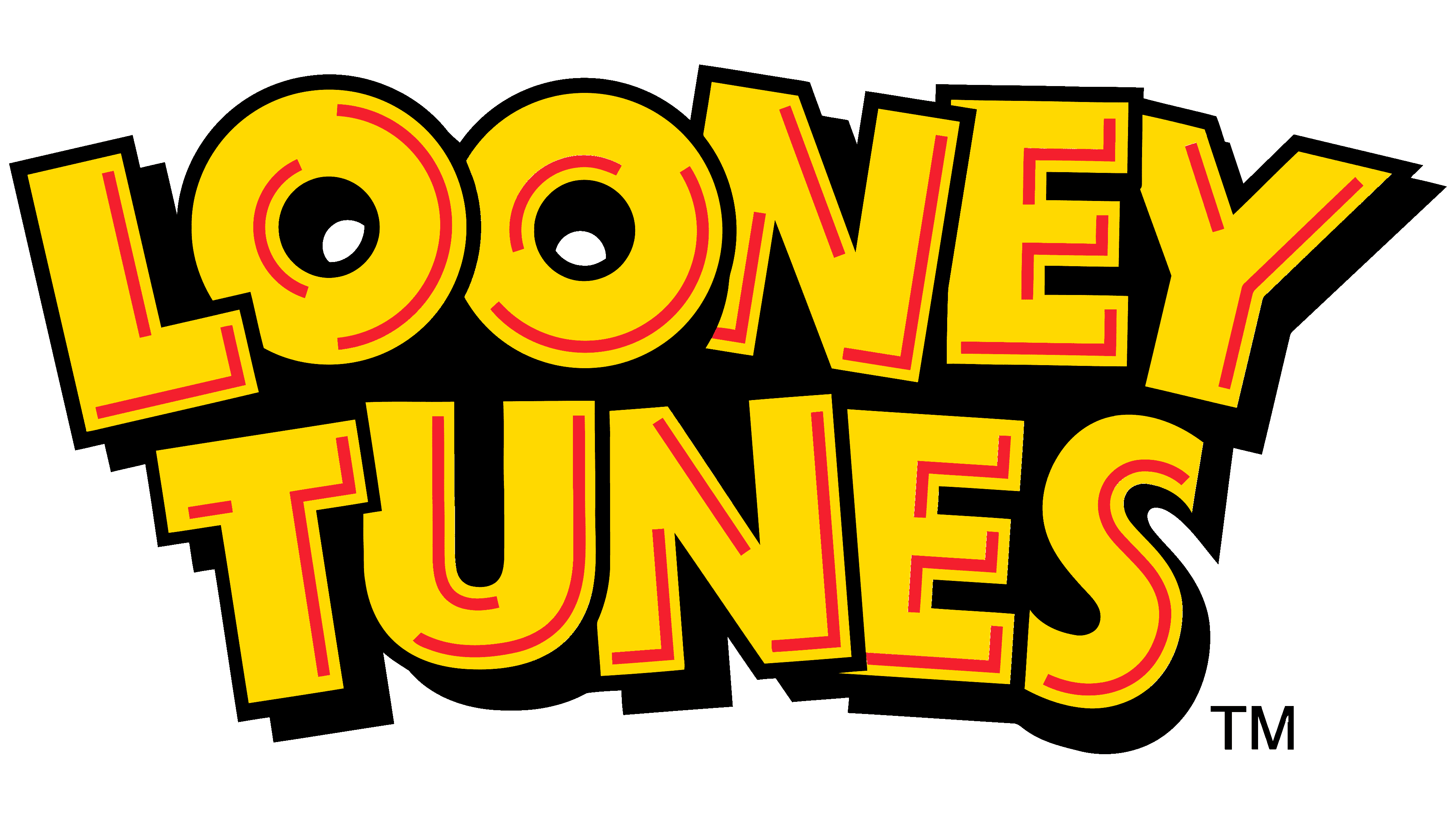
![]() Looney Tunes Logo PNG
Looney Tunes Logo PNG
The Looney Tunes logo is recognizable for its concentric circles that evoke a stage curtain. The form evokes associations with classic cartoons and a cheerful mood. It feels like an entrance into a world of humor, energy, and carefree adventures.
Looney Tunes is one of the Warner Bros. Entertainment Inc. It comprises short animated films that first appeared in 1930 and are still produced today. Unlike its partner series, Merrie Melodies, which was based on the most popular songs, Looney Tunes was story-driven from its earliest days. Then the distinction between the two projects blurred as the transition to color film began.
The early cartoons were black-and-white and created to promote Warner Bros.-owned music. It was assumed that viewers would buy records and sheet music after watching the short films. The very first star of Looney Tunes was the cartoon character Bosko. He used to say the famous phrase “That’s all, folks!” at the end of every episode. Then the animators quit, taking Bosko with them as the copyright owners. This prompted the company to add many characters to the story, including Porky Pig (1935), Bugs Bunny (1940), Tweety (1942), and the stalking cat Sylvester (1945).
In the 1970s, racist and suicidal jokes, dangerous stunts, and smoking and drinking alcohol scenes were removed from cartoons. Everything was done to increase the animated series’ popularity among a wide audience. Production ended in 1987, when the creators realized that a new generation of viewers needed new content.
Meaning and History
![]()
The Silly Symphony collection of animated musical shorts inspired the name “Looney Tunes”. Many believe the famous brand was once known as Looney Tunes and wonder when it changed its name. This misconception stems from the Mandela Effect, in which many people recall events that never occurred. In fact, the word “Tunes” has always been spelled with a “u” and an “e.” Numerous logos featuring the show’s name attest to this.
1930 – 1934
![]()
In the first black-and-white Looney Tunes cartoons, the visuals looked completely different from what modern viewers are used to. The brand’s early logo reflected the spirit of the era and the atmosphere of classic animation.
The composition is built around a wooden fence, on which hangs a slightly sagging banner reading LOONEY TUNES. The lettering is large, slightly distorted, with volume and shadows. The typeface is simple and geometric. Beneath the name, a modest registration line reads REG. U.S. PAT. OFF. in a small size and a plain font.
Below, the image includes the credit line “Produced by LEON SCHLESINGER.” The words Produced by are written in a graceful, soft handwritten cursive, while the producer’s name is set in a straight serif typeface in uppercase letters.
The scene is complemented by three characters moving together as a friendly group. A boy wearing short pants and a cap holds the hand of a girl in a dress with short hair. The girl pushes a baby stroller with an infant holding a bottle. A playful puppy happily hops alongside them. The characters are drawn in a style typical of early cartoons, with exaggerated heads, expressive faces, and lively motion, similar to those of the Fleischer characters or early Oswald the Lucky Rabbit.
The background emphasizes the era’s light, casual style, featuring simple outlines of bushes and trees behind a rough fence, with subtle shadow fills and contours.
The original version of the Looney Tunes emblem fit naturally into early cartoons. An animated variation of the logo was used in the opening and closing titles. For example, in one ending, the character Bosko jumped out from behind a sign reading A LOONEY TUNE together with a dog, spread his arms, and delivered the famous line That’s all, folks. The dog supported him with loud and cheerful barking.
1934 – 1936
![]()
When the cartoon character Bosko stopped appearing on screen, Looney Tunes continued using the logo, developing its style and composition. With each new release, the design details changed, but the core remained the same: the spirit of animation embedded in the lettering.
This version of the emblem features a two-line composition. The top line reads “LOONEY,” with “TUNES” below it. The typeface is large and freely hand-drawn, with smooth, slightly asymmetrical contours in the spirit of early cartoon art. The letterforms are soft and dimensional, reminiscent of old posters or comedy film titles of that period, without strict symmetry or serifs.
The emblem’s color scheme is black and white. The interior of the letters is white, with outlines drawn using a thin black line. Volume is achieved by placing a gray shadow behind the letters. It gives the text a sense of light floating and flexibility.
A distinctive feature of this version is the way the letters appeared on screen. They did not remain static but bounced slightly in different directions, rhythmically changing height and direction. This created an atmosphere of humor and playful chaos, a hallmark of Warner Bros. cartoons.
Later, the Looney Tunes title began to appear against a theatrical curtain background. Even in later versions, the principles established in the early period remained intact, namely, simple forms, smooth lines, and internal motion conveyed through the rhythmic movement of the letters.
1936 – 1937
![]()
In its opening sequences, Looney Tunes always aimed to convey the cartoons’ mood, and one of the brand’s historical emblems clearly demonstrates this. At the center of the composition is a cheerful cartoon pig with a wide smile and an open mouth. The character has rounded cheeks, raised eyebrows, and a small, neat snout. Behind him is a dark green background with soft, blurred transitions and shadows, giving the image a lively and dimensional look.
The name LOONEY TUNES is written in large, bright yellow letters and placed above the character. The lettering is curved upward in a smooth arc. Behind each letter is a dense dark shadow that creates a sense of volume.
In the lower part of the image, the producer’s name, LEON SCHLESINGER, appears in white Art Deco lettering. The letters are large and geometric, with smooth, rounded forms. Above this name is a small Produced by line. Below is an oval frame containing the release number.
The final element of the design is a soft, smoky green texture that surrounds the entire image, unifying the composition and adding warmth and a sense of coziness reminiscent of classic cartoons.
1937 – 1940
![]()
In the late 1930s, Looney Tunes introduced a logo that reflected its era, filled with humor, music, and colorful characters. The central figure of the composition is a cartoon pig shown in full length. He is elegantly dressed in a green jacket with a red bow tie. His right arm is raised, holding a gray hat with a white band, and a wide smile lights his face.
The character’s background is blue and adorned with numerous musical notes. They are scattered chaotically in different sizes, in white and light blue shades, with shadows. The entire composition feels lively, and the cartoon’s musical theme is clearly present.
Above the character, an arched LOONEY TUNES title made of uppercase yellow letters in a cartoon style. The characters are large and dimensional due to dark brown shadows. The letterforms appear slightly loose and relaxed, giving the name a playful and energetic feel that matches the studio’s animation style.
The logo is closely tied to the imagery and atmosphere of the cartoons, in which viewers perceived the cheerful pig as a symbol of good mood and light irony.
1940 – 1942
![]()
Looney Tunes characters were always marked by light humor and vivid imagery, which were reflected in the brand’s next full-color logo. The center of the composition again features the pig, now wearing a bright blue suit and a red bow tie, lounging on a dark wooden fence. His pose is relaxed and casual. He leans slightly and watches attentively. Black musical notes float around the character, emphasizing the cartoon’s rhythm and animated spirit.
Below the pig, the LOONEY TUNES name is written in yellow letters in an unusual cartoon style. The letters are large and dimensional, with uneven outlines, soft edges, and bright orange strokes inside. Reddish brown shadows add depth and a three-dimensional effect to the text. The title is curved in a semicircle, slightly raised in the middle, and lowered toward the edges.
The logo’s background is dark, with purple-blue tones and subtle gradients. The fence on which the pig rests is rendered with vertical dark strokes, creating the impression of a rough, stylized wooden surface.
1942 – 1944
![]()
In 1942, the Looney Tunes brand introduced an emblem featuring familiar elements for the first time, which remained memorable to audiences for decades. At the top is the LOONEY TUNES title written in large white letters that bounce slightly along an arc. The type is hand-drawn, dimensional, lively, without even lines or strict contours, with dark red shadows.
The main focus of the composition is on two characters peeking out from the center of the image. One of them is the well-known cartoon pig with a kind and friendly expression. Next to him, peeking over his shoulder, is a mischievous black duck with a yellow beak. Together, they look at the viewer, drawing attention and emphasizing the cartoons’ light, ironic character.
The background is composed of circular elements that create a striking tunnel effect. At the center is a bright red circle, from which blue rings radiate outward. The blue becomes darker toward the edges and lighter toward the center, creating a sense of depth and drawing the viewer into the composition.
1944 – 1964
![]()
Color film gradually entered Looney Tunes cartoons starting in the early 1940s, changing the style of the studio’s logos and opening sequences. A new stage introduced bright colors, central circles, and character imagery familiar to everyone. Among them was Porky Pig, whose cartoons featured a logo with blue rings and a rich red center.
The design was based on rings of varying saturation, from dark blue at the edges to lighter tones toward the center. At the very center was a bright red circle that served as the base for the main title. This structure created depth and drew the viewer into the image.
Alongside Porky, other characters also appeared. For example, cartoons featuring Daffy Duck used a yellow-green logo with the same vivid red core. Director and artist Friz Freleng, before the rise of the famous Bugs Bunny, preferred orange-pink rings with a blue center, while his earlier cartoons featured red-black gradients.
A shared element of all these openings was the large LOONEY TUNES title, arranged in an arc and composed of white letters with bold, bright red shadows. The characters overlap, maintaining density and visual unity. The typeface is cartoon-like and hand-drawn, with soft lines and slight irregularities that emphasize the animated style.
1964 – 1969
![]()
When Warner Bros. closed its animation studio in the 1960s, Looney Tunes continued to exist, now under the auspices of DePatie-Freleng Enterprises. The new owner brought the series back to screens and introduced a new logo, first shown in Chuck Jones’s short Now Hear This, which premiered on April 27, 1963.
The design was developed by artists Chuck Jones and Maurice Noble, who chose a text-based format. The LOONEY TUNES title consisted of letters that appeared hand-drawn and literally jumped across the screen. The typeface was created specifically for this project. It had no serifs and was completely asymmetrical. Letters repeated within the words, yet none were identical. Even the two E letters looked entirely different, reflecting the spirit of the cartoons with their freedom and light humor.
This version remained in use until the end of the 1960s. It was used not only by DePatie-Freleng Enterprises but also by Format Productions for shorts featuring the adventures of Wile E. Coyote and the Road Runner. Later, the logo moved to Warner Bros. Seven Arts Animation, which briefly revived cartoon production. Even so, many viewers saw this emblem as a sign of the end of an era, as the studio faced financial difficulties and beloved characters appeared on screen less frequently.
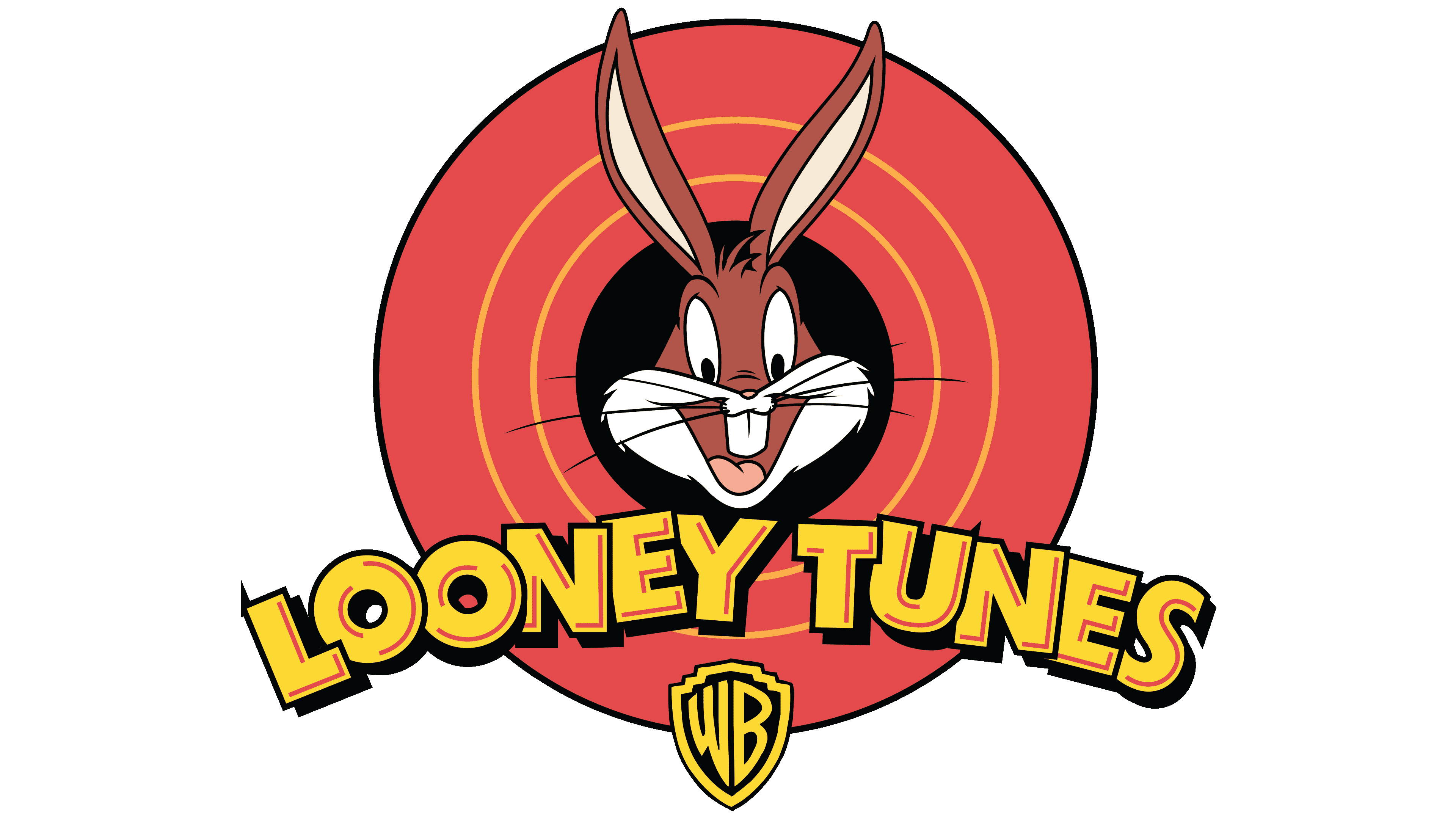
1996 – 2007
![]()
When Warner Bros. decided to bring the Looney Tunes animated series back to screens after a long break, it needed to present familiar characters in a fresh, bright way. At the center of the updated emblem appeared one of the most beloved characters, the cheerful Bugs Bunny. He greeted viewers with an open smile and a sly look.
Bugs’s appearance is instantly recognizable. The character has bright eyes directed toward the viewer, an open mouth, and his famous large teeth emphasize his playful nature. His long ears spread outward at the top, while his light muzzle and white cheeks contrast with the black background. All of this is enclosed in a circle, around which wide rings of rich red-orange color extend outward.
The lower part of the composition features bold LOONEY TUNES lettering. It is arranged along a wide arc, rendered in bright yellow with a black outline and a reddish shadow within the letters.
Below the title is a small Warner Bros. logo in the form of an elongated shield with a sharp lower point. Inside it, the letters WB are placed. The shield is black with a yellow outline, helping it blend naturally into the overall style.
The new emblem echoes the classic 1942-1964 version, emphasizing its connection to the golden age of Warner Bros. animation. Bringing back the visual language of the past in a modern execution allowed the brand to preserve tradition while sparking interest among audiences across generations.
2007 – today
![]()
In the 2007 version of the Looney Tunes emblem, following a redesign, viewers were greeted with a familiar, bright image presented in a refreshed form. At the center remains a favorite of several generations, the gray rabbit Bugs Bunny. He now stands with his gloved paws spread to the sides, as if delivering the famous line That’s all, folks. Alternatively, greet everyone.
Around the black circle, four rich-pink rings extend, creating the recognizable cartoon tunnel. The rings are separated by thin yellow lines that add depth and dimension to the composition. Bugs Bunny himself looks cheerful and welcoming. His mouth is open in a smile, two large teeth are visible, and his long gray ears are raised upward. The rabbit’s paws extend only partially beyond the rings.
The lower part of the emblem features a slightly arched LOONEY TUNES title. The letters remain large and cartoon-like, colored bright yellow, with the shade slightly lighter than before. A black outline around the letters and a subtle shadow create a light sense of volume. Decorative highlights from the previous version were removed from the lettering.
Below the main title is a small Warner Bros. shield, executed in the same manner as in the previous version.
The elements of the new emblem preserve the image of the earlier brand, while the depiction of Bugs Bunny now carries added liveliness and emotional expression.
2024 – today
![]()
Ahead of the 2024 Olympic Games, the Looney Tunes brand launched a joint campaign with the Olympics and introduced an updated logo developed by the Loyalkaspar studio. It was first revealed on May 17. This marked the start of a new promotional wave featuring characters familiar to several generations.
The new emblem retained the animated tunnel style, built from a series of colored rings that converge toward the center of the composition. The rings are rendered in rich shades that gradually soften from bright red at the outer edges to calmer orange and warm yellow closer to the center. Each shade remains distinct despite the smooth transition, creating the effect of gradual immersion into the image.
At the very center is a black ring. Over the rings sits the white LOONEY TUNES text, split into two lines. The word LOONEY appears at the top, with TUNES below. The letters look cartoonish, with soft, free outlines, asymmetry, and variations in size and width. They do not sit in a straight line; they bounce slightly up and down. This enhances the composition’s liveliness and connects it to the playful atmosphere of the studio’s cartoons.
The typeface is uppercase, without strict geometry. Each letter is emphasized with a bold black outline and a red inner shadow, creating the impression of light dimensionality. Despite its flat appearance, the logo feels rich and energetic due to its color and typography.
The logo update coincided with the launch of the Looney Tunes X Olympics campaign, which brought together classic characters and a major global sporting event. The decision by “Loyalkaspar” allowed the brand to integrate naturally and harmoniously into the Olympic context while emphasizing the style and emotional character of Looney Tunes.
Font and Colors
The star of the Looney Tunes logo is Bugs Bunny, the key character from many short cartoons. Bugs Bunny is a charming anthropomorphic hare who became famous for his carefree character and carefree attitude towards life. He is deservedly regarded as a cultural symbol of America and is among the ten most frequently depicted cartoon characters globally.
The font used for the arch lettering is the same as it was half a century ago. More specifically, it’s a set of individual glyphs that mimic a bold geometric grotesque. The designers only slightly modified the letters to give them a three-dimensional appearance. The inner contours and outer shadows achieved this. Subsequently, enthusiasts created a free typeface based on the Looney Tunes Tilt BT logo.
Like in the cartoons, Bugs Bunny is drawn using two primary colors: white and gray. At the same time, the inside of his ears is light pink, his mouth is red, and his pupils are black. A shade closer to Deep Carmine Pink (#F02F34) was chosen for the rings, and an analog of Sunglow Yellow (#FFD236) was chosen for the letters. The center circle, shield, shadows, and outlines are black.