


![]() Los Angeles Logo PNG
Los Angeles Logo PNG
The vibrant Los Angeles logo invites tourists to immerse themselves in the sunny vacation atmosphere on the US West Coast. It embodies freedom, joy, and optimism. The emblem also displays the diverse culture beyond just the Hollywood district.
Meaning and History
![]()
The private organization, Los Angeles Tourism & Convention Board, better known as LA Tourism, positions its native metropolis as the best place for leisure and business. It conducts marketing campaigns and provides detailed information about the city, hotels, events, transportation infrastructure, and other issues that may interest travelers or business partners. This increases tourism industry revenue and helps create new jobs. The organization regularly updates its logo to make Los Angeles attractive to the public.
Several emblems have existed in the city’s history. These are mainly textual signs, with designs ranging from a strict print font to casual handwritten inscriptions. They enhance L.A.’s authority among those who can influence the city’s financial position, such as tourists, investors, and business people. One of the most striking is the 2021 logo, which resembles Art Deco-style graffiti aimed at the millennial and Zoomer generations.
What is Los Angeles?
Los Angeles is the second-largest city in the US, the main metropolis of Southern California. It is home to the Hollywood film industry and is recognized as the creative capital of the planet, housing many artists. Thanks to its advantageous geographical location, L.A. can boast a warm climate, long beaches, picturesque mountains, and rich vegetation. The city attracts millions of tourists and investments, and the Los Angeles Tourism & Convention Board handles its promotion.
before 2012
![]()
Before 2012, the LA Tourism organization used a logo with the inscription “LOSANGELES” without spaces. Both words here are executed in the same bold sans-serif font. They are separated only by the color scheme: the orange “L,” the burgundy “O,” and the turquoise “S” stand out brightly against the other black letters. The gray phrase “THE OFFICIAL GUIDE ” is in the top right corner, reduced several times. The strict font conveys the image of Los Angeles as an elegant and modern city, considered a world center of art and innovation.
2012 – 2018
![]()
In this logo, the city’s name is set in a flamboyant, thin, and illegible black handwritten font. This design is related to the organization’s positioning of L.A. as a destination for unique experiences. The creative inscription symbolizes the city’s creative origin, individuality, and exclusivity.
The word “DISCOVER,” set in straight, bold sans-serif letters in the top left corner, indicates that the Los Angeles Tourism & Convention Board provides information and opportunities for travel enthusiasts.
2019 – 2021
![]()
The logo used until 2021 contains a white inscription with a blue outline. Handwritten letters convey the individuality and creativity inherent to the City of Angels. Rounded smooth lines add softness and lightness to the inscription, reflecting the friendly atmosphere and pleasant climate. The unevenly thick outline creates the illusion of movement, symbolizing the metropolis’s active life.
2021 – today
![]()
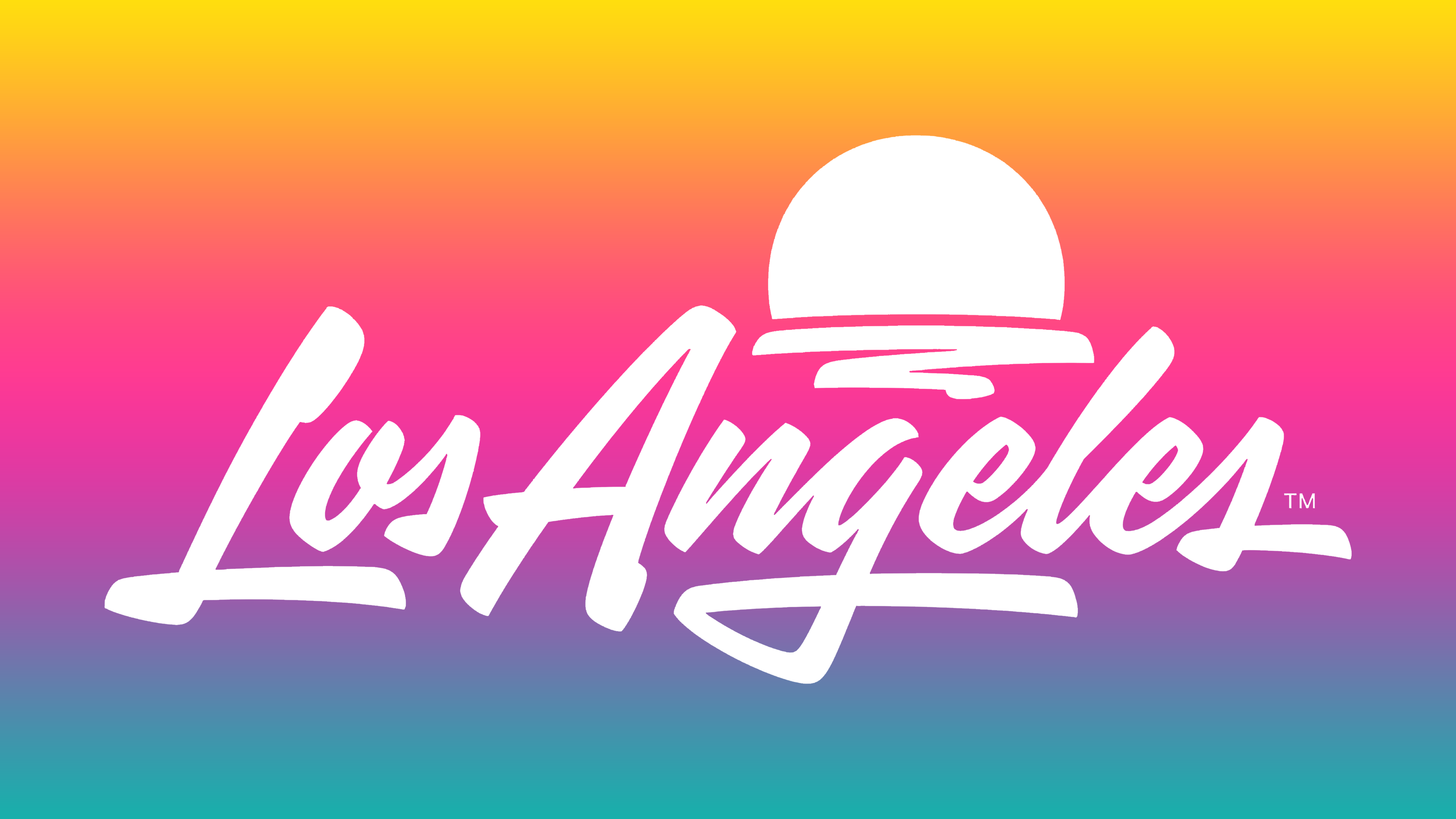
On June 16, 2021, LA Tourism introduced a new logo to mark the lifting of most COVID-19-related restrictions. The logo signified the revival of the tourism industry and was used in the advertising campaign. Two firms conceived the emblem design: Studio Number One, headed by Shepard Fairey, and House Industries, led by Andy Cruz.
Fairey, the author of the iconic “Hope” poster for presidential candidate Barack Obama, noted that he collaborated closely with Cruz. They studied the city’s culture, absorbed its optimism, and created a vivid graffiti-style symbol with characteristic lively, dynamic lines. The poster features the inscription “Los Angeles” against a backdrop of a setting sun. This emblem conveys the city’s flavor with beaches, palms, and landmarks, but does not directly mention them.
- The dome-shaped sun simultaneously resembles the roof of the Griffith Observatory, Cinerama Dome, or the arch of the Hollywood Bowl. It also references the picturesque sunsets and warm climate.
- The chaotic lines under the sun could be both a symbol of creativity and an abstract ocean.
- The Art Deco-style inscription conveys the image of L.A. as a creative and freedom-loving city. Cruz admitted that skateboard graphics inspired it.
Font and Colors
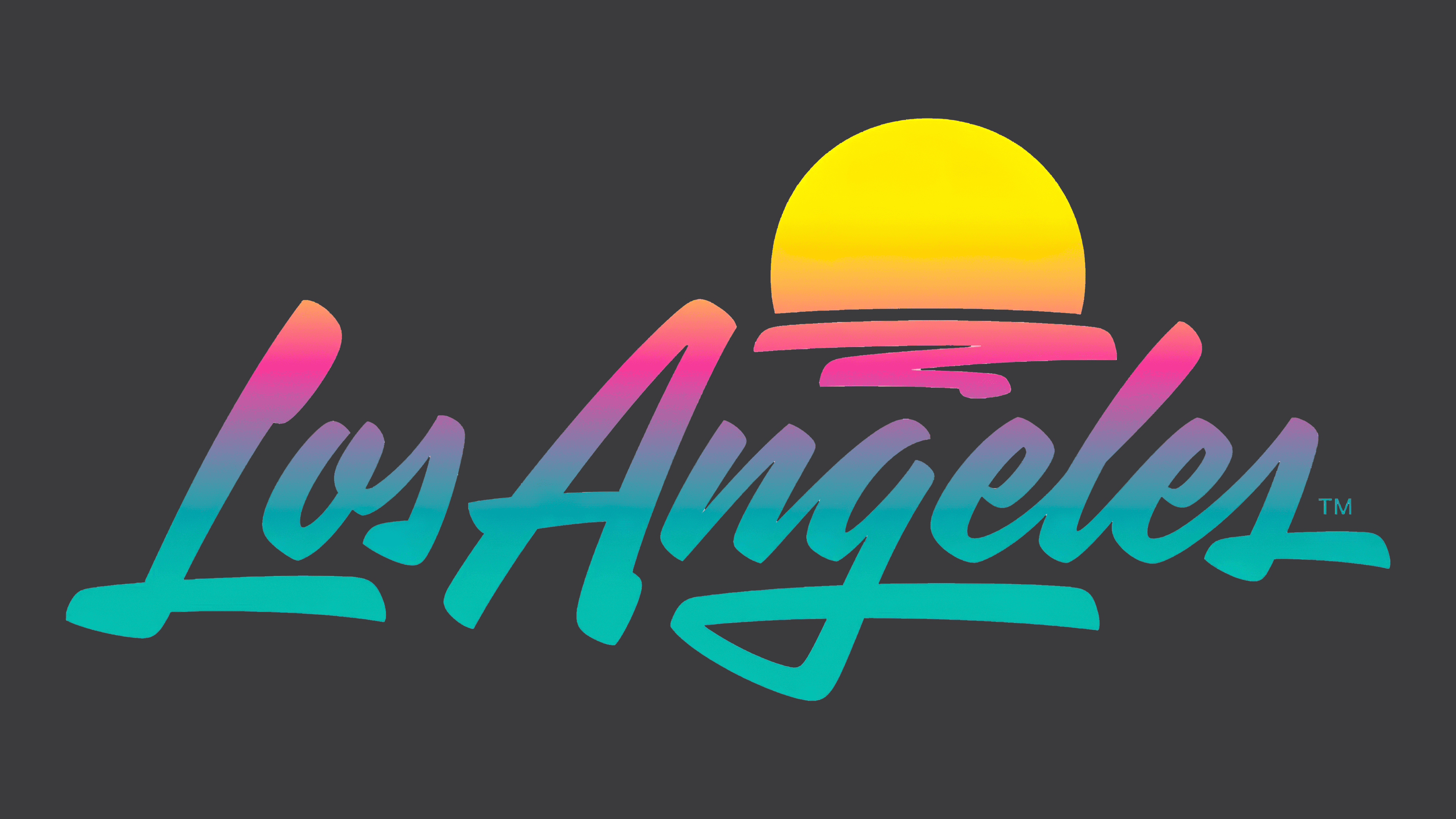
The handwritten text on the 2021 logo is in a sharp, flamboyant font that conveys movement. It expresses Los Angeles’s dynamism and energetic atmosphere. The initial letters shift slightly downward, indicating the city’s openness and expansiveness.
The emblem’s tropical palette represents a beautiful day in L.A. from sunrise to sunset. The gradient includes vibrant colors: gold, pink, purple, and turquoise. The smooth transition of shades symbolizes the multifaceted metropolis, with its rich natural environment, diverse attractions, and well-developed tourist infrastructure.