The LOT Polish Airlines logo demonstrates the airline’s efficiency, great potential, and professional staff. The emblem highlights the company’s comfort for its clients and its confident presence in the sky. The logo is about old Europe, a proud and hospitable country, combining the natural beauty of Poland and the spirit of its people into a sense of flight. It is a silent hint of the mysteries and wonders that await you when you step off the airplane.
LOT Polish Airlines: Brand overview
LOT Polish Airlines was established on January 1, 1929, by merging all existing Polish airlines. The name “LOT” stands for “Linie Lotnicze,” meaning “airlines” in Polish. Initially, the company operated domestic flights using small Junkers F.13 and Fokker F.VII aircraft.
By the 1930s, the airline had expanded its network, including its first international route from Warsaw to Bucharest in 1930. Subsequently, flights were added to other European capitals like Berlin, Prague, and Vienna. In 1935, introducing the modern Lockheed L-10A Electra aircraft marked a significant improvement in passenger service.
During World War II, from 1939 to 1945, operations were halted, with aircraft and staff evacuating to the UK to serve with the RAF. After the war, in 1945, the company resumed operations, rebuilding its network using surviving pre-war planes and new Soviet Li-2 aircraft.
The 1950s saw further expansion, with the introduction of transatlantic flights to New York in 1955 using Il-18 aircraft. The airline’s entry into the global aviation market was a notable milestone. In the 1960s, the company transitioned to jet aircraft with the arrival of the Soviet Tu-134 in 1968, improving service quality and reducing flight times on European routes.
Throughout the 1970s, fleet modernization continued, with the addition of long-haul Il-62 aircraft for transatlantic routes. The company made history 1977 as the first Eastern Bloc airline to operate American Boeing 767 planes. Despite political and economic challenges in the 1980s, the airline persevered, expanding routes to Asia and the Middle East. The end of the communist regime in Poland in 1989 marked the beginning of the company’s transformation into a modern commercial airline. Privatization and fleet renewal followed in the 1990s, with the airline joining the Star Alliance in 1999 for increased cooperation with major carriers.
In the 2000s, the company continued to modernize and grow, introducing new routes to North America and Asia and becoming the first European operator of the Boeing 787 Dreamliner in 2004.
Financial difficulties from 2010 to 2015 led to restructuring and government support. Still, from 2016 to 2019, the airline returned to profitability, expanding routes and modernizing the fleet with new Boeing 737 MAX and Embraer E-Jet E2 aircraft.
2020, the airline faced challenges due to the global aviation crisis, temporarily halting international flights and focusing on domestic and key European routes. Despite this, the company played a vital role in repatriating Polish citizens. Plans were announced to expand cargo operations using passenger aircraft for freight to mitigate losses from reduced passenger traffic.
In 2021, the airline gradually reestablished its route network as global aviation conditions improved. The company prioritized profitable routes and streamlined its operations for greater efficiency. Midway through the year, it revealed intentions to modernize its medium-haul fleet by potentially acquiring new narrow-body aircraft to replace its aging Boeing 737 and Embraer E-Jet models.
Throughout 2022, the company continued to adjust to evolving market conditions. The airline bolstered its presence in the charter flight sector by collaborating with tour operators to cater to popular tourist destinations. Additionally, the same year, it expanded its Miles & More loyalty program, introducing new perks for frequent flyers and strengthening partnerships with other Star Alliance members.
By 2023, the airline reached a significant milestone, marking 95 years since its establishment. To commemorate this achievement, the company launched various special promotions for passengers and unveiled an updated livery for a portion of its fleet, symbolizing the blend of tradition and modernity. Furthermore, the airline announced plans to extend its long-haul network by considering new routes to Asia and increasing flight frequencies to North America, utilizing its fleet of Boeing 787 Dreamliners.
Meaning and History
What is LOT Polish Airlines?
LOT Polish Airlines (Polskie Linie Lotnicze LOT S.A.), proudly carrying the title of Poland’s flagship carrier, maintains its status as one of the oldest operating airlines in the world. It was founded in 1928 and is positioned as a pioneer of the aviation industry and a founding member of the International Air Transport Association (IATA). As of 2022, the airline is the 18th largest airline in Europe. With its extensive network spanning Europe, Asia, and North America, the airline constantly strives to connect Poland to the world by facilitating business, tourism, and cultural exchange.
1928 – 1976
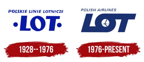
The LOT Polish Airlines logo is primarily text-based and comes in two variations:
- Expanded (the full name of the airline in Polish: Polskie Linie Lotnicze)
- Abbreviated (the first part of the word Lotnicze, highlighted in uppercase letters: LOT)
The top text is in a smooth italic font characterized by medium line thickness, squat glyphs, and wide spacing between characters, except in two places where the letters almost connect. The geometric typography style adds seriousness to the emblem and inspires trust in travelers. The slight tilt of the first text adds a sense of dynamism to the logo.
The largest element of the emblem is the LOT inscription. Although all the glyphs are uppercase, they do not form an acronym. This is a shortened form of the Polish word “lotnicze,” which translates to “aviation.” This way, the company wanted to emphasize its Polish roots and show authenticity, which it achieved well, as these three glyphs make it recognizable worldwide.
On the sides are two bold dots of different heights: the right and the left are higher. This asymmetry visually adds movement to the static elements. All logo components have a beautiful cobalt hue that harmonizes perfectly with the color of the sky.
The tilted “O” particularly draws attention, adding energy and significantly enlivening the emblem. The tilt is noticeable through the almond-shaped inner aperture, slightly shifted to the left. The logo has no serifs to show clients the safety of choosing Polish airlines.
1976 – today
The LOT Polish Airlines logo, designed in 1929 by Tadeusz Luczan Gronowski, symbolizes the airline’s pride and heritage. This logo, which won a design competition, features a simple depiction of a crane in flight at its center. The crane, drawn in a minimalist style, sits within a circle. In the modern version of the logo, this circle is part of the letter “O” in “LOT,” blending the old and new seamlessly.
Above the main logo, the words “POLISH AIRLINES” are displayed in capital letters in a smaller, italicized, sans-serif font. This font has clean lines, adding to the sleek, modern look.
Choosing a crane is significant. Known for their long migrations, cranes symbolize travel and endurance, aligning with the airline’s mission of connecting people over long distances. The minimalist crane design makes the logo recognizable and versatile across different media.
Integrating the circle into the letter “O” adds a unique visual element and cohesion to the design. This clever detail honors the airline’s heritage while adapting to modern branding. The sans-serif, italicized typeface enhances this modern look, conveying movement and forward thinking.
The LOT Polish Airlines logo balances tradition and innovation. The historical crane and modern typography create a timeless and adaptable design, ensuring the logo remains relevant and effective and represents the airline’s commitment to excellence in air travel.
The italicized “POLISH AIRLINES” adds a sense of dynamism, suggesting smooth and efficient service. The logo’s bold, simple design makes it easily identifiable, helping it stand out in a crowded market.


