


![]() Lotus Logo PNG
Lotus Logo PNG
The Lotus logo is part of a line of unusual cars that stand out from the crowd. Just as a pick allows you to get the perfect sound of the strings, the perfect racing cars roll off the manufacturer’s assembly line.
Meaning and History
![]()
The company originated as Lotus Engineering Ltd. Although Colin Chapman is believed to be its founder, there were two of them: Colin Dare also opened the company. They are both graduates of University College London. The company’s official year of appearance was 1952, but unofficially, it was 1948, when Chapman assembled his first racing car in the garage.
The production site was located in the Hornsey district of North London, in the old stables behind the Railway Hotel. In 1954, the plant was divided into Lotus Engineering and Team Lotus. Then, five years later, a group of the same name was formed, represented by Lotus Cars Limited and Lotus Components Limited. They were engaged in manufacturing several types of cars. In 1971, the Lotus Components Limited organization received a new name (Lotus Racing Limited), after which it ceased its activities.
The second plant was moved to Cheshunt in 1959, and from 1966, it occupied a modernized site with a test center in Hethel. It was a converted World War II airfield, and its runway served as a test track. After the death of founder Colin Chapman in 1982, the company entered a period of financial instability. Therefore, the plant was purchased by General Motors Corporation, which later sold it to Romano Artioli and DRB-HICOM. The international organization Geely is from China, and its shareholder is Etika Automotive, which owns the brand.
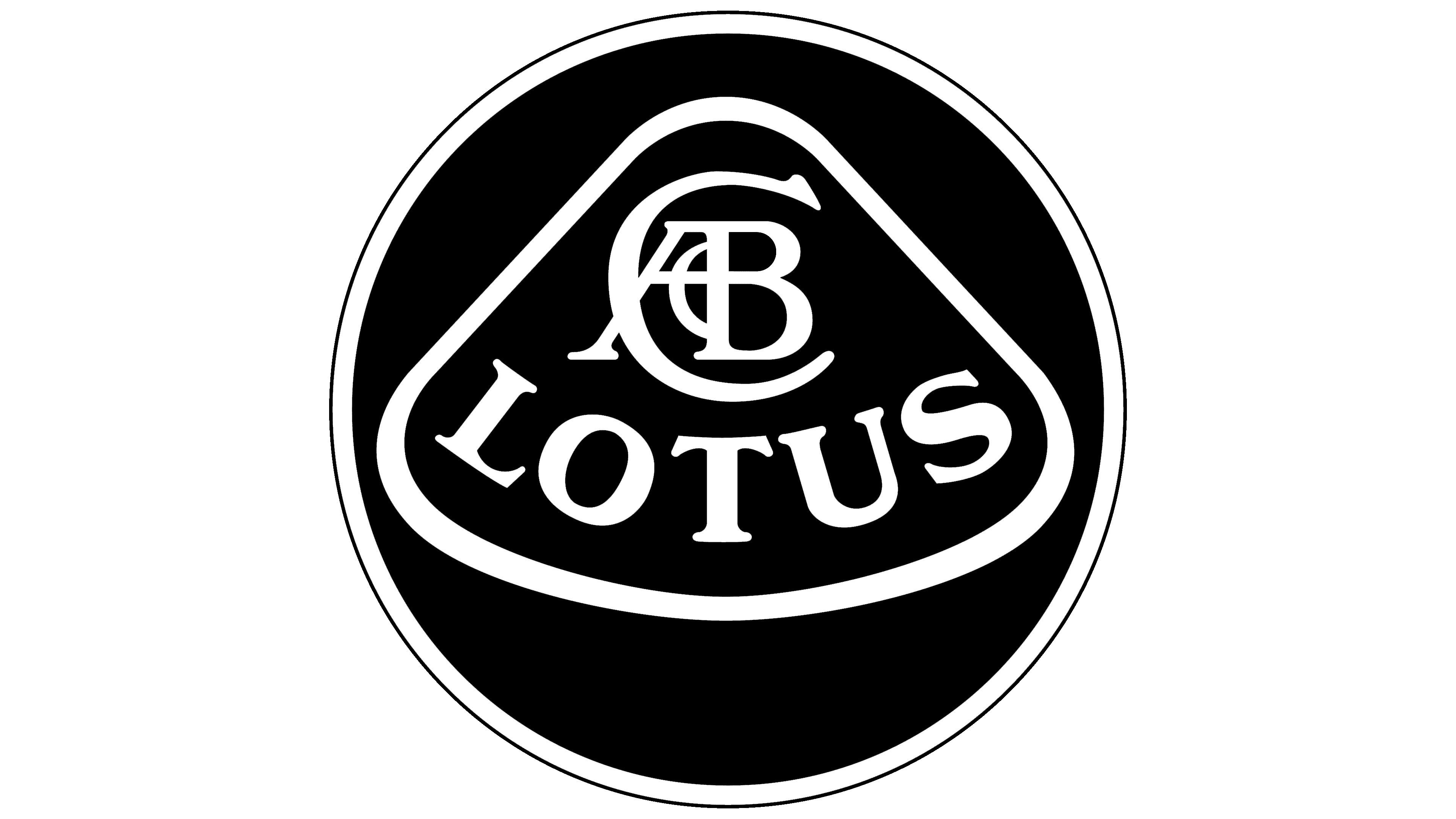
Throughout its existence, the trademark had only one logo, but it underwent several modifications. It has hardly changed since its inception, retaining its original elements, color, and shape. There are six known variations of the emblem.
What is Lotus?
Lotus is a British land transport manufacturer officially called Lotus Cars Limited. It specializes in racing cars and sports cars of various models, including the Evora, Exige, and Elise. The distinctive features of its vehicles are high speed and maneuverability, achieved through well-thought-out aerodynamics, innovative technologies, and lightweight but strong materials.
1948 – 1984
![]()
The debut logo looked like a round badge with a silver line along the edge. Inside was an abstract image of a lotus flower, a monogram, and the brand name in uppercase letters. The strokes were neat and subtle. The triangle had rounded corners and a curved bottom.
1984 – 1986
![]()
After the first redesign of the emblem, the monogram and circle disappeared; only a schematic triangle remained, which looked more like an oval due to the horizontal lengthening. The fill inside the shape is green, and the letters and borders are gold. The title was written in a serif typeface, with each character stacked on the other. This technique was likely used due to space constraints in the logo.
1986 – 1989
![]()
In 1986, the developers restored the monogram, which had been present in the first version.
1989 – 2010
![]()
The debut version was chosen as the logo during this period, but with a slightly changed color scheme. Black and silver are past things, so the symbol has become much more colorful. The developers painted the inscription and the letter pattern above it in white, the triangle in green, the circle in yellow, and the frame in gray. They also changed the title’s style to a thin serif font.
2010 – 2019
![]()
The logo has acquired three dimensions. To raise the sides of the circle, the designers widened the edging strip, deepened the gray, and added highlights. They also darkened the edge of the yellow circle, making it visually lower than the frame. The triangle in the center with rounded corners, which personifies the lotus flower, is outlined with a thin silver line, and all the letters are thinned.
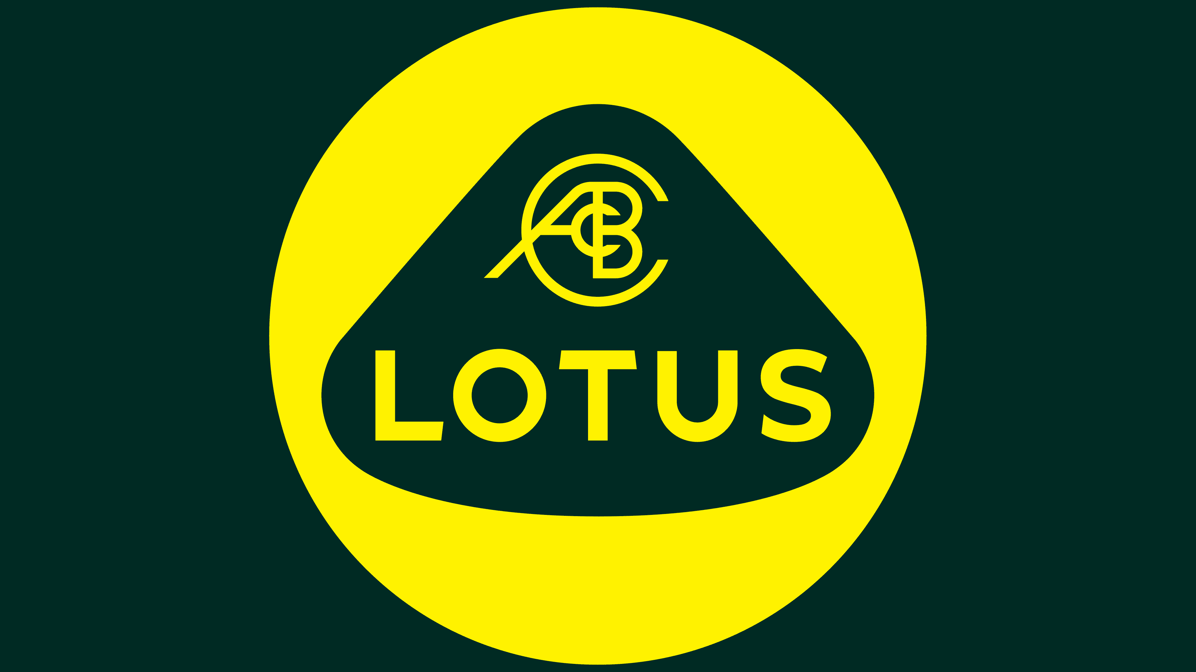
2019 – today
![]()
With the advent of the simple, flat identity trend, the company approved a concise version of the logo. There are no bulges, edging stripes, frames, or white light. Yellow and green predominate. The first is the circle and all the inscriptions; the second is the lotus symbol. In addition, the typeface has been replaced in both the monogram and the brand name. It has become stricter, wider, and sans-serif.
Font and Colors
The monogram in the logo appeared immediately. It consists of the first letters of the automobile company’s founder’s first and last name, “ACBC.” The abbreviation stands for “Anthony Colin Bruce Chapman.” But his original partners (the Allen brothers) were convinced that the monogram was a combination of the main founder’s initials, supplemented by their first and last names. They believed there was an abbreviation for “Michael Allen, Nigel Allen, Colin Chapman.”
Earlier versions of the logo used a serif typeface. In the updated version, the word “Lotus” is written in a hard, bold, grotesque type, close to Wardrum Bold or Lucifer Sans SemiExpanded Bold. The difference is in the oblique cuts at “L” and “T.” The first has an obliquely cut leg; the second has an upper transverse line.
The brand has used different color schemes at different times. If earlier the palette was meager and monotonous (black, white, silver), now it is bright and catchy (yellow, green, white). The current combination speaks of the company’s striving for optimism, further growth, and development.