


![]() Louis Roederer Logo PNG
Louis Roederer Logo PNG
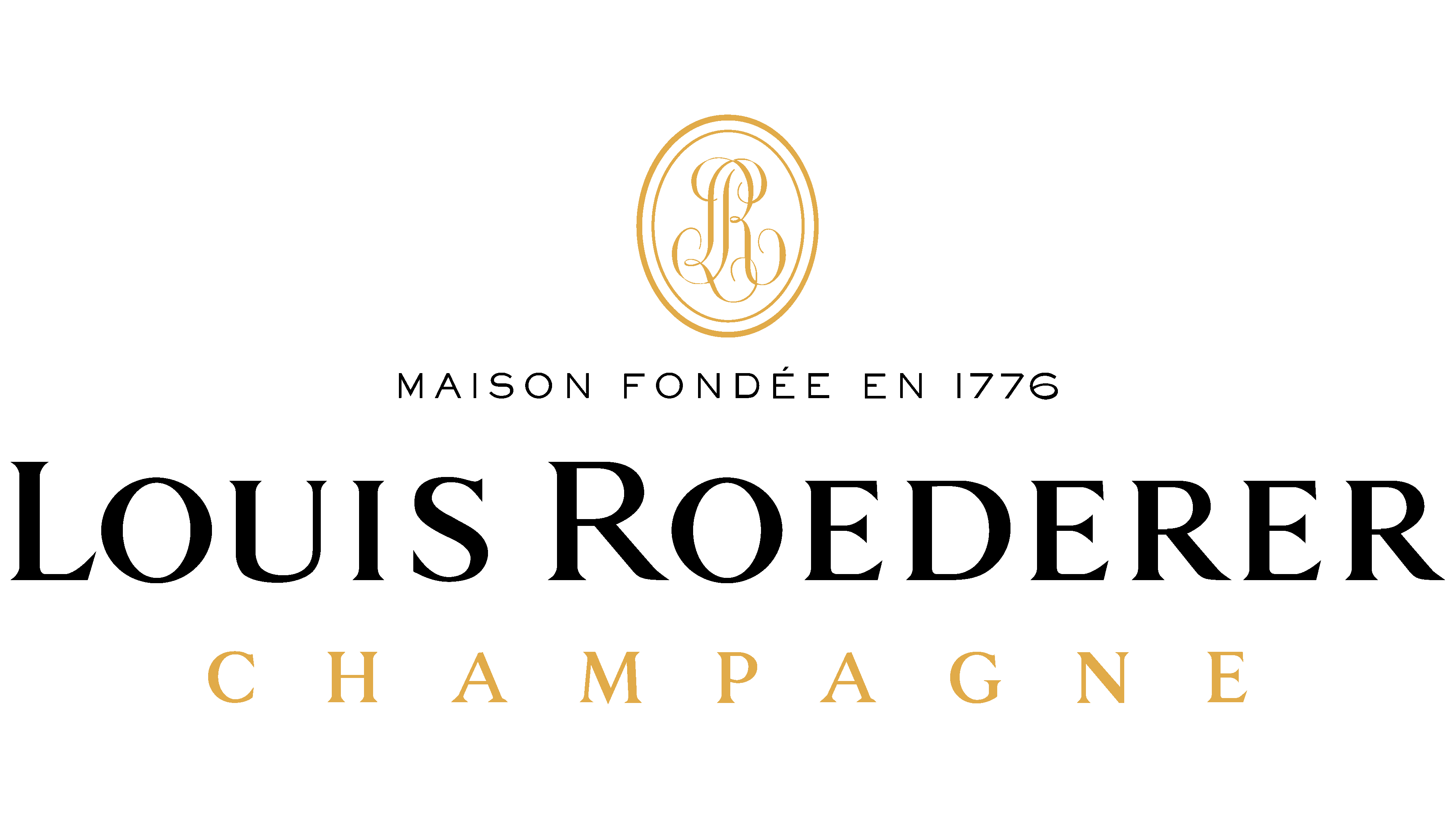
The emblem’s monograms convey that the wine house is an old company with a rich history. The Louis Roederer logo conveys confidence, dignity, and the measured pace of work developed over the centuries. At the helm are experts who know how to create the best wine.
The house was founded in Reims in 1776 as Dubois Père & Fils. In 1819, it passed to the Roederer family. In 1833, Louis Roederer inherited it from his uncle and renamed it after himself. He moved against the common model of the time by buying vineyards rather than depending on outside growers.
Russia became its main market. By 1872, Roederer was selling 2.5 million bottles a year, about one tenth of all Champagne produced in the region. Moët & Chandon and Dom Pérignon, later under LVMH, also sought imperial favor. Still, Roederer gained the strongest link with the Russian court.
In 1876, Tsar Alexander II asked that his Champagne be served in clear crystal bottles with flat bottoms, fearing that poison or explosives might be hidden in dark glass or in the punt. Louis Roederer ordered such bottles from a Flemish glassmaker, which led to the creation of Cristal, later known as the first prestige cuvée. For more than 70 years, it remained reserved for the imperial court.
After the 1917 Russian Revolution and American Prohibition, Roederer lost key markets. Camille Olry-Roederer took control in 1932 and rebuilt the house. In 1945, she released Cristal commercially as a dry Champagne. Later, Jean-Claude Rouzaud expanded with Roederer Estate in California in 1982 and Deutz in 1994. In the 1990s and 2000s, Cristal entered hip-hop culture through Tupac Shakur, Notorious B.I.G., Jay-Z, and Diddy, before Jay-Z’s 2006 boycott and shift to Armand de Brignac.
Meaning and History
The Louis Roederer brand became especially famous in 1876. On its centennial, Louis Roederer II (a representative of the family’s third generation) began supplying champagne to Tsar Alexander II of Russia. Moreover, he developed an alcoholic drink on an individual order and gave the novelty the name Cristal. This brand exists to this day. And in 1908, another ruler, Nicolas II, designated the company an official supplier of wines served at the royal table.
The manufacturer pays great attention to detail, so he grows grapes in the Champagne region in accordance with organic principles. The aging period for champagne is also strictly regulated: 6 years for Cristal, 5 years for vintage wines, and 3.5 years for Brut Premier. This explains the high price of champagne and the premium look of the packaging, which became even more fantastic after the 2014 redesign. It was then that the new Louis Roederer logo was introduced, which is still used today.
What is Louis Roederer?
This is one of the most renowned champagnes in the world, the flagship Cristal, symbolizing the pinnacle of French champagne craftsmanship. The family-owned estate from Reims, France, was created for Russian tsars. The house meticulously controls grape quality and production, cultivating its vineyards, which is rare among major champagne producers. The brand continues to produce champagne, from the famous Brut Premier to the celebrated Cristal, remaining true to a unique style based on the harmony between strength and elegance.
It differs little from the old version. Still, Philippe di Meo, who was responsible for rethinking the corporate identity, sought to make it even more elegant while also showing the company’s authenticity. As a result, the traditional oval seal, in the form of the monogram “LR,” has become larger. Considering that earlier, it was visible only on Cristal labels, this brought the super-expensive champagne brand closer to other sparkling wines produced by Louis Roederer. The print doesn’t just intertwine the “L” and the “R”, it brings together the brand’s modernity and historical past.
The inscription was changed in the same way. The designer made it expressive and elegant to show the sophistication of prestigious drinks. There are no other elements in the logo except for the monogram and text. But they are quite enough for labeling bottles, given the manufacturer’s desire for a minimalist design.
The most distinctive feature of Louis Roederer is the seal, which features the monogram “LR” within a double oval. The letters look atypical for today, but very characteristic of the 18th century, when the Louis Roederer company was founded. And this emblem also demonstrates the connection between the Champagne house of the Champagne family and the ruling elite, as it originally adorned the label of Cristal, a sparkling wine created specifically for the Russian Tsar. The artistic interweaving of “L” and “R” is reminiscent of the exquisite medieval monograms used by important persons to fasten their letters.
Font and Colors
The Louis Roederer logo features two radically different fonts. For the phrase “MAISON FONDÉE EN 1776”, the designers chose a subtle grotesque. The middle horizontal strokes “F” and “E” are shortened by almost half, reminiscent of Armitage Regular from Dunwich Type Founders. At the same time, the rest of the letters have nothing to do with this typeface.
The second and third lines (“LOUIS ROEDERER” and “CHAMPAGNE”) use a high-contrast triangular serif font. All characters are in uppercase, but the first “L” and “R” are enlarged. The black color unites the inscriptions and the monogram, although some versions include gold. The official logo’s background is white.