


![]() Lowenbrau Logo PNG
Lowenbrau Logo PNG
The emblem’s image shows that the brewery adheres to high production standards and does not deviate from the recipe developed in past centuries. The Lowenbrau logo adorns products that are worthy of representing the country globally.
The earliest record tied to Löwenbräu dates to 1383, when Munich sources mentioned the inn “Zum Löwen,” or “At the Lion.” In 1524, tax books named brewer Jörg Schnaitter at Löwengrube 17. The name Löwenbräu, meaning “Lion’s Brew,” appeared in the Munich brewery register in 1746.
In 1818, Georg Brey bought the brewery and turned it into a major industrial producer. Construction of a new plant on Nymphenburger Straße began in 1826, and by 1851, all production had moved there. In the brewing year 1863-1864, Löwenbräu led Munich breweries, making a quarter of the city’s beer.
In 1872, the company became Aktienbrauerei zum Löwenbräu under Ludwig Brey. Löwenbräukeller opened on June 14, 1883, and the lion trademark was registered in 1886. By 1912, annual production reached about 1 million hectoliters, with exports to markets including Britain and the United States.
World War I damaged exports, and in 1921, Löwenbräu merged with Unionsbräu Schülein & Cie and Munich Bürgerbräu. The deal included the Bürgerbräukeller, later associated with Hitler’s failed Beer Hall Putsch in 1923. After World War II bombing, production resumed with an agreement involving the Schülein heirs in the U.S. In 1974, Miller Brewing gained U.S. production rights, but its altered recipe hurt the brand’s reputation. Löwenbräu later merged with Spaten-Franziskaner-Bräu in 1997 and was acquired by InBev in 2004. Beer has been served at Oktoberfest since 1810.
Meaning and History
The Löwenbräu bottles indicate that the company dates back to 1383. However, historical documents indicate that there was no brewery at the site when it appeared in 1383. After studying the archives, Helmuth Stahleder got a more realistic date: 1524. Then the brewer Jörg Schnaitter moved to the seventeenth house on Löwengrube (then called something else) to start brewing there. After 15 years, he moved out, but the enterprise remained and continued to grow, becoming Munich’s largest brewery in the 1850s.
The name Lowenbrau also did not appear immediately. The oldest mentions of him are found in documents from 1746-1747. It is known that it comes from the name of the street Löwengrube, which was first mentioned in the archives in 1640, and is somehow connected with a fresco depicting a lion. What came first, the wall painting or the word Löwengrube? Historians do not know. Only one thing is clear: the Lowenbrau logo was created based on this fresco, located on the seventeenth house, where beer production began in 1524.
What is Lowenbrau?
This is one of the most recognizable Munich breweries, whose name translates as “Lion’s Brew,” exemplifying traditional Bavarian brewing. From its beginnings as a humble Munich brewery, it has used only barley malt, hops, water, and yeast, strictly adhering to the German Beer Purity Law (Reinheitsgebot). Over time, the brewery has grown into a global brand known for traditional German varieties such as “Munich Lager,” “Original,” and “Premium Pils.” These varieties maintain the clean and crisp taste that has made Bavarian beer renowned internationally.
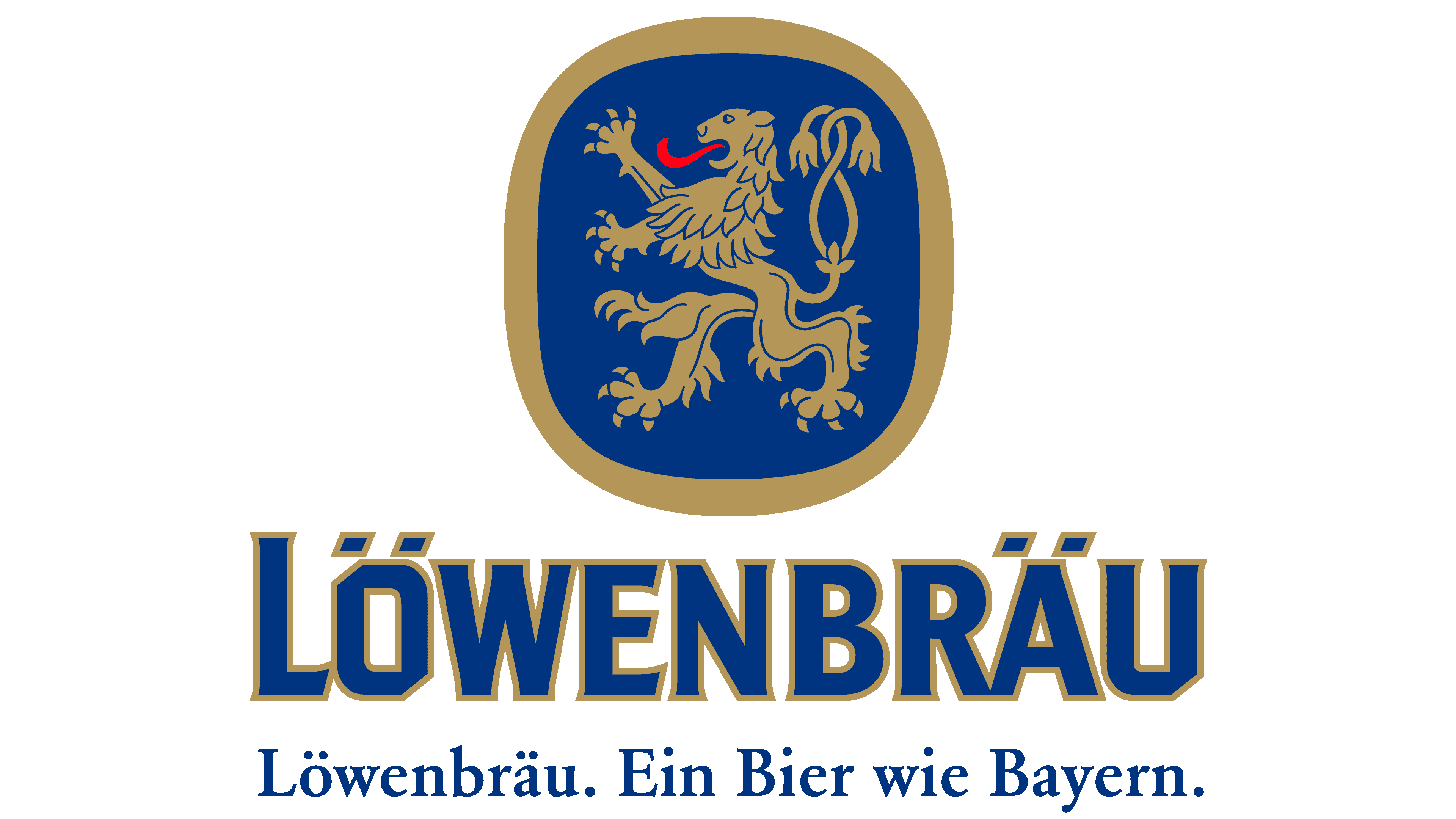
The original fresco depicts the sixth chapter of the Book of Daniel, in which the biblical hero was thrown to the lions for praying to the God of Israel. The brewery logo does not have any of this; it contains only a lion, designed in a coat-of-arms style. The animal is shown in profile and stands on its hind legs. Its long red tongue is stretched forward, and two tails with tassels at the ends are intertwined. The artists detailed the claws and mane in accordance with heraldic traditions.
The lion is inside a blue oval rectangle with a golden border. At the bottom, the word “LÖWENBRÄU” is also written in blue with golden outlines. This variant is used on bottles and serves as the company’s main distinguishing mark. So even now, when Germany’s largest brewery has become a small regional brand of Anheuser-Busch InBev Corporation, its logo still reminds us of a glorious past.
The proud king of beasts reflects the name Lowenbrau and symbolizes courage, strength, fearlessness, justice, and greatness. Such an associative array corresponds to the concept of a beer company. The stylization of the coat of arms reinforces a sense of antiquity and the brand’s rich heritage, which she seeks to emphasize to the fullest.
Font and Colors

The inscription “LÖWENBRÄU” looks impressive thanks to the heavy, visually striking letters. A bold font with roughly the same line thickness seems cumbersome, but only at first glance: the slashes at the edges of the “Ö,” “E,” and “U” make the name more dynamic. The same goes for short, barely visible serifs at the ends of all letters except “Ö.” Because “R” and “Ä” touch at the bottom, the readability of the word is difficult. Perhaps this was done intentionally to attract attention to the logo’s imperfection.
The traditional colors of Lowenbrau gold and blue are perfectly combined. According to the laws of heraldry, only the tongue of the lion is bright red. The designers added a gradient to the golden frame to give the image a sense of volume.