Lowrance: Brand overview
Lowrance was founded in Tulsa, Oklahoma, in October 1957 by founder Darrell J. Lawrence to transform the marine electronics market. The company marked its entry into the industry with the creation of the “Little Green Box,” the world’s first sonar designed for consumer use. This invention fundamentally changed the dynamics of the fishing industry by providing anglers with invaluable data on the state of the underwater world.
Over the decades, Lowrance has continued to push the boundaries of marine electronics. Among the company’s early accomplishments were the development of the recorder and the release of integrated sonar and GPS. Under the leadership of Darrell Lawrence, who served as CEO and president from 1964 to 2006, the company has consistently delivered leading-edge products that have further cemented its status in the industry.
In 2006, Lowrance was acquired by Simrad Yachting for $215 million, creating Navico, a major player in the marine electronics market. However, Lowrance has maintained its focus on pioneering technology in this market, offering advanced solutions such as high-definition systems (HDS), 4G broadband radar, and StructureScan, which combines side-scan and down-scan capabilities.
Despite the change in ownership and international expansion, Lowrance’s operations center remains in Tulsa, Oklahoma, with manufacturing facilities in Ensenada, Mexico.
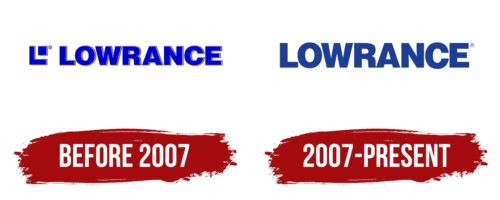
Meaning and History
before 2007
2007 – today
The bold letters line up perfectly and resemble a dense hedge. With a balanced combination of angles and curves, the lettering looks modern and easy to read. The optimal spacing of the letters also contributes to this: they are mostly arranged separately, with the exception of the letters “R” and “A,” which are grouped together due to the outstretched legs. There are no serifs in the smooth letters, which gives the emblem an austere look. The blue color gives the emblem hope and inspires confidence in the future and the desire for new horizons.
The logo does not just say the name; it is as if it tells what the brand is. The letters, close but not too close, resemble a well-coordinated team, showing that everything is under control. The blue color is not just any blue, but one that says, “Don’t worry, things are getting better.” It’s like a little work of art that you can look at and think about.
Lowrance color codes
| Marian Blue | Hex color: | #1b3f95 |
|---|---|---|
| RGB: | 27 63 149 | |
| CMYK: | 82 58 0 42 | |
| Pantone: | PMS 661 C |
