


![]() Lucky Strike Logo PNG
Lucky Strike Logo PNG
The cigarette company is proud of its famous name. That’s why the Lucky Strike logo is dedicated to the brand name and appears on every pack on store shelves.
Lucky Strike traces its history to Virginia, where R. A. Patterson introduced the name in the early 1870s. At first, it was linked to chewing and pipe tobacco rather than cigarettes. In 1905, the trademark was acquired by the American Tobacco Company, which was later connected with British American Tobacco. The brand entered the cigarette market in 1916, using the slogan “It’s Toasted” to highlight its tobacco-processing method.
During World War I, Lucky Strike gained wider recognition among soldiers and civilians through the line “Reach for a Lucky instead of a sweet.” In the 1920s and 1930s, the brand leaned heavily on advertising, including celebrity endorsements that tied it to Hollywood culture. These campaigns made Lucky Strike one of the more visible American cigarette brands of its period.
World War II brought another major shift. The brand changed its familiar green pack to white, presenting the move as support for wartime production needs. In the 1950s and 1960s, as public concern over smoking risks grew, Lucky Strike continued to market itself around tobacco quality and taste.
In the 1970s and 1980s, demand moved toward lighter cigarettes, and Lucky Strike answered with lighter versions, though its peak influence had passed. In the 1990s and 2000s, tighter advertising laws and changing attitudes toward smoking forced the brand to rely more on heritage and packaging. Later, it added new formats, including smokeless tobacco and e-cigarette products, while remaining available in many international markets.
Meaning and History
![]()
Brand recognition is high because only one redesign has been carried out since 1940, when the first company logo was officially introduced. Both versions are made in the same style, the main element of which is a round frame with a verbal inscription inside. Due to its strong appeal to the target audience, the logo stands out from the competition. It is used on cigarette packages and in advertising campaigns.
What is Lucky Strike?
This is one of the most famous companies specializing in the production and sale of cigarettes. The brand’s popularity is directly related to more than a century of history and a high level of loyalty from the target audience.
1940 – 2013
![]()
The first version of the logo was introduced in 1940 and remained in use for 73 years. It consisted of a branded wordmark that was placed inside a red circle. This circle also had a triple outline of white, dark gray, and black.
The company name is written in two lines in a classic bold sans-serif typeface. The inscription consists exclusively of capital letters with a minimum distance between characters. Also, under the main name, the slogan Lucky Strike: “It’s toasted.” This inscription is much smaller than the main inscription but is also in black capital letters, with the same font.
2013 – 2018
![]()
The only redesign to date took place in 2013. The principle of creating the logo has been preserved: a red circle with an inscription inside. However, unlike the previous version, there were not many additional rings, except for one made of gold.
Interestingly, this time, professionals created the “G2 Germany” logo. Visually, the logo could resemble a seal, and the dominance of gold suggests the brand’s noble origins.
The font has changed a bit. Now, a more refined bold serif typeface is used. The golden capital letters have virtually no blank space. There are arched lines above and below the company name. Also, around the main inscription, there are many additional ones, all made with gold capital letters. These are: “R.A. PATTESON TOBACCO COMPAN. EST. RICH’D. VA. USA.”
2018 – today
![]()
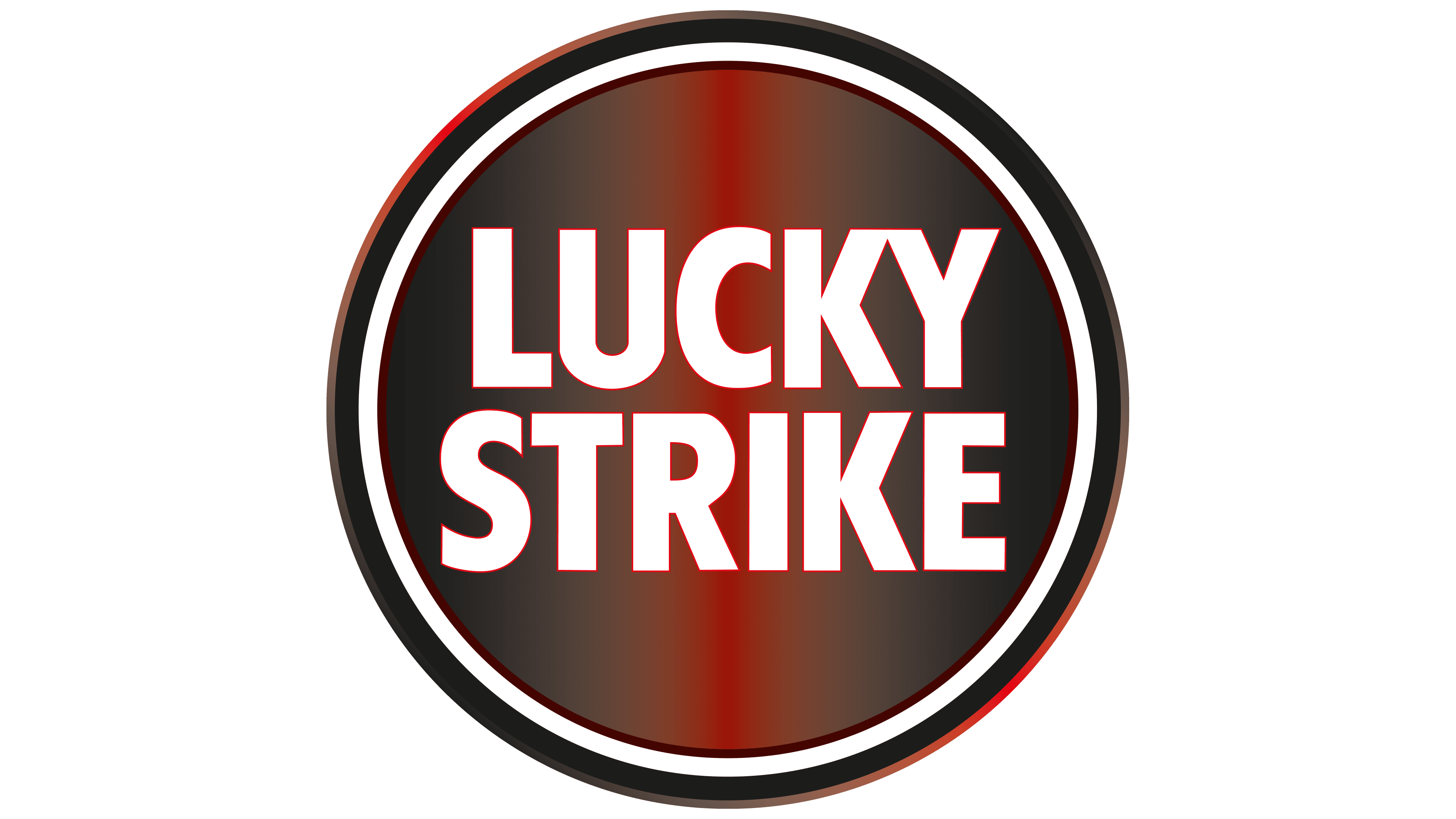
The 2018 Lucky Strike logo embodies boldness and elegance, merging classic with contemporary. The outer golden border, featuring a gradient, creates an illusion of shine, giving the emblem a sophisticated look. The internal red circle is now enhanced with a vertical gradient, adding depth and richness to the visual image.
At the center, against the red gradient, sits the brand name “Lucky Strike” in two lines of white letters. A clear sans-serif font emphasizes the brand’s modern character and simplicity. This clarity of lines and distinctness of each character ensure ease of reading and recognition.
Since its inception in 1871, Lucky Strike has maintained its reputation and recognizability through a logo that, despite changes, continues to capture the spirit of the times, blending tradition with modern trends. This emblem reflects the brand’s history and its place in the smoking culture. The bold red and bright white letters not only grab attention but also serve as a reminder of Lucky Strike’s enduring nature and consistent quality.
Font and Colors
The old Lucky Strike logos retain a nod to its heritage while presenting a more modern and sophisticated aesthetic. Including serifs at the corners of certain letters adds a touch of aristocracy, distinguishing it from older versions of the logo that used fonts resembling MPI Republic Gothic and Dynamo Pro Medium. This evolution in design reflects a balance between tradition and contemporary sensibilities, honoring the brand’s long history while appealing to today’s consumers. The logo’s evolution indicates the brand’s ability to adapt and stay relevant in the dynamic landscape of consumer goods.
The font in the new Lucky Strike logo closely resembles LCT Picon Condensed Bold, a typeface by Quentin J. Stavinsky. It’s characterized by its modern sans-serif style, embodying a clean, contemporary look. This font was released by the foundry La Casse Typographique in 2018. This font for the Lucky Strike logo aligns with the trend towards sleek, minimalist branding, providing a sharp and refined appearance while maintaining links to the brand’s original aesthetic.

The black-and-red color palette has been changed to golden red. The first option is more familiar to many buyers of Lucky Strike products, most likely because of its long history of use. The current version of the color scheme is associated with ancient medallions, passion, and the desire to develop.
FAQ
When did Lucky Strike go from green to red?
During World War II, Lucky Strike cigarettes switched their packaging from green to the well-known white-and-red. The original green was seen as out of style, and the company wanted to attract women, who were fast becoming key customers. The goal was to align with the latest fashion trends to make the brand more attractive.
They said the green dye was needed for the war, which was a smart way to support the war effort and gave them a good reason to update the packaging. This shift to white and red worked well, giving Lucky Strike a fresh, modern look that people liked. This new design became a classic in the tobacco world and helped make the brand what it is today.
What does the word Lucky Strike mean?
“Lucky Strike” means just what it sounds like: a lucky or successful hit. It brings to mind moments of good luck, like stumbling upon something valuable or winning unexpectedly. For an American cigarette brand, this name suggests that picking Lucky Strike could bring a bit of luck and pleasure. It’s a clever way to make the brand more attractive, offering a feeling of happiness and a potential reward for choosing their cigarettes. Since its start, Lucky Strike’s catchy name has been a big part of its charm, making it a well-known name in the tobacco world.
Who does Lucky Strike?
Lucky Strike, a well-known cigarette brand, is part of the British American Tobacco family, a global leader in the tobacco industry since 1902. British American Tobacco, which operates worldwide, added Lucky Strike to its portfolio by acquiring American Tobacco Company. This move helped the company grow and diversify its brand offerings. Today, Lucky Strike stands out for its iconic red logo and packaging, recognized worldwide.
Whose Lucky Strike cigarettes are they?
British American Tobacco, a leading tobacco company, produces Lucky Strike cigarettes. They produce many cigarette brands, both global and local, including Dunhill, Kent, and Pall Mall. They even have special brands for certain regions, such as “Java Zolotaya” in Russia. With around 200 brands in its lineup, British American Tobacco offers a wide range of tobacco products. Lucky Strike is one of their key brands, famous worldwide, and it plays a big part in the company’s success and image.