A manufacturer of flooring and other home products uses a neutral logo that plays on the brand’s name. The Luna logo has an original design and creates a creative mood and creative interior solutions.
Luna: Brand overview
| Founded: | 1999 |
| Headquarters: | United States |
| Website: | luna-stores.com |
Meaning and History
Visual recognition of the brand is at a high level since the logo has not changed much since the company was founded. Moreover, it is easy to remember because it is associated directly with the moon. The company received the name “Luna” in honor of the ancient Roman goddess of the moon.
What is Luna?
This is one of the largest companies in the US regarding the production of flooring. Every year, more than 10 million Americans from all over the country purchase products manufactured under the Luna trademark.
1999 – 2007
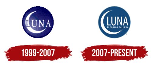
The first version of the logo was introduced in 1999. It already has an indispensable foundation that persists to this day. The basis of the logo is a purple circle with a barely visible outline. Inside it is a verbal inscription with the name of the company, as well as a crescent moon located on the left. On its surface is the first letter of the brand name, namely “L.” Unlike other characters in this word, it is made in purple. The rest of the letters are white. For the name, a classic serif font was used. All letters are capital, and there is a large space between them. The wordmark looks powerful and progressive. At the same time, the glow of the moon extends to the left side of the circle, making it lighter and brighter. The circle itself, which is the frame for the emblem and the name, can be associated with the night sky.
If you return to the outline of the logo, you may get the feeling that it is drawn by hand. Thus, a jagged border is created. Therefore, here you can see a reference to a potential buyer. After all, the style in which the logo is made cannot be called ideal, as well as the skills of a person who first decided to make repairs in his house.
The complex structure of the logo resulted in it not being quite aesthetically pleasing on some surfaces.
2007 – today
The first logo redesign took place in 2007. As a result, it has become more concise and minimalistic if we talk about the color palette chosen by the company. Also, as in the original version, the base was a circle, but this time in dark blue. Inside it was the moon, located on the left, and a verbal inscription with the brand’s name. The first letter in the word in the updated version was outside the Earth’s satellite. A slightly modified font was used, but the lines in capital letters remained extremely thin. This adds some elegance to the logo. Also, there are no serifs in the new version of the logo. There is no glow from the moon; therefore, it is easier to place the logo on a product or as part of an advertising campaign.
Font and Colors
For the word inscription, a classic sans-serif typeface was used in the latest version or with them in the original. Clear and straight lines in the letters make the brand name easy to read on any surface. The writing style of the symbols contrasts perfectly with the moon emblem, which adds interest to the target audience.
The blue and white color palette was not chosen by chance. Blue is often associated with the sky, while white is often associated with the stars in it. After redesigning and replacing purple with blue, the logo began to look more modern and progressive.
Luna color codes
| Dark Cerulean | Hex color: | #154b7c |
|---|---|---|
| RGB: | 21 75 124 | |
| CMYK: | 83 40 0 51 | |
| Pantone: | PMS 7462 C |
| Moonstone Blue | Hex color: | #6e98ab |
|---|---|---|
| RGB: | 110 152 171 | |
| CMYK: | 36 11 0 33 | |
| Pantone: | PMS 7696 C |


