


![]() Lysol Logo PNG
Lysol Logo PNG
The Lysol logo is appealing for its soft lines and simplicity, as the company has focused in recent years on disinfecting everything related to the younger generation. A special emphasis is placed on schools, kindergartens, and other institutions where children spend much of their time together. The friendly design helps teach a child the basics of maintaining cleanliness for strong health.
Lysol began in Germany in the late 19th century, when pharmacist and chemist Gustav Raupenstrauch developed a cresol-based disinfectant after research in Wiesbaden. In April 1889, Hamburg merchants Rudolf Schülke and Julius Mayr founded Schülke & Mayr. They began producing the new product under the Lysol name.
The brand gained early credibility during the 1892 cholera outbreak in Hamburg, when Lysol was used in citywide sanitation efforts. In 1893, Hamburg authorities honored Schülke & Mayr for its role during the epidemic. News spread outside Germany, and in 1890, The New York Times had already described Lysol as a strong antiseptic recommended by Austria’s main sanitary authority.
In the United States, distribution rights went to Lehn & Fink, a New York company founded in 1874. American production under Lehn & Fink began in 1912, and Lysol was first marketed mainly as a medical and surgical antiseptic. During the 1918-1920 Spanish flu pandemic, demand for disinfectants made the brand familiar to many U.S. households. In the 1920s and 1930s, dangerous advertising promoted Lysol for feminine hygiene, a use later discredited by medical evidence.
In 1967, Lehn & Fink was acquired by Sterling Drug, which expanded Lysol into household cleaning, including toilet cleaner in 1968. Eastman Kodak bought Sterling Drug in 1988, then sold L&F Products to Reckitt & Colman in 1994. After the 1999 merger with Benckiser N.V., Lysol became part of Reckitt Benckiser. It continued competing with Clorox in the U.S. disinfectant market.
Meaning and History
![]()
To combat the cholera that raged in late 19th-century Germany, Gustav Raupenstrauch invented a disinfectant that was initially used in medicine. Later, it transitioned to the industrial and household disinfectant category as it proved unsafe. Previously, it contained cresols and chlorophenol, but its formula was later changed to use benzalkonium chloride and hydrogen peroxide as the base. It’s now a disinfectant and antiseptic for sanitizing hard and soft surfaces, hands, and the air in enclosed spaces. The Lysol logo conveys the product’s gentleness, safety, and high efficacy. This is reflected in the smooth lines of the inscription and the sharp angles of the background.
What is Lysol?
Lysol is a line of cleaning and washing agents for disinfecting surfaces, air, and hands. It first appeared in 1892 in Germany, where it was used in medicine to fight cholera. Gustav Raupenstrauch developed the formula for this product, with Schülke & Mayr as its first manufacturer. In the early 20th century, when the license was purchased by the American company Lehn & Fink, the product was included in the household and industrial disinfectant category. It’s designed for cleaning and antiseptic treatment. The current owner of the trademark is Reckitt Benckiser Group, which distributes the products in the USA, Canada, India, South America, and Europe.
1892 – 1920s
![]()
The emblem combines four basic factors: the ability to fight infections (sharp angles), marketing appeal (red color), consumer loyalty (soft, handwritten font), and a focus on microorganisms (a white circle resembling a microscope). The antiseptic’s name is diagonally centered. A line extends from the last ‘l’ to highlight the word “Lysol.” It is predominantly in lowercase, except for the first letter, which is in uppercase. An isosceles triangle is used as the background.
1920s – 1956
![]()
The redesign changed the geometric shape: now, instead of a triangle, we see a red rectangle. Its middle part holds the brand name with a smooth left slant. The developers kept the handwritten style of the font but shortened the upper curve of the capital “L” to make the letter look compact. They also added a small line of small-print glyphs to briefly present some marketing information.
1956 – 1999
![]()
In this version, designers swapped the colors: the inscription is now red on a white background, not white on red. This combination retained the logo’s boldness but removed its bulkiness. As a result, it looks minimalist and works well as a product label. Another adjustment involved the text style, although it remained handwritten. The modernization affected the font, particularly the letter width (now bold), the slant (a clear horizontal with slight italicization), and the underline (which became straight and smooth). A large dot is clearly visible beside the “o,” and a graceful swirl peeks out from the top of the “L.”
1999 – 2005
![]()
The logo features an upward-ascending inscription. This time, it’s blue, with a silvery shadow near the letters, adding 3D depth. It creates the impression of a single line floating above a white surface. This compensates for the lack of a striking color (red) and is equally eye-catching. Designers shortened the left upper swirl of the capital “L” and separated the bottom underline from the lowercase “l.” Now, the bar is wide, with two pointed ends on opposite sides. The text is in a handwritten style: the italicized inscription consists of smoothly rounded glyphs.
2005 – 2010
![]()
The new Lysol emblem received not a cobalt blue but a sky blue, maintaining the light shading of the letters at the bottom and right. Designers again adjusted the wavy stroke of the “L,” slightly shortening it. They curved the bottom bar into a semi-arch, trimmed the sharp ends, and added a light gradient.
2010 – today
![]()
The logo maintained its style: italic, handwritten, diagonal. Only a few details were added, making it less concise. The background of the inscription is now a wide ribbon folded in half. Outside, it’s light blue, almost white, with a sparkling gleam and a dark blue border at the top and bottom. The inside is painted red. The silvery shadows near the letters are preserved.
Font and Colors
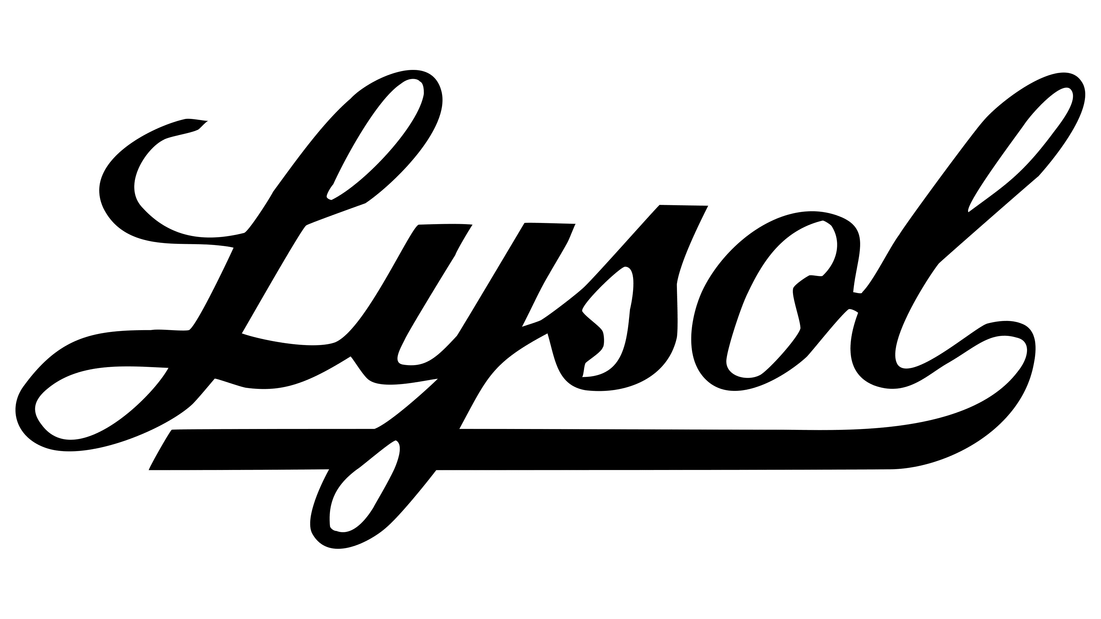
The word “Lysol” on the label is in italics, lowercase. The letters are connected, bold, and rounded, creating a sense of safety and trust. The original spray cap inscription (in 1968) was set in Franklin Gothic Extra Condensed, which contrasts starkly with the light, airy font in the logo. It was geometric, tall, semi-bold, and angular.
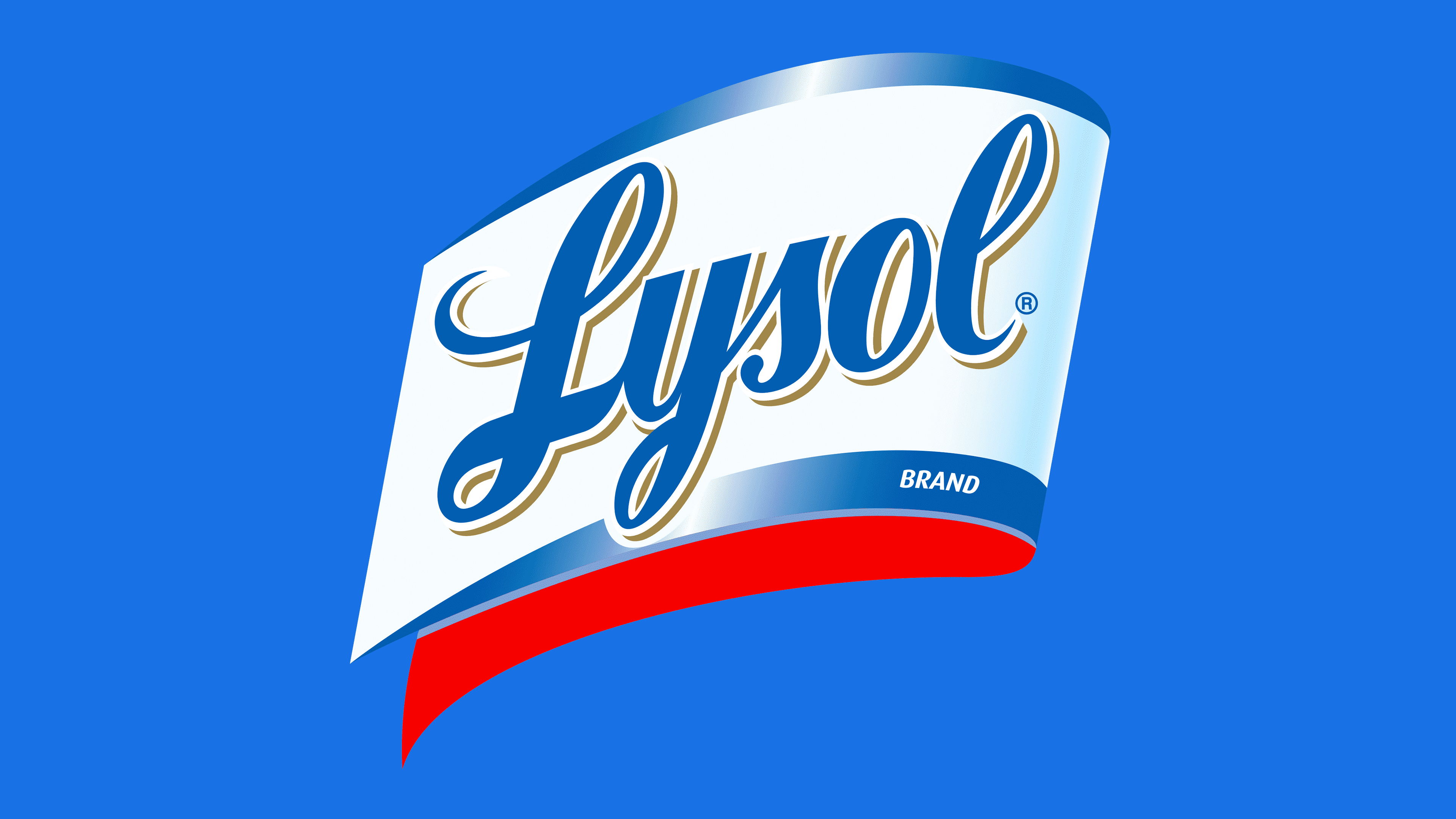
The brand palette’s primary color is blue in several shades. It can be simultaneously dark, cobalt blue, and light blue, with a sparkling gleam. In different versions of the emblem, it is well complemented by white, silver, and red. Overall, blue is associated with medicine because it calms and relaxes, easing anxiety.