Macedonian Airlines: Brand overview
Emerging as the national flag carrier of Northern Macedonia, Macedonian Airlines served the country from 1992 to 2003.
The genesis of the airline began in 1992 when North Macedonia gained independence from Yugoslavia. The airline was originally created as a result of a cooperation between the Macedonian government and the Greek flag carrier Olympic Airlines.
The newly formed Macedonian Airlines made its maiden flight in June 1992 with a modest fleet of 2 Fokker 100 jets. Based in Skopje, it served mainly European destinations. In the following years, the airline expanded its presence in Northern Macedonia with domestic flights while expanding its European network.
Significant changes occurred in 1996, when the Macedonian government took full ownership of the airline, terminating the joint venture with Olympic Airlines. With the start of the new millennium, Macedonian Airlines added 6 Fokker 100 jets to its fleet.
However, the airline’s relatively small size made it vulnerable to mounting financial difficulties. The national carrier faced persistent unprofitability, mounting debts, and stiff competition from emerging low-cost carriers in Europe.
Sadly, after operating for 11 years, Macedonian Airlines ceased operations in December 2003. Despite annual peak traffic of more than one million passengers, the airline could not last due to significant losses.
Meaning and History
What is Macedonian Airlines?
It is the national airline of North Macedonia, based in Skopje. It offers regular passenger services to various destinations in Europe and the Middle East. The company operates a fleet of narrow-body aircraft, such as the Boeing 737 and Airbus A320, providing reliable and efficient connectivity between the country’s capital and key regional centers.
1992 – 2003
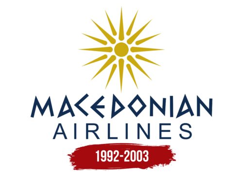
The use of Greek script for the lettering “MACEDONIAN” emphasizes the identity of the airline, which is noteworthy since it was not allowed to enter Greek airspace due to its controversial name. The stylized letters have straight lines and few angles. In contrast, the word “AIRLINES” is written in a font with softer outlines, creating a dynamic contrast. At the top is a yellow sun: a small circle with two rows of rays in the form of sharp spikes. This is a reference to the flag of Macedonia, which depicts the so-called “new sun of freedom.”
The contrast between two different fonts is a strategic choice to combine tradition and modernity to indicate a wide range of services or a philosophical position. The yellow sun pays homage to the Macedonian flag and evokes a sense of national pride and optimism, evoking a sense of community and heritage in potential customers.


