The publishing company uses an inspiring logo that is associated with boundless imagination. Macmillan logo is a symbol of dreaminess and love for books. It motivates one to immerse oneself in an exciting story invented by the writers.
Macmillan: Brand overview
| Founded: | 1843 |
| Founder: | Daniel MacMillan, Alexander MacMillan |
| Headquarters: | New York City, United States |
| Website: | macmillan.com |
Meaning and History
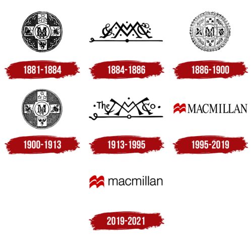
Visual recognition of the brand is quite high. For all the time, seven versions of the logo were presented to the target audience. All of them are made in a rather modest color palette, but at the same time, they look elegant and confident.
What is Macmillan?
It is one of the oldest publishing companies in the United Kingdom, with over 170 years of history. Despite this, it works not only for the domestic market, as evidenced by representative offices in many countries in Europe and North America.
1881 – 1884
The first officially confirmed version of the logo was presented in 1881. It was probably used before, as it can be seen in the biographies of Alexander Pope and Leslie Stevens. This is a rather mysterious emblem that looks more like a seal. It is made in the form of a circle with many elements. In the central part is another circle with two “M”s inside. This is an abbreviation for the company name. A fly is depicted on the right, a butterfly on the left, stars on top, and acorns on the bottom.
The inscription itself is in Gothic type. Moreover, one letter is much larger than the other.
1884 – 1886
The first redesign was introduced in 1884. He changed the specifics of the logo. Now it was a horizontal line with a rounded left edge and a thick black dot in the center. Above this line, two “M”s were displayed. One of them was wide but small in terms of height. The second, on the contrary, was high but at the same time narrow. In order to make the logo more mysterious, dots were used between the letters, and decorative elements were placed on the sides.
1886 – 1900
The previous version of the logo existed for a relatively short time, and later the company decided to return to the original version. In general, the same elements were used: two letters “M” in the center and four additional images. At the same time, in the new version, it was decided to give preference to white, which made the logo more vivid and memorable.
1900 – 1913
Again, a round frame and a base identical to the original version are used. At the same time, the space between the images was filled with white dots on a black background. Also, the circle has a narrow white outline.
1913 – 1995
For the longest time in the 20th century, an option was used that was very similar to the one that was relevant in 1884-1886. However, now the logo looks more modern and confident. The rounding in the horizontal line has become more elegant, and the dot in the center has become white. The letters in the center have also been resized. In addition, an additional inscription, “The,” appeared to the left of them. The “h” had a significantly elongated tail that even hooked the outermost “M,” thereby replacing the “&” character that had been used previously.
1995 – 2019
It was at this stage that the company decided to move to a more modern style. It was an elegant typeface with serifs and thin lines in the capital letters. To the left of the name is an emblem that can be associated with an open book or a flag. It is made in red with a white line in the middle. The emblem is no larger than the height of the letters in the main name.
2019 – today
The logo is as similar as possible to the previous version. However, the capital letters in the title have been changed to lowercase, and the font has been somewhat simplified. Interestingly, this version of the logo can be used in both two-dimensional and three-dimensional versions. Interestingly, in some cases, the name of the company division is additionally used.
Font and Colors
In the first versions of the logo, no wording was used, except for the two letters “M” located in the center. The name appeared only in 1995. The font was modern and sleek. Since the last redesign, a rounded sans-serif typeface has been introduced. It is not unique because it is as similar as possible to the classic “Arial,” but at the same time, it is readable on any surface without any problems. Moreover, the letters look harmoniously against the background of the emblem.
The company prefers laconic black and white if we talk about the color palette. However, in the last two versions, a color emblem appeared, made in red and white. Red should be associated with Macmillan’s potential customers with passion and a desire to grow. The background color is usually white.
Macmillan color codes
| Racing Red | Hex color: | #cc0001 |
|---|---|---|
| RGB: | 204 0 1 | |
| CMYK: | 0 100 100 20 | |
| Pantone: | PMS Bright Red C |
| Black | Hex color: | #000000 |
|---|---|---|
| RGB: | 0 0 0 | |
| CMYK: | 0 0 0 100 | |
| Pantone: | PMS Process Black C |


