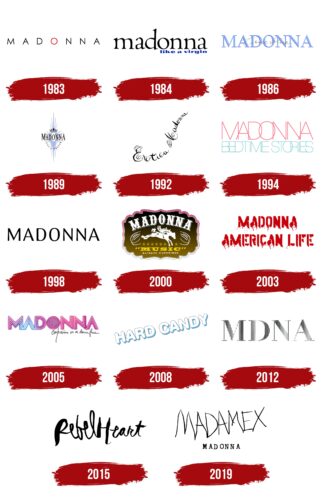
The Madonna logo is unusual and extravagant, much like the singer herself. The design reflects the artist’s multifaceted nature, as she can transform on stage. Not every aspect of her personality is visible to the public. The emblem emphasizes restraint and a demand for respect for boundaries.
Madonna: Brand overview
The famous queen of pop music, Madonna Luisa Ciccone, was born on August 16, 1958, in the small town of Bay City, Michigan. Coming from a Catholic family, the third of six children, no one could have guessed that she would become a global superstar, leaving an indelible mark as a singer, songwriter, and actress.
At the age of five, Madonna experienced the tragic loss of her mother. Despite this grief, she showed innate talent and a deep passion for music from an early age. Her father, who single-handedly raised his children, was undoubtedly impressed by her resilience and dedication to music.
After graduating from the University of Michigan, Madonna boldly moved to New York City in 1978 with the goal of becoming a dancer. She worked various jobs to support herself, including waitressing at Dunkin’ Donuts.
Madonna’s career took a sharp turn for the better in 1982 when she signed with Sire Records. Her debut single, “Everybody,” was released, which became an international dance hit and began her ascent. Subsequent albums and hit singles such as “Like a Virgin,” “Material Girl,” and “Papa Don’t Preach” cemented her position in the 20th-century music industry.
Madonna’s music and style, characterized by innovation and boldness, made her an unrivaled symbol of the 1980s. She fearlessly challenged the existing music and popular culture norms, leading to profound changes in the industry.
Throughout the 90s and 2000s, Madonna constantly reinvented herself, releasing successful albums such as “Ray of Light” and “Confessions on a Dance Floor.” At the same time, she made a name for herself in the film world, receiving critical acclaim for her roles in “Desperately Seeking Susan” and “Evita.”
In addition to her outstanding achievements in music and acting, Madonna has carved out a niche as a philanthropist. An ardent supporter of AIDS research and education, she also supports many charitable organizations and projects that resonate with her.
Madonna’s exceptional talent, innovative approach, and ambition have made her one of the most influential performers in history. Her music and style have significantly impacted the development of popular culture, and her enduring legacy continues to inspire many artists worldwide.
Meaning and History
What is Madonna?
She is an American singer, songwriter and actress known for her provocative music and unconventional image. She began her musical career as the drummer for the band Breakfast Club before embarking on a successful solo career. Her self-titled debut album was a huge success, making her a pop music phenomenon. She released many successful albums including Like a Virgin, True Blue, and Ray of Light. Her music, acting career and entrepreneurial endeavors have cemented her status as one of the most influential figures in pop culture.
1983
The singer’s first album featured a logo with black, thin, feminine letters. The artist uses her real name as her emblem, honoring her mother. The name “Madonna” evokes positive associations derived from a respectful address to a woman. By choosing her name as her brand, the singer established an image of a virtuous, beautiful, and ideal representative of women.
The central “O” in the logo is red, suggesting thoughts of a heart and lipstick. This element highlights the passion, energy, and femininity that Madonna brings to her music and performances.
1984
The emblem first appeared on the album Like a Virgin. The lettering, in a lowercase old-style font, gives the logo elegance and classic beauty. The emblem reflects long-established views and points to the material interests of women seeking a wealthy lifestyle and favoring men with money.
1986
The emblem of the album True Blue harmonizes with its title. Delicate lavender serif letters symbolize blossoming love and magical feelings. This album was inspired by the singer’s husband, Sean Penn, and is dedicated to their love.
The logo’s colors and style highlight the romance and depth of emotions the singer experienced then. The word “blue” suggests Penn’s masculinity and strong qualities, symbolizing the album’s overall concept. In the background, the album title is written in cursive, creating a sense of something personal and intimate.
This handwritten script emphasizes the sincerity and openness of the feelings Madonna decided to share with her audience.
1989
The emblem of the album Like a Prayer creates a sense of starry, regal, and elevated imagery. It symbolizes a quest for greatness and a desire to worship and touch the sacred. From the center of the image, numerous lavender rays radiate outward, creating an effect of brilliance and light, evoking a sense of a miracle or divine revelation.
At the top of the emblem, a royal crown represents wisdom and power. This element emphasizes the high ideals and spiritual aspirations embedded in the album’s concept. The name Madonna is written with the first and last letters capitalized, giving the inscription a sense of perfection and harmony.
1992
The logo for the album “Erotica” is handwritten at an unusual angle, giving it distinct expressiveness and uniqueness. The design mimics the curves of a body, creating an impression of touch and seduction. It evokes images linked to erotic thoughts, enhancing its emotional impact on the viewer. The swirling, elaborate letters draw immediate attention, reminiscent of lace and lingerie ruffles, emphasizing the album’s intimate and sophisticated nature.
1994
The logo for Bedtime Stories features thin, intertwined letters, creating a sense of lightness and tenderness. The top level of the logo displays “Madonna” in pink, while the bottom features the album title “Bedtime Stories” in blue. This color and font combination gives the emblem a softness and romantic feel, reminiscent of a cozy bed with a fluffy blanket.
The logo evokes gentle and romantic thoughts, like a bedtime story. The interweaving of symbols creates a smooth and harmonious transition, enhancing the feeling of calm and tranquility.
1998
The logo for the compilation Ray of Light is harmonious and balanced, reflecting the psychedelic atmosphere of the singer’s seventh album. The tracks and design reveal Madonna’s sacred interests and quest for inner harmony and peace.
The logo’s rounded black letters appear simple and stylish, symbolizing a person who has found spiritual truth. These design elements highlight the album’s theme, filled with meditative motifs and deep reflections on life.
2000
The album emblem for “Music” resembles a sign in front of a tavern in the Midwest, conveying a rural atmosphere. Madonna appears as a shepherdess, with country and folk-style songs, perfectly matched by an image of a cowboy horse galloping down a dusty road. The logo evokes a sense of journey and personal style, highlighting the strong and independent nature of the performer.
The starry row above the album name represents stylish and popular music, attracting listeners’ attention. This design element adds a sense of exclusivity to the logo and indicates the high quality of the album’s musical content.
2003
The crimson letters on the cover of the album “American Life,” with their blood-like streaks, evoke the imagery of life slowly flowing from veins. The singer carefully examines each event that has become part of her life, defining her as an individual and an American, awakening pride in her country. The blood in the logo symbolizes self-identification and a deep connection with the nation.
The album’s tracks are filled with scenes of war and violence, serving as powerful symbols of the struggle for freedom. These scenes reflect the historical and cultural aspects of America’s formation, emphasizing the importance of every step toward independence and national identity.
2005
The disco ball and neon lights of the “Confessions on a Dance Floor” logo grab attention with their vibrant and memorable design. The emblem perfectly captures the dance style of the album, creating a sense of a party on the dance floor. The design resembles a set an experienced DJ might create, adding dynamics and energy.
Gradient transitions and purple-blue shades enhance the atmosphere of joy and fun. These colors evoke a feeling of lightness and carefree moments, immersing listeners in a world of music and dance where they can forget everyday worries and enjoy the moment.
2008
The album Hard Candy is introduced with large, soft white letters written diagonally. These letters create an airy and light effect, drawing attention with their unusual shape and arrangement. This is the first logo where Madonna did not use her name, making it especially memorable.
Most songs on the album are autobiographical. The title Hard Candy does not directly reference the singer’s name. Candy in the title replaces the word “sex,” highlighting Madonna’s bold and liberated image, which she maintains in her eleventh collection.
The white color of the inscription gives the logo a sense of sincerity and honesty. This color symbolizes openness and truthfulness, conveying a message about important topics without lies or pretense.
2012
The MDNA album logo features striped letters. Each character consists of many lines that resemble the ribs of a prism. These lines create an illusion of depth and volume, giving the logo a dynamic and complex appearance. As the letters turn at different angles, they reveal new facets of the artist’s personality, highlighting her multifaceted and diverse nature.
The title MDNA is a shortening of the singer’s name, suggested by her colleague M.I.A. This abbreviation emphasizes key letters, creating an association with the singer’s DNA chain, symbolizing her uniqueness and individuality.
The album collection embodies the artist’s views and beliefs. Each song reflects her life principles, thoughts, and feelings, forming a complete picture of her inner world.
2015
The Rebel Heart album logo resembles the messy handwriting of someone struggling to control their emotions. The lines of the logo evoke the spikes of an electrocardiogram, creating a sense of dynamism and emotional tension. The continuous writing of the words in the logo emphasizes unity and the flow of thought, while black symbolizes a rebellious spirit and inner strength.
This choice of logo reflects the essence of the album, conveying the idea of breaking conventional norms and rules. The unconventional spelling in the logo demonstrates the artist’s ability to resist external pressure and stay true to personal beliefs.
2019
This Madonna logo debuted with the release of her studio album Madame X in 2019. The singer’s name appears in the background at the bottom and is much smaller than the word “MADAMEX.” Her name uses a serif font, similar to Ana’s Fletcher Typewriter by Ana’s Fonts or CarbonType by Vic Fieger. The album title, “MADAMEX,” is written in jagged capital letters that appear hand-drawn. The black color of the lettering symbolizes grace and elegance.
The prominent “MADAMEX” in large letters and Madonna’s smaller name create intrigue about the album, suggesting something unique for her. The vintage serif font for her name gives it a retro feel without seeming outdated. The hand-drawn style of “MADAMEX” adds a personal touch, as if Madonna sketched it herself in a moment of inspiration.
The logo’s design contrasts the refined serif font and the jagged, hand-drawn letters. The large “MADAMEX” commands attention, while Madonna’s smaller, elegant name subtly underscores it. This contrast creates a dynamic and memorable visual.
The black color in the lettering enhances the logo’s sophisticated and timeless appeal. The “MADAMEX” hand-drawn effect lends an artistic and spontaneous vibe, reflecting Madonna’s creative spirit. The overall design captures a sense of elegance mixed with raw artistic expression.


