


![]() Malibu Logo PNG
Malibu Logo PNG
“It only takes a couple of glasses of liquor to feel like relaxing on exotic beaches,” the Malibu logo says. The image reveals the beauty of the sunset before the viewer and invites you on a pleasant journey.
The story of Malibu began in the late 1970s in South Africa within International Distillers & Vintners, part of Grand Metropolitan. In 1978, Peter Fleck, James Espey, and Tom Jago encountered a coconut rum liqueur, Coco Rico, produced by Gilbey’s.
Tom Jago, who developed Baileys Irish Cream in 1974, supported the concept. Due to South Africa’s political context, the product was repositioned with a Caribbean image, and production later moved to the Caribbean. The name “Malibu” was selected for its association with coastal lifestyle imagery.
In 1979, Malibu launched in the UK. Early batches used clear bottles painted white by hand. With an alcohol level of 21%, it was classified as a liqueur, allowing TV advertising that stronger spirits could not access under UK regulations. Campaigns built around tropical imagery helped establish brand recognition.
During the 1980s, Malibu gained popularity in bars, especially in cocktails such as the piña colada. In the 1990s, distribution expanded across Europe, and new flavors, including mango, pineapple, and passion fruit, were introduced.
In 1997, Grand Metropolitan merged with Guinness to form Diageo, placing Malibu alongside brands like Johnnie Walker, Smirnoff, and Captain Morgan. In 2002, Diageo sold Malibu to Allied Domecq for £560 million to comply with regulatory requirements.
In 2005, Pernod Ricard acquired Allied Domecq with Fortune Brands, integrating Malibu into The Absolut Company, which also manages Absolut vodka. In the 2010s, ready-to-drink products were added. By 2020, annual sales reached 4.4 million cases, second only to Baileys among liqueurs.
Meaning and History
![]()
For the first time, this drink appeared in 1893 on the island of Curacao in the Caribbean. Since 1980, it has been produced in Barbados. The brand that issued it was resold several times before Pernod Ricard acquired it. This event is dated 2005th year.
Today, Malibu is produced in the town of Black Rock (West Indies) at the West Indian Rum Distillery. Like many years ago, it is still blended with coconut extract according to legendary recipes. Moreover, it remains exotic and sophisticated. All this is reflected in detail in the corporate logo, imbued with the spirit of the Caribbean coast.
The brand wants to stay in line with modern events, keep up with life, and use trendy techniques to delight consumers with exquisite taste. Therefore, the latest redesign has improved the logo by adapting it for electronic sales. As a result, the label, label, and logo accurately reflect the mood of the low-alcohol drink: relaxation, calm, and freshness.
The branding gravitates towards identity. The vibrant Caribbean landscape enhances its authentic character. Simultaneously, its design is evolving from simple to complex, acquiring increasingly attractive details. They convey legendary product value and relevance, regardless of the season or year, beyond the individual paradise.
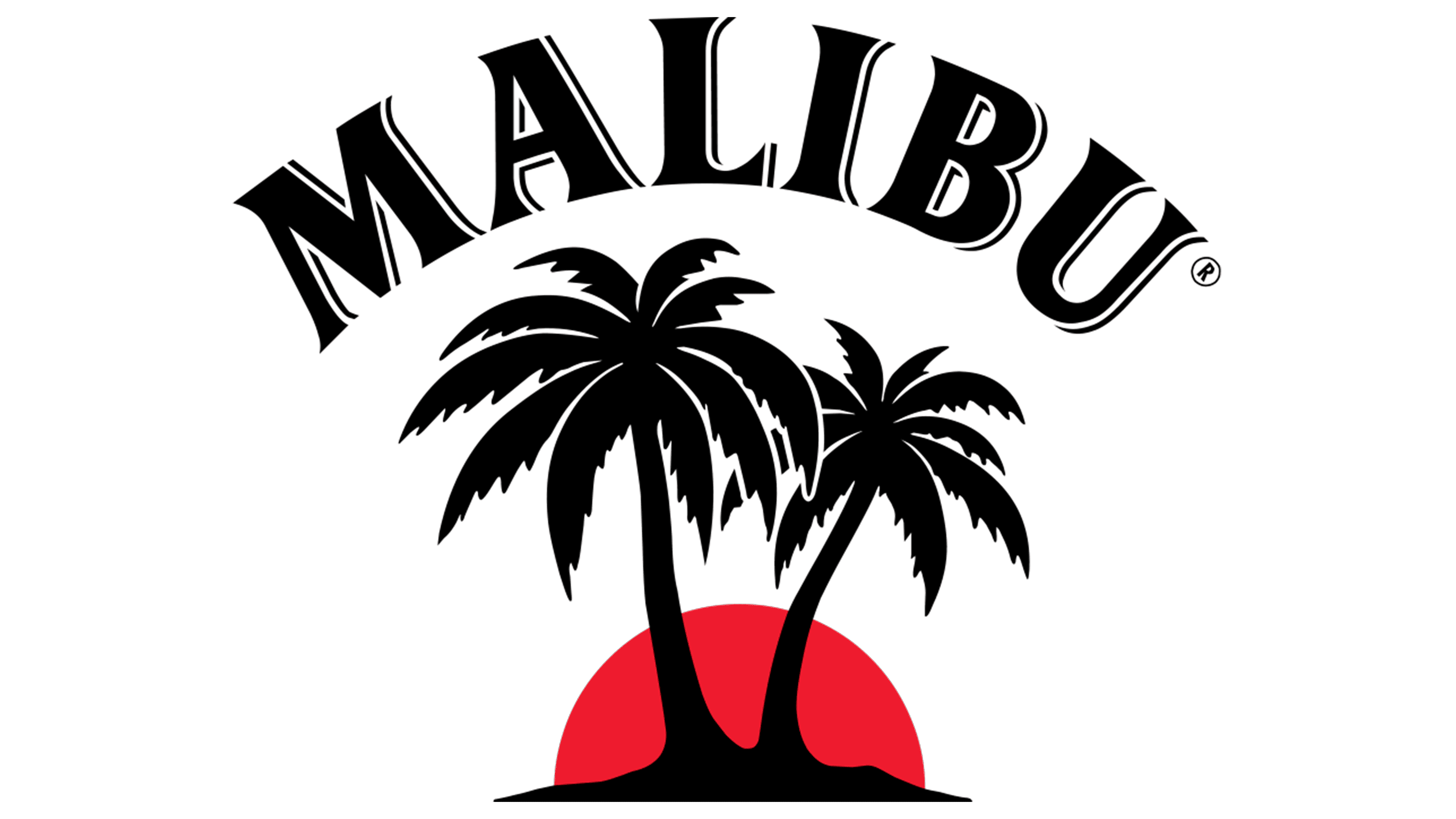
The emblem of the famous brand depicts two palm trees against a sunset background. At first, the logo was in black and white, but then it got colorful. Palms are located in the center: one is high, the other is low. A slight glare from the setting sun highlights the leaves. The opening variation also shows a piece of land. And in the later version, it is not: the plants seem to look into the porthole, inviting them to enjoy life in the carefree nature.
The original emblem depicted the sun’s disk in half; now, it is complete. It obscures the sky, promising a bright mood and excellent weather. Simultaneously, through the designers’ efforts, the red eventually turned into an attractive yellow, with a slight darkening along the edges.
What is Malibu?
Malibu is an alcoholic beverage based on Caribbean rum, coconut extract, and distilled water. The brand was introduced in 1982 and is now owned by Pernod Ricard. The liqueur has a refreshing tropical flavor, making it popular at beaches and resort parties; it is served over ice or in cocktails such as Malibu Sunset and Piña Colada.
1982 – 2013
![]()
As already mentioned, the Malibu logo features an exotic landscape that reflects the spirit’s place of production. The brand’s birthplace is the island nation of Barbados, so its debut emblem depicted a small island with two palm trees. The choice of vegetation is because Malibu liqueur has contained natural coconut extract from the first day. The artists detailed the trunks, leaves, and fruits, but presented them in a white-and-brown palette. The little piece of land below was also brown. The only bright spot was a red-yellow sun with a gradient. It rose on the horizon, so it looked not like a disk but like a semicircle. It can be assumed that then it was dawn, and the palm trees darkened at dusk. The brand name was at the top, forming an arch. It used a bold font with rectangular serifs.
2013 – 2019
![]()
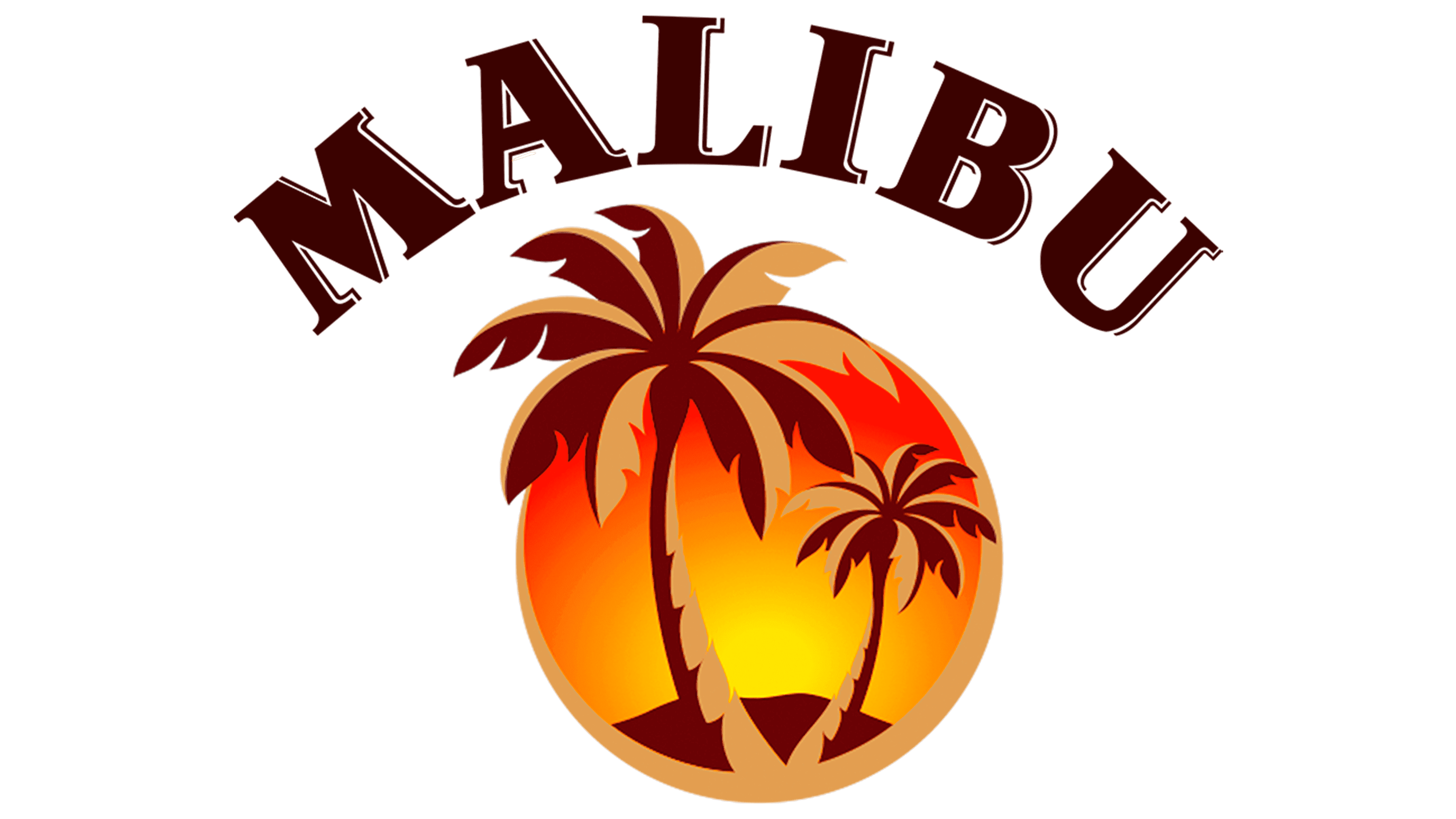
In 2013, the letters became more elegant, acquiring short, triangular serifs with rounded ends. At the same time, the inscription was enlarged, and a contrasting font was used. The palm trees changed places: the big one was on the left, and the small one was on the right. In addition, in this version, they did not grow from a piece of land (it was moved to the background) but from a dark gold ring that forms a frame. The palms themselves were part dark gold, part brown. The base was a red circle with a yellow gradient spot inside. Obviously, this is how the artists depicted the sun.
2019 – today
![]()
After another redesign, the lower half of the sky turned yellow, and the upper half dark pink, with the two colors smoothly transitioning into one another. The letters have lost the decorative contours that made them voluminous. The serifs have become much smaller, and they are short. But this is offset by extensions at the ends of the glyphs. The horizon line no longer looks like a hill; the artists have leveled it, although not perfectly. Instead of dark brown, light brown is now used, and beige with a green tint has replaced dark gold.
Font and Colors
The text part contains only the brand name. The word “Malibu” is placed at the top of the logo. It hangs in a semicircle over the palm trees, resembling an arch. They are set in a custom font based on the classic Bengali Serre, which echoes Fire Ladder (shadow lines) and Dragon Serial Heavy (a strict serif style).
The color scheme is traditionally Caribbean, with white (coconut pulp and white sandy beaches), orange, golden, yellow (sunny shades), and brown (coconut skin).