The Maltesers logo represents a symbol of childhood, and the brand’s products are a familiar taste to many. The light, airy milk-filled balls appeal to all taste buds. Seeing the chocolate candy with its light milk filling evokes a desire to forget everything else.
Maltesers: Brand overview
The origins of Maltesers may be traced back to 1937 when American industrialist Forrest Mars Sr. founded Mars Incorporated and came up with a novel idea for a light chocolate snack. At the time, Mars, a United Kingdom resident, set out to develop a product distinct from the conventional heavy chocolate candy.
The goal behind creating the company was to provide an “energy snack” that would satisfy women’s cravings for chocolate without making them feel guilty about their calorie intake. Mars invented a method for producing a milk chocolate-coated, malted milk product with a light, crunchy middle. The words “malt” and “teasers” were combined to create the name “Maltesers,” which reflects the lighthearted attitude of the product.
The candy was first made in a facility located in Slough, England. British consumers took to the distinctive texture and taste right away. Early promotion for the product emphasized its lightness with the phrase “The chocolates with the less fattening centre.”
Rationing during World War II restricted the manufacture of candy and many other confections. But following the war, the snack’s appeal skyrocketed, and the treat became a mainstay of British candy culture.
Mars increased production and distribution in the 1950s and 1960s. The product started to be exported, mostly to nations that were part of the British Commonwealth. During this time, the candy was promoted as the ideal snack for movie theaters, further solidifying its association with amusement and relaxation.
The 1970s saw a notable increase in candy’s appeal. During this decade, the famous marketing campaign, which still uses the phrase “The lighter way to enjoy chocolate,” was introduced. This ad highlighted the product’s distinctiveness and positioning as a less guilty pleasure.
Manufacture in Australia started in the 1980s, greatly increasing the brand’s market share in the Asia-Pacific region. In this decade, new package formats, such as individual portion packs and huge family packs, were also introduced.
For the brand, the 1990s were a time of innovation. Introduced in 1994, Teasers are flat chocolate bites that include small pieces of the original candy. This product brought in new customers and broadened the brand’s offering.
Throughout the 2000s, the company kept growing its market share worldwide. The brand started to expand rapidly in continental Europe and North America. Seasonal product variations, including Easter eggs from the brand, were also introduced during this period.
The product line saw additional advancements throughout the 2010s. Launched in 2012, Buttons are flat chocolate discs with the original candy’s distinct crunchy feel. The firm debuted Teasers in bar form in 2015.
In 2015, the brand introduced a new product called Teasers in the form of bars. Through this invention, the company could enter the chocolate bar market and draw in new customers by fusing the well-known taste of the original product with a practical bar style—the bargained popularity fast, especially with young people looking for easy-to-carry snacks.
A global campaign advocating for diversity and inclusivity was initiated in 2017. Several commercials for the campaign featured individuals with impairments narrating hilarious anecdotes from their lives. This campaign enhanced the brand’s favorable reputation and was well-praised for its innovative approach to advertising.
2018 the company introduced Buttons, flat chocolate discs with the brand’s signature crunchy feel, to its product lineup. This product provides consumers with an alternative method to savor the well-known taste of the original candy. Buttons gained popularity fast, particularly among youth, and aided the brand in solidifying its place in the market for chocolate snacks.
2019 was a noteworthy year for the firm in terms of its investments in sustainability. By 2025, the company intends to switch to only ecologically friendly packaging. This project involved cutting back on plastic usage and creating new, easily recyclable materials for packaging.
The company unveiled a brand-new product in 2020 called Truffles. With a richer, creamier taste, this premium version of the beloved candy was designed to appeal to an adult market looking for more sophisticated chocolate treats. The exquisite packaging used to offer the truffles made them appear like the ideal treat or gift for special occasions.
White Chocolate, a white chocolate version of the original product, was introduced in 2021. This product provided brand enthusiasts with a fresh taste experience and was created in response to white chocolate’s increasing appeal among customers.
A brand-new product line, Moments, debuted in 2022. This creative series created novel flavor combinations by combining different fillings with the iconic taste. The line included options including fruit, mint, and caramel fillings. Moments were created to appeal to consumers looking for more intricate and varied flavor experiences without sacrificing the iconic texture and form.
The company introduced the worldwide “Celebrate the Light Side” campaign in 2023. This campaign promotes optimism and the ability to find joy in small moments throughout daily life. Several commercials featuring real-life scenarios in which people discover joy and laughter were part of this campaign.
Additionally, the company increased its market share among vegans by launching “Plant-Based,” a variation of its original product composed only of plant-based ingredients.
The brand invested in expanding its online storefront that same year. A new online store with exclusive items and sets that can only be purchased online has been introduced.
Meaning and History
What is Maltesers?
This well-known candy company is well-known for its distinctive chocolate-covered malt balls. Mars makes these crunchy and light sweets, which have a unique spherical form with a center that resembles a honeycomb. The product has a creamy milk chocolate coating over a crunchy malt-flavored center, which creates a nice textural contrast. Their airy texture and comparatively low calorie count compared to solid chocolate bars are highlighted by their marketing statement, “An easy way to enjoy chocolate.”
1937 – 1943
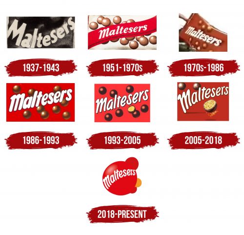
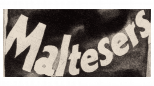
The first Maltesers logo was straightforward in form and symbolism. It reflected all the delicious features of the product and the elegance of each ball from the package. The color choices were minimal, focusing on the name of the sweets. The large, light-colored letters on a dark background stood out. The wavy inclination of the text element turned the letters into dancing symbols, indicating playfulness, lightness, and absolute freedom.
The logo aimed to emphasize the product’s airiness through various means. Therefore, the logo had an overall geometric form (rectangle) but lacked sharp corners on each consonant letter. Letters like “l,” “t,” “s,” and “r” had rounded corners.
In the first iteration, only the capital letter was slightly more restrained than the others. It was simple, like traditional chocolate bars, while the rest of the letters were new, light, and airy, like the snack balls.
The brand’s logo stood out among competitors with its individuality and dynamics. The “Maltesers” logo was well-identified and liked by both children and adults.
1951 – 1970s
The desire to improve product quality led to significant changes in the logo. It is now colorful, bright, and more informative.
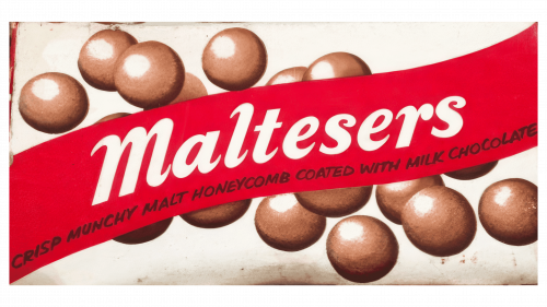
The logo no longer consisted of just two elements – text and background. New additions were made: another background and images of the most delicious chocolate balls with natural ingredients and superior filling. Alongside the letters’ legibility and the red background’s beauty, the clients were enticed to try what looked delicious against the milky background.
The visualization of the packaging contents attracted more target audiences, increasing overall sales of the chocolate treats.
The realistic depiction of dark brown products with white centers created a desire to try the treat immediately. The brand name in white and red indicates the creator.
The letters were now voluminous and neat. The capital “M” was similar to the others. The logo had 16 chocolate balls, and each new logo development altered the number of sweets.
Detailing included a phrase written in black script on a red banner: “Crisp Munchy Malt Honeycomb Coated with Milk Chocolate.” The company’s honesty and openness towards its customers were highlighted. The recipe remained a secret, but the ingredients of each ball were boldly displayed on the logo. Interestingly, people’s attention was held longer on this new logo than on its predecessor. Everyone wanted to know the ingredients of the light snack.
1970s – 1986
This period marked the company’s position as a provider of pleasure. Each treat promised multifaceted happiness and joy. The taste and benefits, energy boost, and good mood were guaranteed for anyone who succumbed to the temptation of just one Maltesers ball.
Such a philosophy was reflected in the logo. The bright red background was eye-catching and memorable. The white letters were noticeable and well-identified the company. Nine large chocolate balls tempted and aroused hunger. The combination of elements created an excellent visual effect. The dynamic letters tilted and following one another like a boat on waves enhanced this effect.
1986 – 1993
The focus now shifted to graphics and innovations. Keeping up with the times, the company used modern techniques to draw attention to its products. The background became brighter, richer, and more contrasting. The white letters were a key element of the overall color scheme. The balls appeared as if in free fall, symbolizing the freedom of choice and the excellent opportunity to quickly satiate hunger. Interestingly, the arithmetic of letters and balls matched, conveying reliability and stability through identical numerical values.
1993 – 2005
In 1993, a logo combined familiar elements from previous logos. Tradition took the forefront. The focus was on the familiar, unmatched taste of the beloved candies. Therefore, the red background was retained. The letters, appearing lively, were placed in a row with minimal spacing between them. The product was depicted but in a new format. A half ball allowed one to see the superiority of the filling. This cross-section image of the candy effectively replaced the phrase “Crisp Munchy Malt Honeycomb Coated with Milk Chocolate” from 1951.
2005 – 2018
The modern aesthetics of the logo were bright and simple. Each element was highly visualized. There were no excesses since the treats were unique and packed with countless taste highlights. The new logo featured three balls, one showcasing the value of the filling. The candies were voluminous; the background remained traditionally red. Large and slightly elongated letters were arranged from larger to smaller along a smooth, oval line. They were dynamic, much like the company’s development over 80 years.
2018 – today
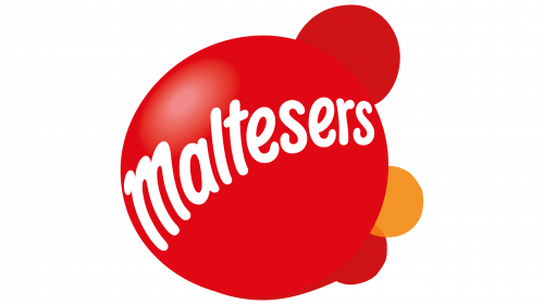
The new period marked significant changes: the focus shifted, and the letters became part of the voluminous, airy treat. The red color, attracting attention, remained but now had several shades, highlighting the intricacies of the airy balls that promised a unique aftertaste for everyone who tried them.
Interestingly, the new logo featured a single round orange element for the first time, standing out against the others and identifying the product as unique.
Individuality became crucial, alongside quality – the hallmarks of the new era, captured in the logo.
