


![]() Mammut Logo PNG
Mammut Logo PNG
The Mammut logo is associated with mountaineering equipment, but not directly; it uses unusual images of snowy mountains. This is an example of a successful visual identity that plays with the brand’s name.
Mammut began in 1862 in Dintikon, Switzerland, where rope maker Kaspar Tanner opened his own workshop after training in Germany. His first ropes were made for farming, transport, and everyday work. Tanner later moved to Lenzburg, built a covered workshop, and passed the family business to his son Oscar around 1897.
As mountaineering grew in Europe, Tanner’s ropes found a new market among climbers. In 1943, the company registered the Mammut name for its rope line, using the mammoth as a symbol of strength. In 1952, the firm adopted the Mammut name fully and focused on ropes for climbing and sailing. That same year, it launched Mammut-Argenta, a twisted nylon glacier rope. In 1964, Mammut-Dynamic became the first single rope certified by the UIAA.
In 1968, Mammut entered the field of avalanche safety with the Barryvox VS-68 transceiver, developed for the Swiss army and released commercially in 1974. The brand then moved beyond ropes: in 1978, it launched Altitude jackets and pants made with Gore-Tex, followed by sleeping bags in 1981 and softshell products in 1984. Under Conzzeta, the company added Furst AG in 1989 and Toko in 1993. In 1994, it introduced the mammoth logo, which is still used today.
In the 2000s, Mammut expanded through acquisitions. Ajungilak joined in 2001, adding sleeping bags, and Raichle followed in 2003, bringing expertise in mountain footwear. That year, the company became Mammut Sports Group AG, based in Seon. In 2006, it released Pulse Barryvox. In the alpine equipment market, Mammut competed with Black Diamond and Arc’teryx. In 2021, Conzzeta sold Mammut to British investment firm Telemos Capital.
Meaning and History
![]()
The brand’s visual recognition is high among millions of mountain fans worldwide. The logo is easy to remember and stands out from the competition thanks to the mammoth on the emblem. For many, winter is considered the best time of year to conquer new mountain peaks. Also, it is worth noting that over the brand’s more than 150-year history, the logo has not changed much.
It consists of a word inscription and a legendary emblem located on top. These two elements contrast perfectly, making the image more holistic and progressive.
What is a Mammoth?
It is one of the largest international companies specializing in mountaineering and travel products.
The company name is written in a classic bold sans-serif font. The lines in the letters are thick and crisp, which adds a positive feel to the brand. Even though the symbols look simple, they harmonize with the overall concept, creating a sense of confidence. All letters in the verbal inscription are in capital letters and red, which many people associate with passion and development. The distance between the characters is significant, which adds even more status and authority to the picture.
However, the key focus of Mammut’s potential customers is directly related to the logo. It’s a red circle with a thick black outline. Inside it is a mammoth, turned to the right and looking straight ahead. It is completely black except for the ear, tusks, and eyes. It is interesting to note that the white tusk extends slightly beyond the circle, demonstrating how powerful the company has chosen as a symbol. It is worth noting that the emblem is often used independently of the traditional wordmark logo. For example, if we are talking about an icon on the official website or a sticker for a trademark’s branded products.
Font and Colors
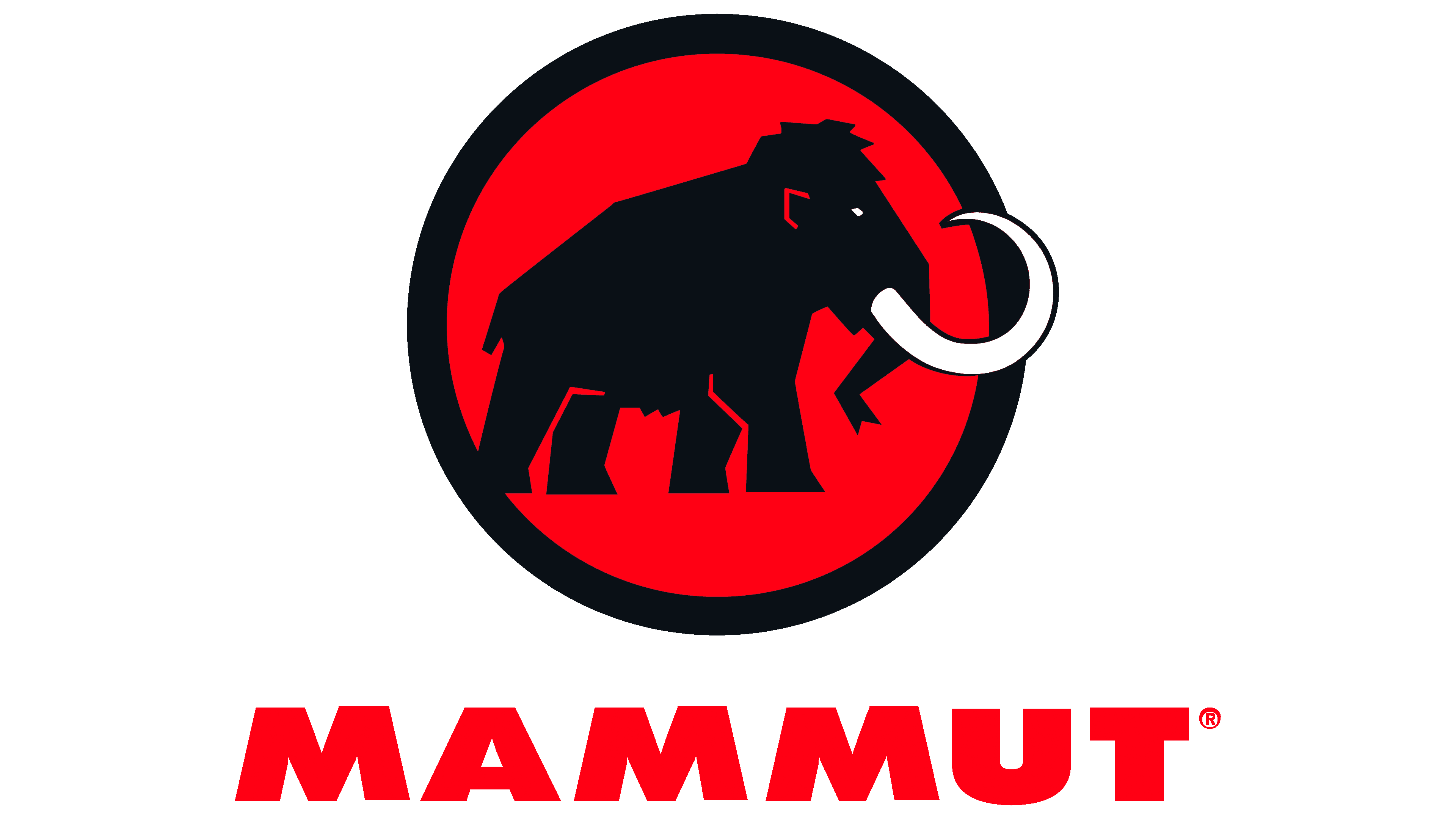
The classic bold sans-serif font was chosen for the word caption. It looks quite traditional, with no unique elements. However, capital letters and spacing between characters allow the company logo to stand out from the competition.
The logo palette consists of red, black, and white colors. Red dominates because the emblem’s frame is painted this color. In general, the chosen option characterizes the company as progressive and energetic. Thanks to the effective color contrast, the brand emphasizes comfort and safety for its customers.