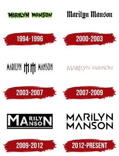
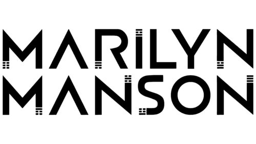
Marilyn Manson’s logo looks sacred, ancient, and simultaneously futuristic. The sign is shrouded in mystery, hidden behind ancient symbols, and embodies the transformation to which the band encourages society with vices and sins.
Marilyn Manson: Brand overview
| Founded: | 1989 – present |
| Founder: | Brian Hugh Warner |
| Headquarters: | United States |
| Website: | marilynmanson.com |
Meaning and History
Despite external differences, the Marilyn Manson group’s emblems share an undertone of fear and negativity. Suppose one looks at the essence of the albums, the reasons for writing, and the lyrics of the songs. In that case, it becomes clear that the performers’ creativity is permeated with the themes of rebellion, aggression, cruelty, and disappointment, which the logos convey. Each sign of the performers was created for a specific compilation and resonated with the mood and views of the band’s frontman.
What is Marilyn Manson?
A musical group with profound and meaningful but somewhat aggressive creativity. Most of the songs are inspired by art. The group focuses on the personality of the vocalist Marilyn Manson, who sings, draws, and writes books. Despite frequent attacks and even hearings in Congress due to the content of the songs, three albums by the performers have platinum status, and three are gold, and the group has entered the Top 100 Heavy Metal Vocalists in 44th place.
1994 – 1996
The first logo appeared on the cover of Portrait of an American Family – the artist’s debut studio album. The emblem is designed in horror style and consists of the group’s black letters, surrounded by green slime dripping from them.
Originally the album was to be called The Manson Family Album, which directly indicated the reason for such a choice of emblem. The surname Manson refers to the maniac Charles Milles Manson, who created a group called Family. The frontman, whose name is used as the name and logo of the group, took the pseudonym after this maniac’s surname.
Part of the album was recorded in the house where the Family gang committed murder. The scary letters of the emblem hint at these horrible events and convey the perversion of the concept of “family” in the context of American culture. Interestingly, the name Marilyn in the logo is taken after the style icon Marilyn Monroe to show contradictions between the visible and inner content of many concepts in the modern world.
2000 – 2003
The emblem of the fourth album Holy Wood (In the Shadow of the Valley of Death), is done in the Old English Blackletter style, used for the logos of some famous print daily publications.
The choice draws an analogy to the news covered in newspapers and is related to the album’s theme. The musician was prompted to Holy Wood by unfounded accusations against the group after a high-profile murder of 12 children in a local school by two teenagers.
The newspapers wrote that the juvenile criminals were fans of Marilyn Manson, and their songs inspired them to brutality. The group endured a strong wave of accusations in the press, and afterward, it turned out that the teenagers were not MM fans.
The black gothic letters and a symbol in the form of Sigillum Dei on the album cover associate the logo with mysticism, horrors, and Gothic subculture. Holy Wood is an image of America mired in sin and consumption, thereby nurturing such child monsters, the author tries to say in the album.
2003 – 2007
For the fifth release, The Golden Age of Grotesque, the artist chose sharp needle-like letters and a symbol in the form of two transformed Ms, which on the album cover are executed in red.
The symbols resemble Nazi symbols, as the inspiration for the album was the life of the Weimar Republic in the 18-30s. The M letters in writing repeat the image of the eagle on the coat of arms of Germany in the early 20th century. Subsequently, the bird was inherited by the democratic party and became a symbol of Nazism.
The sharpness of the letters embodies the theme of the grotesque, a slight madness. The sharp glyphs are the author’s thoughts, as piercing as needles. The reflections in the songs are presented in a continuous stream without censorship. This technique in creativity is called the “stream of consciousness.” The logo it’s reflected by the tight placement of the letters, reminiscent of brain wave activity.
The connection between the emblem, the album’s theme, the song’s content, and Germany in the 30s is quite chaotic. However, Manson tried to draw a parallel between the attitude in America towards the group’s creativity and the Nazi persecution of avant-garde artists that emerged in the early 20th century.
2007 – 2009
The sixth album, with the unusual title, Eat Me, Drink Me received a fitting emblem of thin red lettering, most often placed on a black rectangular background.
The red color, symbolizing love, was used for the logo design for the first time. The shade emphasizes the collection’s content, which is entirely devoted to lyricism and the theme of feelings.
The choice of color and the thin, almost invisible threads of letters correspond well with the disc design with trickling bloodstreams, hinting at the blood flowing from a wounded heart.
The vampire theme also didn’t bypass the logo. Most of the author’s songs were inspired by the movie Trouble Every Day, about love and the suffering of vampires.
The letters have no common base and are placed chaotically, indicating confusion and changeable emotions. The theme was prompted by a difficult divorce from a wife who grew tired of their misunderstandings and the frontman’s infidelities. The singer unexpectedly received the divorce papers on his birthday, an additional blow. This loss of footing is shown in the instability of the inscription.
Interestingly, the singer never performed the album’s songs again due to painful associations.
2009 – 2012
In 2009, a logo appeared for the album The High End of Low. An interesting approach in writing the words where common letters for the title (M, A, and N) are written in capital letters, and the differing parts of the words are placed between them in a reduced version.
The division into two levels inside the inscription embodies High and Low from the album’s title. The collection talks about death, loss, painful love’s end, full of anger and pain. Two levels are the separation of two people, opposition, love, and hate, the transition from the world of the living to the world of the dead.
The image hints at the album cover, the design of which is based on the emblem of the film Tengoku to Jigoku (“heaven and hell”). In the English translation, the title of the director’s film is High and Low.
The overall image of the emblem resembles a tombstone. The black rectangular background, on which the inscription is based conveys the gloomy and emotional compositions of the collection, negative and painful experiences. The white color of the letters forms a contrast. The color palette embodies life and death.
The inscription seems slightly splashed or stained. “When love dies, and pain comes, it poisons, ruins life,” said the dirty letters.
2012 – today
The latest symbol was devised for the 8th album of the artists, Born Villain, released in the spring of 2012. The emblem embodies the collection’s theme, which concerns the desire to change the terrible world.
The black color was used for the long straight glyphs of the inscription, reflecting the theme of horror and negativity. Throughout the album, trying to improve the world, the performer turns into a monster and realizes that it’s too late to change anything. The theme of the battle between light and darkness and the search for an ideal is inspired by “The Flowers of Evil” by Charles Baudelaire.
The ends of each letter have been turned into hexagrams from the Chinese Book of Changes. This ancient treatise dates back to the 700th year BC. It contains 64 symbols for divination. Long lines reflect activity, light, and broken lines – passivity and darkness.
The placement of hexagrams in the logo demonstrates attempts to find a path to the future. The change of symbols from letter to letter describes the process of transformation. Starting with the most passive figure in the first M, the author moves to the most active in the last N.
Despite the sad outcome in the songs, the emblem reflects the hope that human action can influence the world. The villain in this context appears as a “moving” character, unafraid to show his weaknesses and desires.
Font and Colors
Black – the primary color of the group’s emblems. Indicates the somewhat grim themes of the songs. The eternal confrontation between evil and good and the latter’s frequent loss are often heard in the group’s works.
The font of the inscription is futuristic and executed in a minimalist style. Transformation of the ends of letters adds uniqueness. The lack of crossbars in A and open glyphs in R leave space for actions, emphasizing the theme of dynamics, as if the word is in the process of writing. Even the crossbars of the letters are an unshakable monumentality of the laws of being, which the hero tries to shake.
Marilyn Manson color codes
| Black | Hex color: | #000000 |
|---|---|---|
| RGB: | 0 0 0 | |
| CMYK: | 0 0 0 100 | |
| Pantone: | PMS Process Black C |

