 Markel Logo PNG
Complex insurance claims require detailed analysis and calculation, especially when standard policies do not fit a specific situation. Assessing risks for non-standard properties, corporate projects, and specialized sectors requires experience and precise expertise. The Markel logo is associated with a company that specializes in insuring complex and non-standard risks and works with businesses and professional market participants.
Samuel Markel founded Markel in 1930 in Richmond, Virginia. It began as a small underwriting agency. Its main focus was ensuring niche risks for small businesses. Its first clients were shops and workshops that large insurance companies had denied coverage.
By the 1950s, Markel began operations outside its home state. The company offered professional liability policies and specialized insurance programs for industry-specific clients. In 1986, the company listed its shares on Nasdaq.
In the 1990s, the company acquired Essex Insurance, Shand Morahan, and Terra Nova Insurance. These deals opened access to the international Lloyd’s market. In the 2000s, Markel strengthened its position. During this period, it acquired Evanston Insurance. In 2013, the company purchased Alterra Capital Holdings for $ 3.1 billion. This deal made Markel one of the leading U.S. insurers specializing in niche segments. Annual insurance premiums reached about $ 5 billion.
At the same time, Markel Ventures grew. It focused on investments in manufacturing and service businesses. Acquired companies included AMF Bakery Systems and Havco Wood Products. By 2020, the investment portfolio included about 20 companies, with combined revenue of $3 billion.
In 2023, Markel acquired the British company Nephila Capital. In 2024, the company introduced artificial intelligence technologies into risk assessment operations.
The company has a diversified structure that combines specialty risk insurance, reinsurance, and investments in public companies. It manages a broad portfolio of industrial assets and remains one of the largest independent participants in the U.S. insurance market.
Meaning and History
What is Markel?
An American financial group headquartered in Richmond that combines insurance and investment operations. It operates in 18 countries with 80 offices and specializes in insurance for complex risks for businesses and individuals. The structure includes three divisions: one serves small companies, educational institutions, and transportation; the second covers professional liability and property risks; the third operates in international markets in Europe, Canada, Latin America, and the Asia-Pacific region. Premiums are invested through a subsidiary that manages assets, including AMF Bakery Systems. Annual insurance premium volume exceeds $ 9.8 billion, and assets under management exceed $ 33 billion.
1930 – 1940s
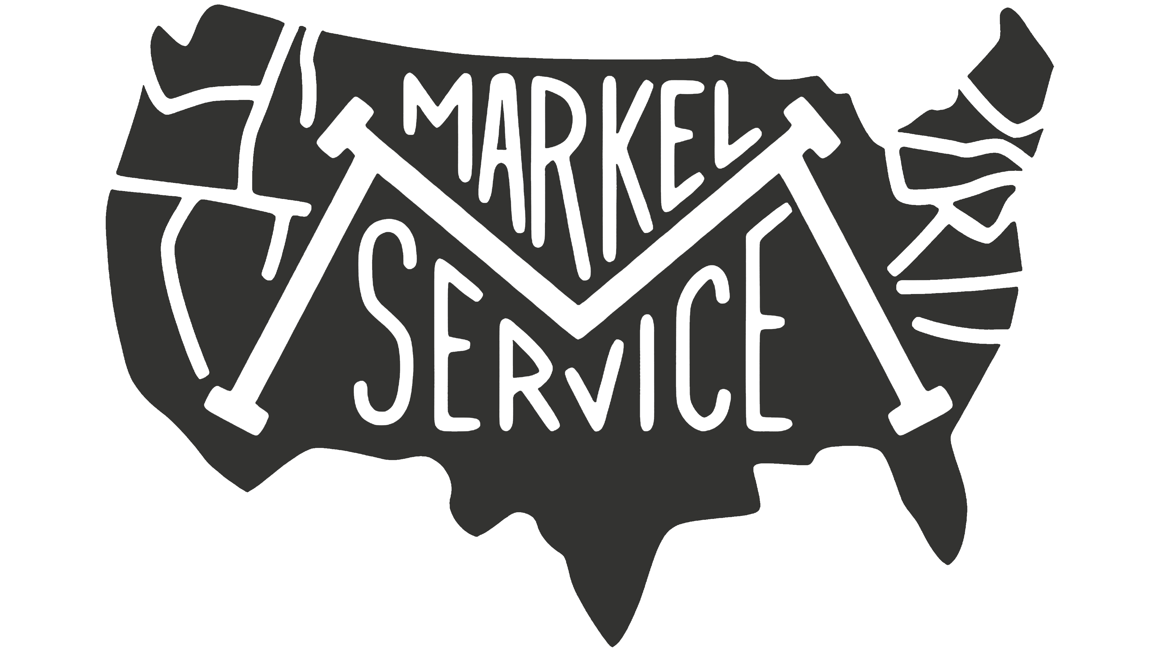
The early Markel Service emblem combined a map of the United States with a network of American highways. A dark gray outline of the continental United States formed the logo’s outer shape. At the same time, white lines inside represented major roads. The routes appeared more densely concentrated near the East and West Coasts. The map identified the company’s geographic market and linked its name to nationwide commercial transportation insurance.
A two-word inscription appeared inside the outline. “MARKEL” occupied the upper line, with “SERVICE” below. A large letter “M” made of diagonal strokes stood between them. Its form resembled a metal framework or engineered structure. The remaining letters were narrow, tall, and sans serif. Variations in letter height and the enlarged “M” allowed the name to fit within the map’s irregular boundaries. The white lines stood out against the dark background, keeping the roads and lettering distinct.
The transportation theme reflected the company’s early business. Samuel A. Markel began insuring motor carriers in 1930. The number of trucks and buses in the United States was growing rapidly. Still, many insurance companies considered the emerging industry too risky. Markel concentrated on this market and organized services for passenger and freight transportation companies. The road map represented the business through the field it served.
The founder’s sons Lewis, Irwin, Stanley, and Milton joined the business during the 1930s. The family company became Markel Service, Inc., named after the Markel family. During the 1940s, the company became known in the United States for its work in commercial transportation safety and handling insurance claims. The emblem accompanied the family business as it developed within the American transportation market.
1940s – 1990s

After World War II, Markel simplified its emblem, retaining the letter “M” and the outline of the United States. The full Markel Service name gave way to a short letter-based mark. The composition became a compact, elongated block. Fewer details remained, and the company’s initial letter took the leading position.
A dark gray field with angular edges formed the background. A light silhouette of the continental United States appeared inside it through negative space. A large gray “M” occupied the map. Broad serifs, heavy vertical supports, and an extended base gave the letter a massive appearance. The contrast between the light map and dark letter separated the company’s geographic market from its name.
A wide decorative frame surrounded the outer section. Repeated diagonal lines ran along its edges, forming opposing slants. The pattern resembled technical markings or transportation packaging. The ornament enclosed the map around its perimeter and placed the country’s silhouette inside an emblem with fixed proportions.
Markel began operating outside the United States by 1951. It entered the Canadian market through Markel Service Canada, Ltd. The U.S. map remained in the postwar logo as the company entered the neighboring market. During the following decades, the family-owned group expanded its insurance expertise. It gradually moved beyond its original focus on transportation risks.
1990s – 2023
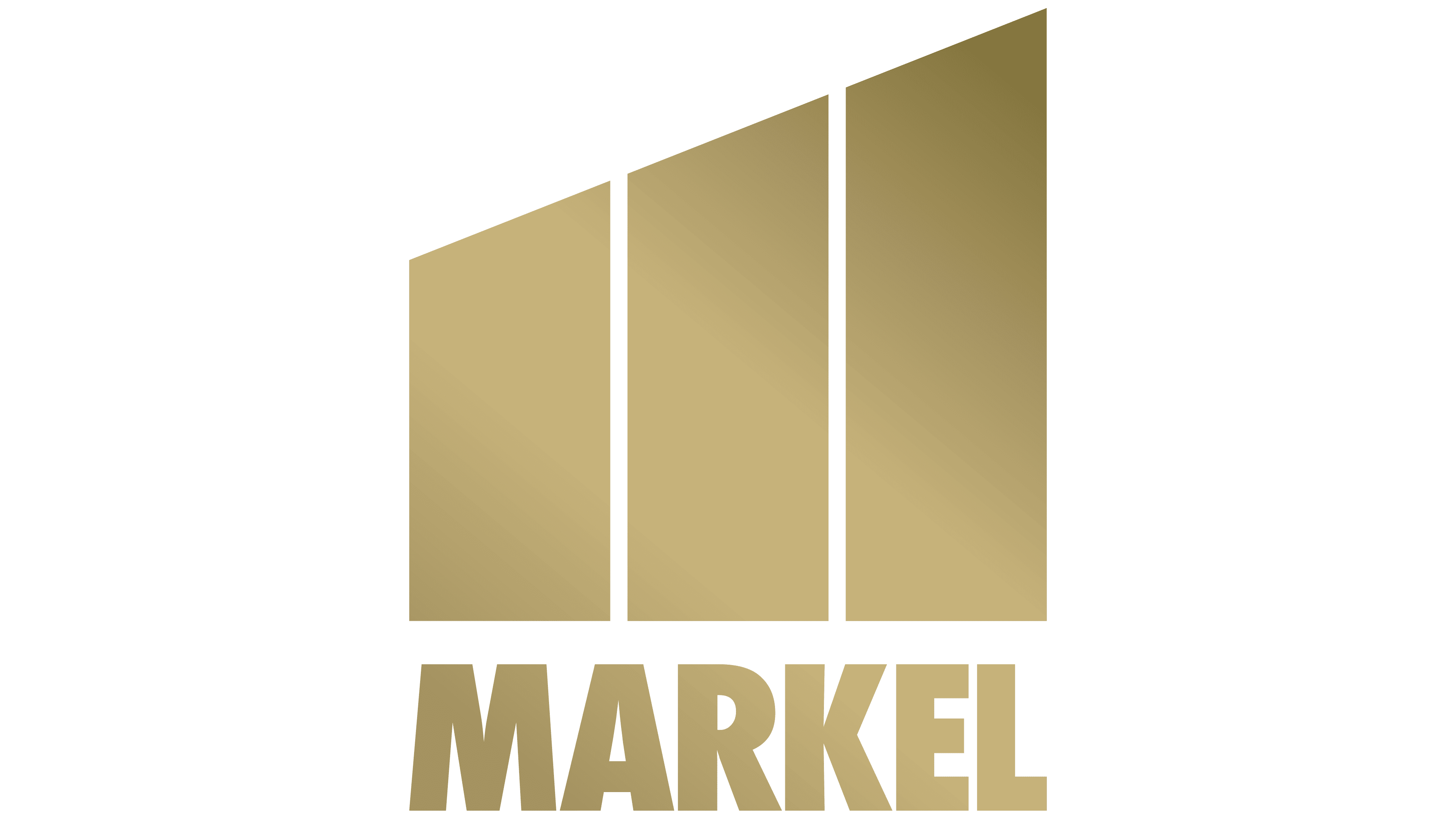
Markel’s stock market debut changed how the company presented itself to investors. Markel Corporation completed its initial public offering on NASDAQ in December 1986. After the listing, the short name Markel became the primary corporate brand. The transportation imagery of the earlier emblem gave way to abstract geometry suited to the company’s growing business structure.
During the 1990s, the corporate signature gained a figure made of three gold-colored planes. The vertical sections stood side by side and increased in height from left to right. Their lower edges rested on the same horizontal line, while their upper edges rose at the same angle. Narrow white gaps separated the trapezoidal sections while preserving their connection within the larger form.
“MARKEL” appeared below the image or to its right, depending on the layout. The name used heavy uppercase sans-serif letters. Even outlines, dense forms, and consistent-thickness strokes complemented the geometry of the gold sections. The wordmark matched the color of the figure above it. The vertical version suited narrow formats, while the horizontal version placed the emblem and “MARKEL” on one line.
The three-part figure represented the company for approximately 30 years. By the 2010s, it identified a group involved in insurance, reinsurance, investing, and developing Markel Ventures. In June 2016, the emblem was installed on the Central Park Plaza building in Omaha. A corporate press release described it as the property’s new logo. The published image repeated the composition of three gold-colored planes with the “MARKEL” wordmark.
2023 – today
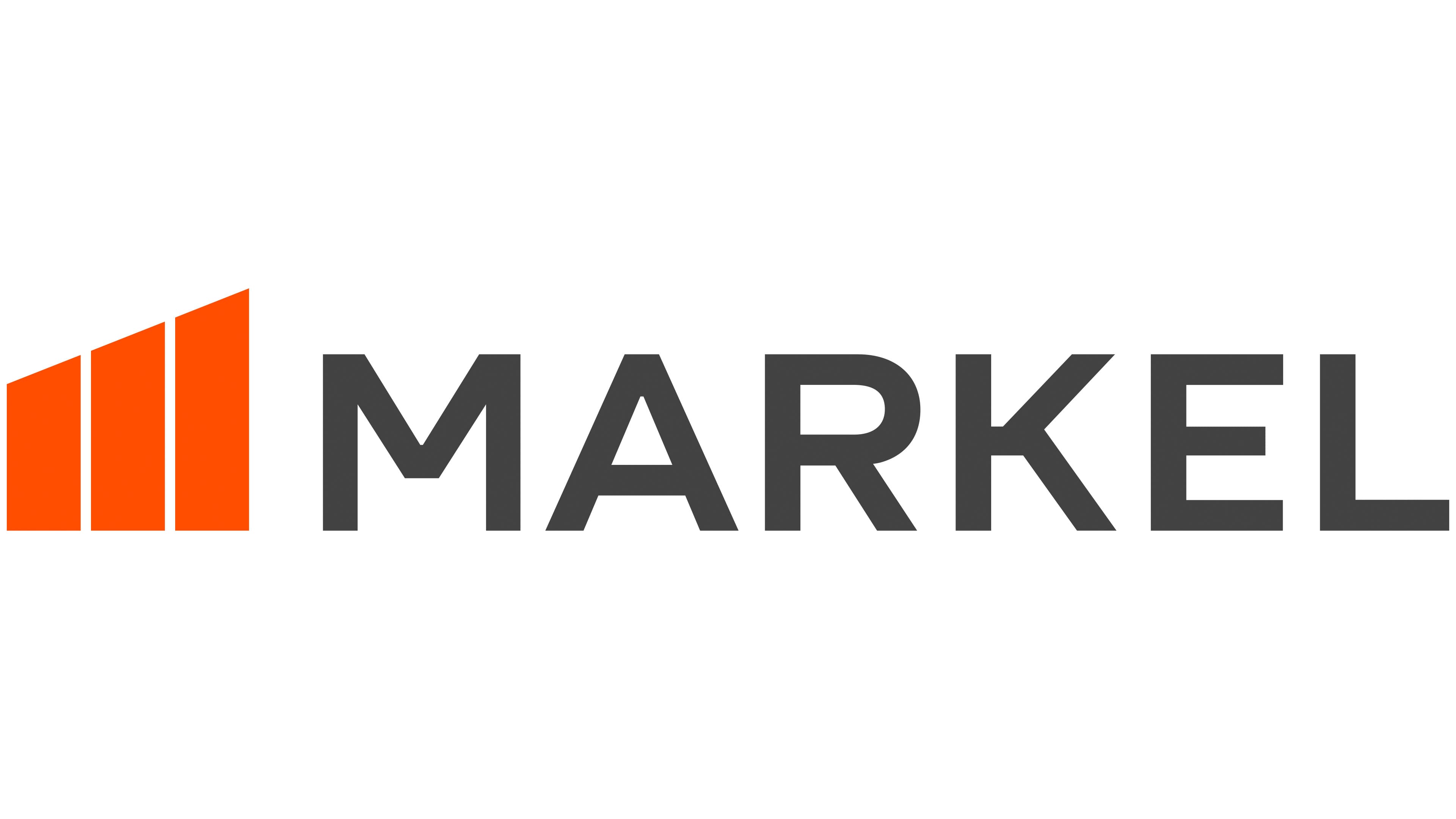
Before 2023, Markel divisions used red, while corporate identity guidelines varied by country. In 2023, the company began the first global brand overhaul in its 90-year history. Markel introduced the new identity on May 18 with Saffron Brand Consultants. The agency studied how brokers and employees perceived Markel before updating the wordmark, imagery, and brand structure.
The project centered on the idea “People Powered,” referring to the role of people and personal relationships in the insurance business. Markel used it to unite its international divisions through shared principles for communicating with customers, brokers, and employees. The three-section figure remained as a link to the earlier identity, with its shape and color updated for the new system.
Three vertical orange sections appear to the left of the name. They resemble elongated four-sided blocks with slanted upper edges. Their heights increase to the right, while their lower edges rest on a single horizontal line. The outlines became more even, and wider white gaps between the planes improved their use in digital formats. Bright orange replaced the muted gold tone and became part of the brand’s primary color system.
The dark gray word “MARKEL” appears on the right in large uppercase sans-serif letters. The geometric basis of the former lettering remains, while the new characters have more open, softer contours. Uniform stroke thickness and even horizontal alignment balance the stepped figure. Orange distinguishes the three sections, while dark gray separates the name and gives the corporate signature a professional appearance.
Markel Corporation legally became Markel Group Inc. on May 26, 2023. The new name reflected the holding company’s three business areas: insurance, investments, and the Markel Ventures group of companies. The Markel family name remained because of its origins and long-standing use throughout the business. Markel Group became the holding-company name, while the specialty insurance operation continued under the Markel brand and the orange-and-gray logo introduced in 2023.