Maroc Telecom: Brand overview
In 1998, Maroc Telecom became Morocco’s main telephone service provider when the country’s telecommunications market was just beginning to become competitive. The company was initially state-controlled, but in 2001, Maroc Telecom was privatized, and a 35% stake was transferred to Vivendi Universal. In 2004, the company went public, listing its shares on the Casablanca and Paris stock exchanges.
A turning point occurred in 2006 when Vivendi transferred the majority of its stake to Emirates Telecommunications Corporation, known as Etisalat, and became its majority shareholder. In 2013, Maroc Telecom expanded its footprint across Africa by acquiring Atlantique Telecom. As of 2021, the company had more than 70 million mobile users dispersed across various African businesses.
Today, Maroc Telecom is Morocco’s leading telecommunications operator, with Etisalat holding the majority of the company’s shares. The corporation has expanded beyond Morocco and now serves more than 50 million people in 10 different African countries, offering a wide range of mobile, fixed-line, and Internet services. Although the company is no longer a monopoly in Morocco, it remains a major player in the country’s telecommunications market.
Meaning and History
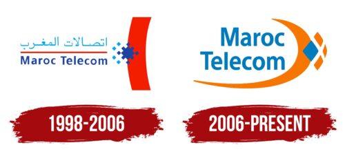
1998 – 2006
2006 – today
The Moroccan company reflected its core value – specialization in telecommunication services- in its logo. It depicted them in the form of a semicircle with a symbolic diamond. The crescent-shaped element also resembles a crescent moon and a boomerang. Its right side shows a composite geometric figure consisting of four rhombuses of different sizes. The largest of them is blue in color and is closest to the viewer. The other three, like the arch, are colored orange. The name of the company is located in the middle and is written in rounded letters. The font is mostly lowercase, except for the first glyphs.
The logo gives the impression of an interesting combination of shapes that tell their own story. The half circle and diamond in the center seem to wink towards high technology and valuable services. The four rhombuses, each a different size, seem to be stepping stones to something even steeper. The big blue diamond is like the main event, front and center. The other rhombuses and the orange crescent moon create a feeling of warmth and hospitality. The name in the center ties everything together like the star of the show but keeps things calm with its rounded letters. The overall design feels both high-tech and inviting.
Maroc Telecom color codes
| Safety Orange | Hex color: | #f67701 |
|---|---|---|
| RGB: | 246 119 1 | |
| CMYK: | 0 52 100 4 | |
| Pantone: | PMS Bright Orange C |
| Star Command Blue | Hex color: | #007bbb |
|---|---|---|
| RGB: | 0 123 187 | |
| CMYK: | 100 34 0 27 | |
| Pantone: | PMS 7461 C |
