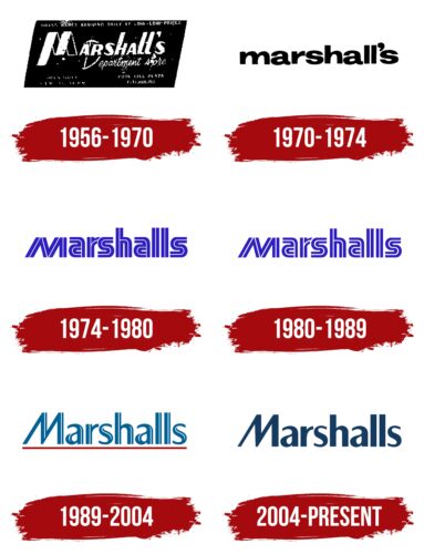
The minimalist Marshalls logo symbolizes professionalism and reliability. It creates a sense of stability and, due to its simplicity, invokes trust in the brand. The recognizable emblem attracts consumers looking for affordable but high-quality goods.
Marshalls Inc: Brand overview
| Founded: | 1956 |
| Founder: | Alfred Marshall, Bernard Goldston, Norman Barren, Irving Blitt |
| Headquarters: | Framingham, Massachusetts, U.S. |
| Website: | marshalls.com |
Meaning and History
The Marshalls logo has changed several times to keep up with modern design trends. However, it has always remained universal, as the store chain offers various products, from children’s toys to cosmetics. The emblem is used as a sign over the entrances to the department stores and contains the brand name derived from Alfred Marshall’s surname. Since the 1950s, the style has evolved: the concise black-and-white inscription has turned into a blue wordmark, characterizing the company as fashionable and progressive. Its visual elements, such as color, font, and letter shape, help create a recognizable image.
What is Marshalls?
Marshalls is an American chain of discounters operating in the United States, Canada, and Puerto Rico. It has been in existence since 1956, and since 1995, it belongs to the multinational corporation The TJX Companies. Its department stores sell well-known branded goods at substantial discounts.
1956 – 1970
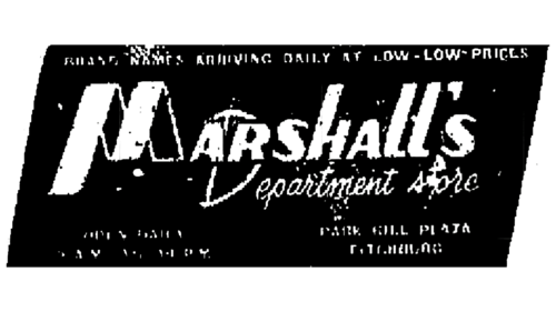
The old logo was used in newspaper advertising and was black and white because color printing was not common at that time. It contained the word “Marshall’s,” composed of bold glyphs with a slight rightward tilt. Notably, the “M” looked like a tape folded several times. All the letters were uppercase but varied in size. Both “l” letters seemed lowercase due to shortened horizontal strokes. Moreover, the left vertical line of the “H” was longer than the right one.
A thin handwritten “Department store” inscription was slightly lower, executed in legible handwriting. At the very top, information about the brand was provided, specifically that it specialized in selling goods at low prices. The text was based on a large black parallelogram, harmoniously matching the italicized font.
1970 – 1974
In 1970, a concise word mark in black appeared. Designers achieved visual harmony by making all letters lowercase and rendering the company name in a bold sans-serif font. It roughly resembles the Rude Extra Wide Extra Bold by DSType, which also stands out for its rough glyph shapes and the high contrast between the thickness of the main and secondary strokes.
1974 – 1980
The logo of the second half of the 1970s contained a neon-blue word “Marshalls” – this time without an apostrophe. The letter “M” was uppercase but was at the same height as the lowercase “a,” “r,” and “s.” Thin white lines were drawn inside each glyph, creating an illusion of a wireframe structure. The contour font was used for decorative purposes: the stripes provided an interesting contrast between the filled areas and the void inside the letters. Meanwhile, the name of the chain of stores remained quite legible.
1980 – 1989
A few years after transitioning to Melville Corporation, the Marshalls store chain underwent rebranding. Since it was very popular at the time, it had to retain the old design by which customers recognized it. Therefore, the style of the contour font remained the same. The designers even enhanced the visual effect by increasing the thickness of the white lines drawn inside each letter. The blue color changed slightly: its neon shade became a little lighter.
1989 – 2004
In the late 1980s, a modified Optima font with thinner and more elegant letters began to be used in the emblem. The internal white lines became less relevant: they no longer mirrored the shape of each glyph but were shortened and looked like glares from the light coming from the right. The uppercase “M” became tall but retained its recognizable oblique shape. The blue color stopped being neon and acquired a dark turquoise shade.
The word “Marshalls” was underlined with a red stripe. It didn’t have a particular symbolic meaning but served as a design element that highlighted the brand’s name. The decorative stripe created a contrast to enhance the visual interest in the logo.
2004 – today
In the new millennium, the company changed the wordmark, removing the red horizontal line. The simplification of the design also affected the inscription, which lost its internal white stripes. This improved the legibility of the logo and helped to give it a modern and elegant look, consistent with fashionable minimalism. The blue color became noticeably darker, which also positively affected the perception of the text. Probably, Marshalls wanted to adapt its emblem to the visual identity of TJX Companies, to which it has belonged since 1995.
Font and Colors
The name of the department store chain is made in a modified version of the Optima font. The inscription is set in bold sans-serif letters, in which straight lines combine with smooth curves. The first “M” is slightly tilted to the right, creating a dynamic effect. Its mobile form is associated with the brand’s energy and activity.
The dark blue color of the logo symbolizes trust, reliability, professionalism, and stability. It gives a sense of confidence and underscores the premium quality of goods offered by Marshalls.
Marshalls Inc color codes
| Indigo Dye | Hex color: | #153c60 |
|---|---|---|
| RGB: | 21 60 96 | |
| CMYK: | 78 37 0 62 | |
| Pantone: | PMS 2955 C |

