


![]() Mary Cohr Logo PNG
Mary Cohr Logo PNG
An impressive display of cosmetics and skincare products features the Mary Cohr logo. The emblem conveys a sense of naturalness and the use of plant- and animal-based active substances. At the same time, the sign focuses on the absence of harmful additives.
The Mary Cohr story began in the early 1970s through a collaboration between Marie Cohr and Jean-Daniel Mondin. She represented the professional beauty sector, while he came from pharmacology and research, focusing on measurable skin-treatment methods.
In 1972, Mondin acquired René Guinot and formed the Guinot-Mary Cohr group. The Guinot brand led with Hydradermie, a method that uses ionization to improve the penetration of active ingredients. The treatment spread to cities such as New York, London, and Hong Kong.
In the late 1970s, Mary Cohr emerged as a separate line. It focused on aromatherapy and plant-based formulas, in contrast to Guinot’s technical approach. In 1987, the Catiovital treatment, combining manual techniques with natural extracts, became a core salon procedure.
Distribution followed a strict model. Products were sold only through professional salons, where specialists selected treatments. This approach differed from mass-market brands like L’Oréal and Clarins.
In the 1990s, the group expanded internationally. In the United States, partnerships included Lachman Imports on the East Coast and Thibiant International on the West Coast. Production remained centered near Paris, with facilities expanded in the early 2000s.
In 2002, Mary Cohr relaunched its aromatherapy line as Aromatic Face Treatment and opened a joint research center. In 2003, the brand introduced Absolue Minceur. It continued work on the “Milieu de Vie Cellulaire” complex used in Longue Vie Cellulaire.
By the mid-2000s, the group operated in over 70 countries with thousands of partner salons. Today, Guinot and Mary Cohr treatments are present in more than 17,000 beauty institutes worldwide.
Meaning and History
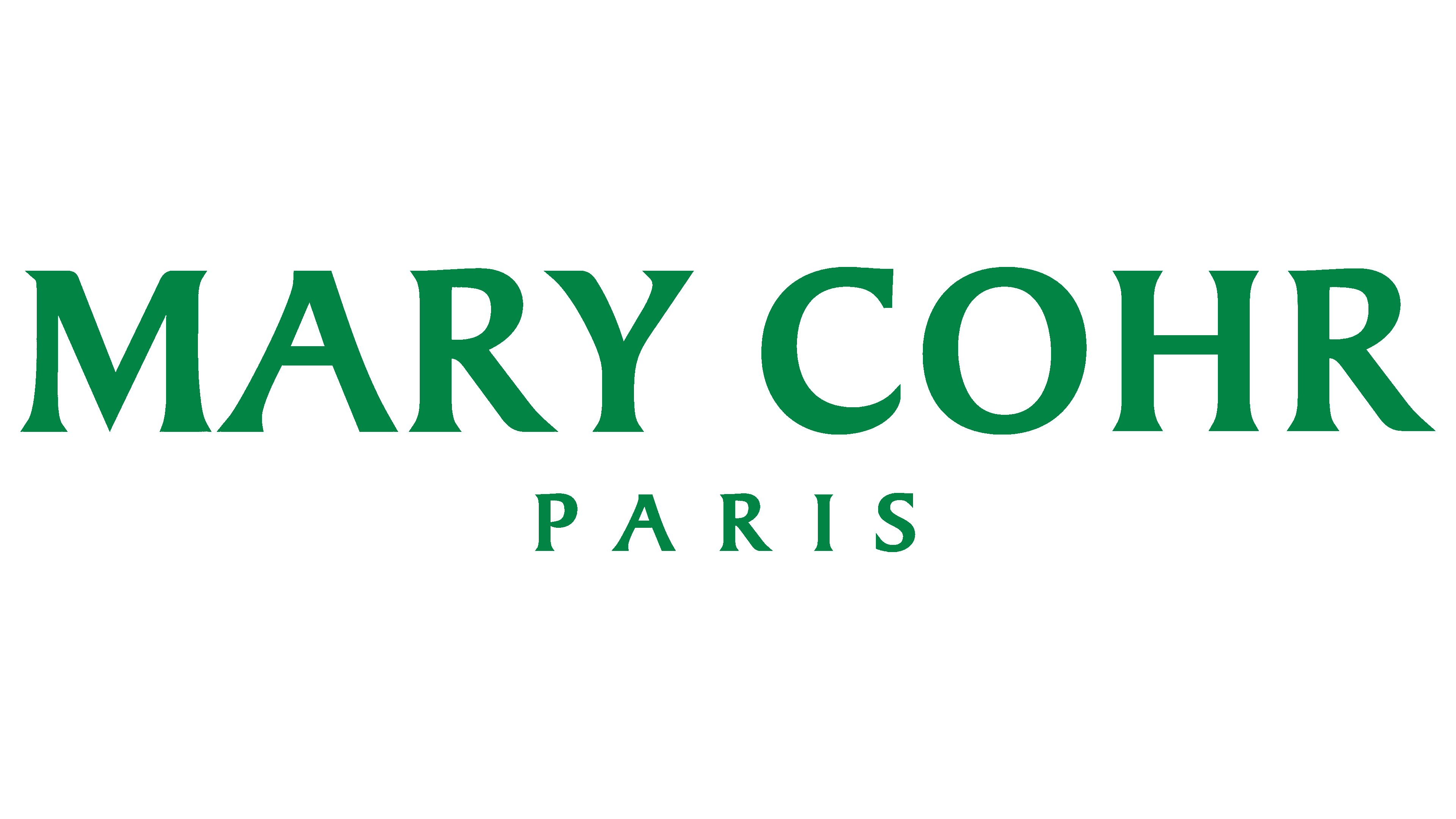
The trademark has several logo variants used for different purposes, but only one is considered official. This is a terse sign, unique in its own way: a pleasant green color emphasizes it. It was chosen by Mary Cohr herself, the founder of the parent company.
Naturalness is evident in this logo. The pastel shade of green conveys this concept. The emblem consists of two elements: the words “Mary Cohr” (brand name) and “Paris” (the city where it is located). The upper element is large, executed in capital letters. On the contrary, the lower text is small and centered within the space between the two inscriptions. The “R” letters have very wide legs. The “A” and “M” have a slight constriction on the left, which expands smoothly.
What is Mary Cohr?
Mary Cohr is a beauty salon chain that uses its own skincare and anti-aging products. It is also the first fashion brand to focus on natural procedures, using products free from chemicals, parabens, and GMOs. The company Guinot-Mary Cohr, founded in 1975, owns it.
Font and Colors
The logo is written in a classic serif typeface. They are very tiny and are not separate strokes but a natural continuation of the letters. The logo’s color palette is complementary, featuring soft green and white.