The Maserati logo invites you to ride the iron horse and become the road king. Only the ruler of a turbulent river of cars can be behind the wheel of such a car. The emblem indicates confidence, royal appearance, and the uniqueness of the company’s products.
Maserati: Brand overview
| Founded: | December 1, 1914 |
| Founder: | Alfieri Maserati |
| Headquarters: | Modena, Italy |
| Website: | maserati.com |
Meaning and History
Maserati’s history is longer than that of Ferrari and Porsche because it has its roots in the early days of the automotive era. However, its chronology dates back to 1926 because it was then that the world saw the Gran Prix 1500 sports car’s newest model. Then, there was Tipo 26, based on Diatto. The start was successful: the racing car with the chrome-plated stamped logo on the bonnet immediately won the Targa Florio competition.
This is the merit of the Maserati brothers—passionate race drivers, engineers, and mechanics. There were six of them in the family, but only one was not interested in the family business. Mario Maserati was more interested in art than engineering. Paradoxically, his creation left the greatest mark in the company’s history. The brothers are long dead, the brand has passed into the ownership of the Dutch corporation Stellantis, and the legendary trident logo continues to exist, recalling Mario’s talents.
Of course, the emblem has changed a lot over a hundred years. Modern designers have adapted it to new standards, significantly improving the graphics and color palette and giving the trident a different shape. But it is still the main decoration of luxury cars, without which it is impossible to imagine either a sports car or a luxury Maserati car.
What is Maserati?
Maserati is an Italian luxury car brand. It was founded in 1914 by five brothers and named after them. In the second half of the 1960s, it was taken over by Citroën; in 1993, the shares were taken over by FIAT, and in 1999 Ferrari took control of the company. Since 2021 Maserati has been part of Stellantis N.V., The main car models produced under this brand are Levante, GranTurismo, Ghibli, and Quattroporte.
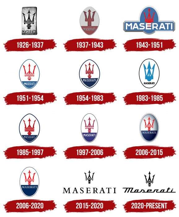
1926 – 1937
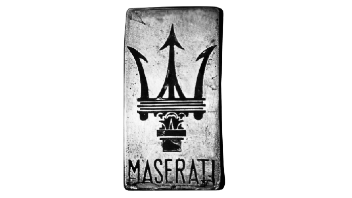
It is believed that the Trident logo was created in 1926. However, according to historical documents, it appeared long before the first Maserati: around 1920, Mario designed the iconic logo at his brothers’ request, making the company recognizable. As a talented artist and a person far from the automotive industry, he decided to do without the classic racing symbols.
In the early years, the emblem looked rather austere. It looked like a vertically elongated rectangle made of polished brass. The word “MASERATI” was engraved at the bottom, and a thin sans-serif font was used for the letters. The image of the upper part of the trident occupied the main part. Mario has given attention to the design, embellishing the drawing with exquisite patterns.
1937 – 1943
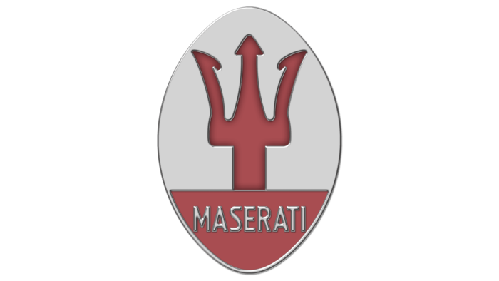
After visiting different cars, the badge has been changed:
- It has acquired an elliptical shape.
- The color of the base has become lighter and got rid of black spots that create a worn effect.
- The trident has lost many details that made it a kind of artwork.
Simultaneously, the brand name remained in its place, but a separate zone was allotted for almost one-fourth of the ellipse.
Archival documents confirm that this logo had a color version. The lemon oval, the blue outline, the red teeth of the trident, and the silvery inscription on the blue background looked colorful and non-trivial.
1943 – 1951
In 1937, Maserati was taken over by the Orsi family. The new owner, Adolfo Orsi, immediately transported her to Modena. With its famous Neptune statue, Bologna is a thing of the past, but the calculating entrepreneur knew the value of a good reputation. There has always been a trident on the front of Maserati cars, and Adolfo was in no hurry to change it.
The iconic symbol has returned to its original form on the new emblem. It became similar to the badge that first adorned the hood of the Tipo 26 in 1926. The designers only dared turn the ellipse into an oval, intersected by a rectangle with large white lettering “MASERATI.” A wide gray outline surrounded the geometric shapes. The trident was red, but due to a faded shade, it was lost against a blue background lined with stripes in the form of sunbeams.
1951 – 1954
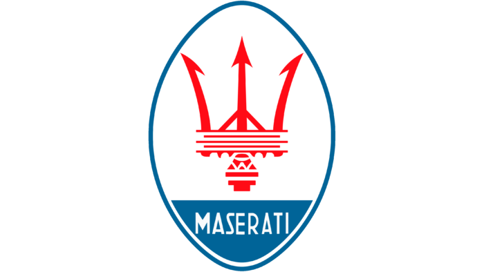
In the early 1950s, the logo of the classic elliptical shape was used. The red trident consisted of many unconnected lines associated with racing competitions. The ellipse had slight shading on the right side, which made it look three-dimensional. The main body was white, except for the navy blue underside. The color of the rest of the elements followed the same pattern: white for the caption and dark blue for the outline.
1954 – 1983
The corners of the ellipse have been sharpened, and the trident has become more compact. The text has moved to the top of the blue segment, and the colors have taken on a dark shade.
1983 – 1985
Orsis promoted Maserati to the luxury category but went bankrupt. The brand was bought by Alessandro de Tomaso, who had his vision of the automotive business. The logo was updated in 1983, two years after the first Biturbo was released. The ellipse was replaced with a white oval with a gray outline, the lettering became the same gray, and the trident became simplified and light blue.
1985 – 1997
The 1985 emblem is identical to the 1954 version; only the trident is wider.
1997 – 2006
In 1997, Maserati and Ferrari merged. The general design trends were maintained, but the small details of the trident were gone. Also, the developers have rounded off the pointed ends of the ellipse, widened the blue area at the bottom, and enlarged the “MASERATI” inscription.
2006 – 2020
The letters have serifs, and the dark outline of the oval has become thinner. The trident has acquired a sharper appearance compared to previous versions.
2006 – 2015
In 2006, a three-dimensional version of the emblem appeared. The designers achieved this effect using shadows, gradients, and additional paths.
2015 – 2020
The most radical restyling was carried out in 2015. The logo has lost almost everything that made it an iconic symbol of Maserati. Only two elements are left: the trident, which has been repainted and reduced in size, and the company name, enlarged and written in the familiar serif typeface.
2020 – today
The modern icon looks exactly like its minimalist predecessor. Only the typography has changed: all the letters in the word “Maserati” are lowercase (except for “M”) and are linked by short lines running down the bottom.
The author of the first trident, Mario Maserati, drew inspiration from what he saw around him. A huge fountain dominated the main square of his hometown of Bologna, which was dominated by Neptune’s statue. This sculpture, created by the early Baroque Giovanni da Bologna representative, pushed the artist towards the cult emblem. The main inspiration was Marquis Diego de Sterlich, who first proposed implementing this idea to be more precise.
Over time, all Maserati sports and road cars have been given the Trident interpretation badge. It is the unchanging symbol of the brand, embodying energy and strength.
Maserati: Interesting Facts
Maserati is an iconic Italian luxury car maker celebrated for its elegance, luxury, and performance. Alfieri Maserati and his brothers founded it on December 1, 1914, in Bologna, Italy. Maserati has become a significant car industry figure known for its innovation, racing achievements, and Italian craftsmanship.
- Founding Brothers Alfieri, Ettore, Ernesto, and Bindo Maserati started the company, initially focusing on race cars. They played a big part in designing and engineering their vehicles.
- Trident Logo: With a trident, the Maserati logo draws inspiration from the Fountain of Neptune in Bologna. The trident symbolizes strength and vigor and nods to the brand’s Bologna roots (Maserati is now headquartered in Modena).
- Racing Success: Maserati has a rich racing history, with notable wins like Juan Manuel Fangio’s 1957 Formula One World Championship in a Maserati 250F.
- Engineering Innovations: Known for its engineering breakthroughs, Maserati developed the “Birdcage” with its unique, lightweight chassis, showcasing the brand’s innovative design approach.
- Luxury Meets Performance: Shifting focus from racing, Maserati now produces luxury cars known for their performance, comfort, and Italian elegance, with models like the Quattroporte and GranTurismo.
- Worldwide Appeal: Maserati enjoys global popularity, symbolizing status and sophistication to a global clientele that appreciates its blend of performance, luxury, and Italian design.
- SUV Expansion: Recently, Maserati entered the SUV market with the Levante, merging Maserati’s design and performance with SUV practicality, reaching a wider audience.
- Electrification Plans: Maserati plans to electrify its lineup, starting with the Ghibli hybrid, as part of its commitment to sustainable technology.
- Customization Options: Maserati offers extensive customization, allowing buyers to personalize their cars, highlighting its focus on exclusivity and personalization.
- Cultural Icon: Beyond cars, Maserati has become a symbol of Italian luxury and performance in media, films, and music, representing prestige and the Italian lifestyle.
Maserati’s story is one of passion, innovation, and excellence. Looking ahead, the brand continues to represent luxury and performance, honoring its century-long legacy.
Font and Colors
The company has used many different fonts to highlight its uniqueness. The modern version is similar to the Raceway. It is also rumored that the capital “M” was taken from Deftone Stylus and all other letters from Boxer Script JF.
Most Maserati logos are color-coded in red and blue, and the official Bologna colors are displayed on the city’s flag. The red trident symbolizes the power of cars, the silvery field represents the earth, and the dark blue represents the water over which Neptune rules. The current monochromatic version is more prosaic because it uses a white emblem on a black background or black on white.
FAQ
Does Ferrari own a Maserati?
Ferrari does not currently own the company. In 1993, FIAT Chrysler bought Maserati. In 1997, they sold 50 percent of Maserati shares to Ferrari, which FIAT Chrysler owned. This allowed Ferrari to influence Maserati, providing engineering support and technology.
Today, the brand is owned by Stellantis. Stellantis was formed from the merger of FIAT Chrysler Automobiles (FCA) and Peugeot SA (PSA) in 2021. This merger created one of the world’s largest automotive groups, including several well-known car brands. Stellantis manages company operations, continuing its tradition of producing luxury and high-performance vehicles.
What does the Maserati symbol mean?
The symbol, featuring a trident, has a deep meaning. The trident represents power, inspired by the Roman god Neptune. While Neptune rules the seas, cars conquer the roads.
A red trident symbolizes power, while a silver or white background represents the land and roads that Maserati vehicles dominate. The trident reflects the brand’s strength and dominance, similar to Neptune’s control over the oceans.
Mario Maserati, one of the Maserati brothers, designed the symbol. He was inspired by the Fountain of Neptune in Bologna, Italy, where the brand was founded. It reflects the brand’s rich heritage and dedication to producing high-performance, luxurious vehicles.
What inspired the Maserati logo?
The Fountain of Neptune inspired the logo in the central square of Bologna. Mario Maserati designed the Trident logo, drawing inspiration from this famous sculpture. Marquis Diego de Sterlich suggested using the trident symbol. The founder liked the idea because Neptune’s connection to Bologna resonated with Maserati’s hometown.
The trident represents power and strength. Neptune, the Roman god of the sea, holds a trident, symbolizing his control over the waters. For a brand, this symbol signifies dominance on the roads.
Choosing the trident was a tribute to Maserati’s origins in Bologna, adding cultural and historical significance to the logo.
Where did the Maserati logo come from?
The logo was created by Mario Maserati, one of the Maserati brothers. The idea came from Marquis Diego de Sterlich, a family friend, who suggested using the trident from the Fountain of Neptune statue in Bologna. Mario took this advice and designed the emblem as Neptune’s trident.
The trident symbol was chosen for its association with power and control. Neptune, the Roman god of the sea, wielded a trident, symbolizing his dominance over the waters. The connection to the Fountain of Neptune also tied the logo to Maserati’s hometown, adding cultural and historical significance.

