
Maxi Health updated its image after many years in the vitamin category, where the emphasis had been on naturalness, care, and familiar images of healthy nutrition. The company began with a small store in Brooklyn, opened by Jack Friedman in 1974. Over time, it grew into a major manufacturer and seller of kosher vitamins, minerals, and herbal supplements in the United States. The Maxi Health catalog includes more than 150 products in tablet, capsule, powder, chewable, and liquid forms. Its certifications include Orthodox Union, Badatz, and Udvari Kashruth in the United Kingdom.
The Brooklyn studio M/OTG worked on the brand update. The team needed to move Maxi Health away from the image of ordinary natural vitamins and present the brand closer to science, laboratories, and evidence-based formulas. The old logo relied on symbols of health and nature. Leaves, curls, a microscope inside the letter “M,” serifs, and italics created a warm image, but the mark looked overloaded. It contained too many different ideas, which made the brand lose its cohesive appearance.
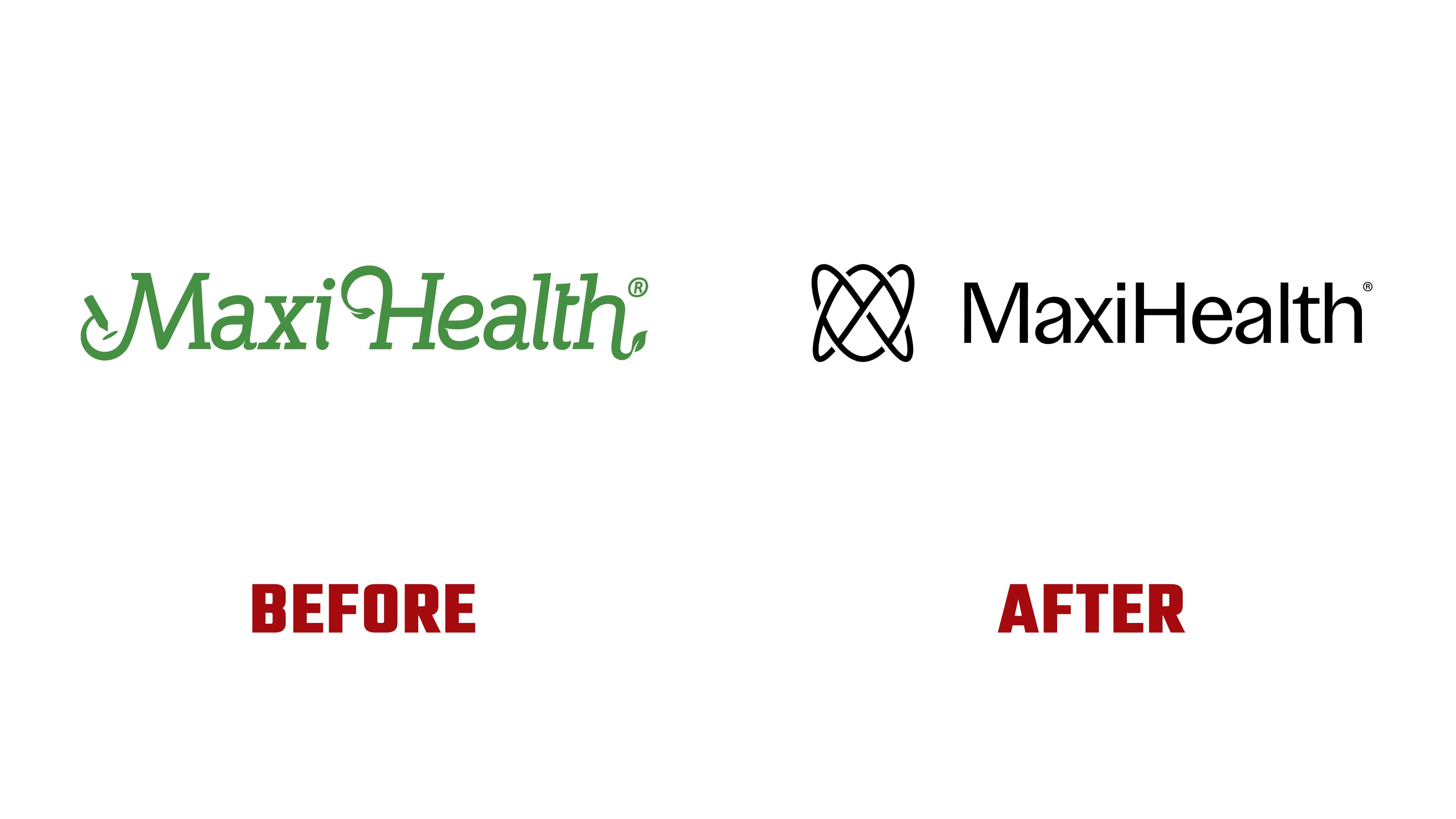
In the new emblem, the leaves, decorative curls, and connection to the health food store image were removed. The mark is based on an abstract form resembling an atomic structure. Inside it, the letters “M,” “A,” and “X” are visible, assembled into a single symbol. The lines intertwine and create volume.
The new logo shows a shift in Maxi Health’s positioning. The brand emphasizes formulas, research, cellular energy, and production closer to the pharmaceutical field. The conversation about health moves away from herbs and natural imagery toward science, control, and precision. For the customer, the emblem signals a rigorous approach to the product. For the market, it shows the brand’s maturation.

The name Maxi Health is set in a sans-serif typeface with a slight difference in stroke weight. The wordmark looks calm and strict, does not compete with the icon, and helps keep the focus on the brand name.
The updated Maxi Health logo emphasizes precision, structure, and technology. For a brand that began in Brooklyn and entered the international market, the update helps connect the company’s history with its current product level.