![]() Maxwell House Logo PNG
Maxwell House Logo PNG
The Maxwell House logo coffee drink runs out so quickly that you don’t have time to notice. Delicious, invigorating, fragrant coffee from the emblem will be a pleasant addition to the morning awakening ritual.
Maxwell House began with Joel Owsley Cheek, a Kentucky native who moved to Nashville in 1873 and started selling groceries. By 1884, he was working with British coffee broker Roger Nolley Smith on a steady blend made from high-grade Arabica beans from Central America.
In 1892, Cheek gave 20 pounds of his coffee to the Maxwell House Hotel in Nashville. Guests preferred it to the hotel’s old coffee, so the hotel became his exclusive customer and later allowed him to use its name. Cheek then founded Nashville Coffee and Manufacturing Company, focusing on coffee production.
In 1901, the business became Cheek-Neal Coffee Company. New roasting operations followed in Jacksonville in 1910, then Houston, Richmond, and Nashville. In 1915, the slogan “Good to the last drop” appeared in advertising. The brand later tied it to Theodore Roosevelt’s 1907 visit to Nashville, though the documented quote from that trip was different.
Cheek sold Cheek-Neal to Postum in 1928 for $42 million. A year later, Postum became General Foods Corporation. Maxwell House then grew into a major food group while competing with Folgers, owned by Procter & Gamble, and regional roasters. During World War II, it supplied instant coffee to the U.S. Army. General Foods was acquired by Philip Morris in 1985, and after subsequent mergers, Maxwell House was acquired by Kraft Heinz.
Meaning and History
![]()
Until the 1980s, Maxwell House was one of the most popular coffee brands in the United States. It owed its success in part to the slogan “Good to the Last Drop,” coined in 1917. The phrase was so successful that it is still used today and is reflected in the corporate logo. Its origin remains unclear: for a long time, it was said that these words were spoken in 1907 by Theodore Roosevelt, when he was treated to a cup of freshly brewed coffee at Andrew Jackson Manor. Company officials later acknowledged that the former president of the General Foods Corporation was the author of the famous motto. Nevertheless, they continue to argue that Roosevelt drank Maxwell House’s coffee and expressed his approval.
The creatives played up the slogan in the logo by adding a cup with a falling drop to the inscription. The design changed several times until a modern version appeared. Interestingly, French consumers accepted the “Good to the Last Drop” concept without enthusiasm. The coffee producer had to look for a different approach to please them urgently. He found that French people like high-caffeine drinks, so he introduced a new, stronger product, accompanied by an emblem featuring a spoon standing vertically in a cup. But this promotional drawing was never the official graphic mark of Maxwell House.
What is Maxwell House?
This well-known American coffee brand was named after a luxurious hotel in Nashville, where this coffee was first offered to guests. A distinguishing feature of the product is its unique roasting technique, which imparts a rich flavor that has become a symbol of high quality. The brand uses coffee bean varieties from around the world to create a diverse product line, including instant, capsule, and traditional ground coffee. In the United States, the brand’s blue can has become a morning staple for millions, and the phrase “Good to the Last Drop” has become an iconic expression associated with quality coffee.
1927 – 1986
![]()
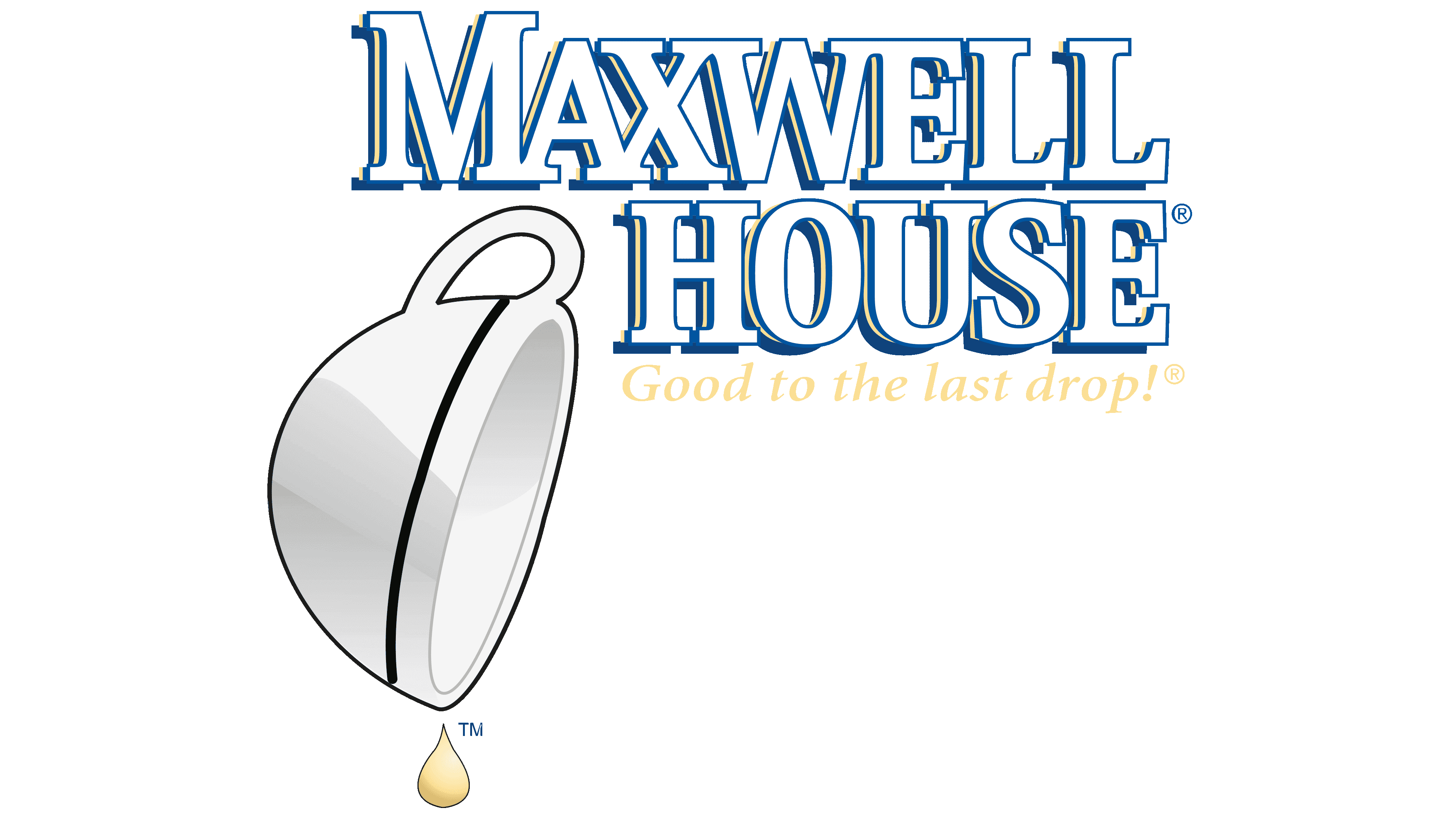
In the late 1920s, the coffee brand was taken over by Postum Co., which General Foods later bought. A three-line logo began to be used with “MAXWELL HOUSE Coffee,” with each word placed one below the other and the letters casting black shadows. A white cup with a handle and a red rim sat on the left. It was tilted so that a drop of coffee dripped from it. The motto “GOOD TO THE LAST DROP” was also placed on two red ribbons. A large blue rectangle served as the background for all the elements.
1986 – 2005
![]()
In 1985, Maxwell House’s decaf blend hit the shelves, and just a year later, the brand changed its logo. It abandoned the red color scheme but kept the blue rectangular base, complete with a wide border with gold inserts. The cup (now white with a blue rim) was moved to the lower-left corner, with the drip turned yellow, like vegetable oil. The rest of the space was occupied by writing. At the top was the word “MAXWELL” with an enlarged “M.” Because of the long serifs, the first five letters blended into each other. Just below was the second part of the name: “HOUSE.” The third line was the famous company slogan, written in gold italics, and under it was the word “Coffee,” for which the designers chose a similar slanted font, but white.
2005 – 2009
![]()
The new century brought another change to the Maxwell House identity. The brand name was centered, and all letters, except the first “M” and “H,” were lowercase. The font became more dynamic with asymmetry and tapered serifs. The word “Coffee” is gone, and the phrase “GOOD TO THE LAST DROP” is at the top. So it wouldn’t draw too much attention, the designers reduced it and replaced italics with a thin geometric sans-serif font. And the most important component, the cup, was right above “Maxwell,” so the drop, which turned brown, fell somewhere between the “x” and the “w.” Because of this redistribution of elements, the logo’s creators had to add a semicircle to the top of the rectangular base; otherwise, the cup wouldn’t fit. The blue background had a radial gradient with darkened edges.
2009 – 2014
![]()
Following a newfangled trend, the designers departed from tradition and simplified the Maxwell House brand name. Its name was at the center of the brand’s visual identity, while the teardrop cup and the iconic slogan were removed. This drew criticism from consumers because everyone was used to the old advertising concept and recognized their favorite coffee by the upside-down cup. The inscription was made in a low-contrast font with short triangular serifs. The designers slightly lengthened the lower-right “x” to create visual balance. They made the rectangular base symmetrical for the same purpose by adding the same bulges at the top and bottom. The shade of blue became much lighter, and the gradient’s location shifted so that the central circle was highlighted.
2014 – today
![]()
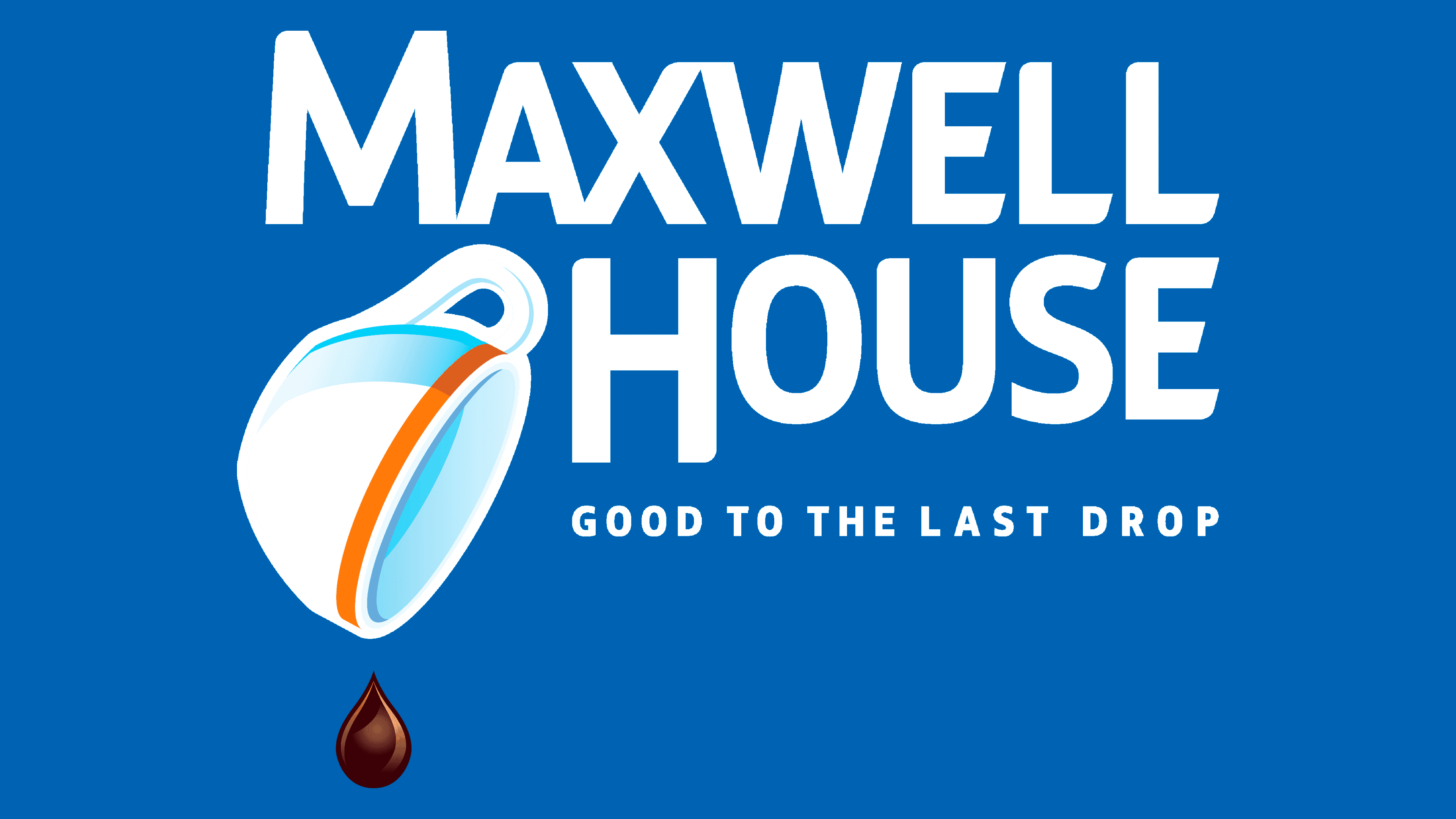
Realizing the importance of tradition, the coffee producer returned to the old concept. In 2014, it launched several new products, redesigned its packaging, and introduced a logo remarkably similar to the one adopted in 1986. Of course, there are several significant differences between them. First, it concerns the colors: now all the lettering is blue, and the base is white. Secondly, the font has changed: “MAXWELL HOUSE” and “GOOD TO THE LAST DROP” are written in the same bold grotesque. Only the letters in the brand name have some corners cut and rounded in places.
The cup, the main element, has a blue outline and blue shadows. The bezel, which used to be blue as well, has become orange. As for the coffee drop, the designers visibly enlarged it. And also added a brown gradient and glare to make it look three-dimensional.
Bringing back the classic logo design, the brand’s owners showcased its vintage look and devotion to tradition. The slogan, accompanied by a clear illustration, effectively communicates the product’s benefits to consumers. Marketers couldn’t help bringing it back because Maxwell House owes its success to the inverted cup-and-falling-drop motif. The coffee producer reintroduced the public to an old advertising concept from the 1920s, and it has remained so memorable that it still resonates a hundred years later.
Font and Colors
The logo designers chose a bold sans serif font for “GOOD TO THE LAST DROP” and a modified version for the phrase “MAXWELL HOUSE.” It is the brand name that is the most interesting because it has asymmetry: many corners are rounded, the horizontal “E” strokes are unevenly cut, the “M” and “H” are disproportionately large compared to the other letters, the “M,” “A,” “X”, and “W” merge at the extremes. The color scheme is traditional: white and blue. But now they are diluted with shades of orange, blue, and brown.